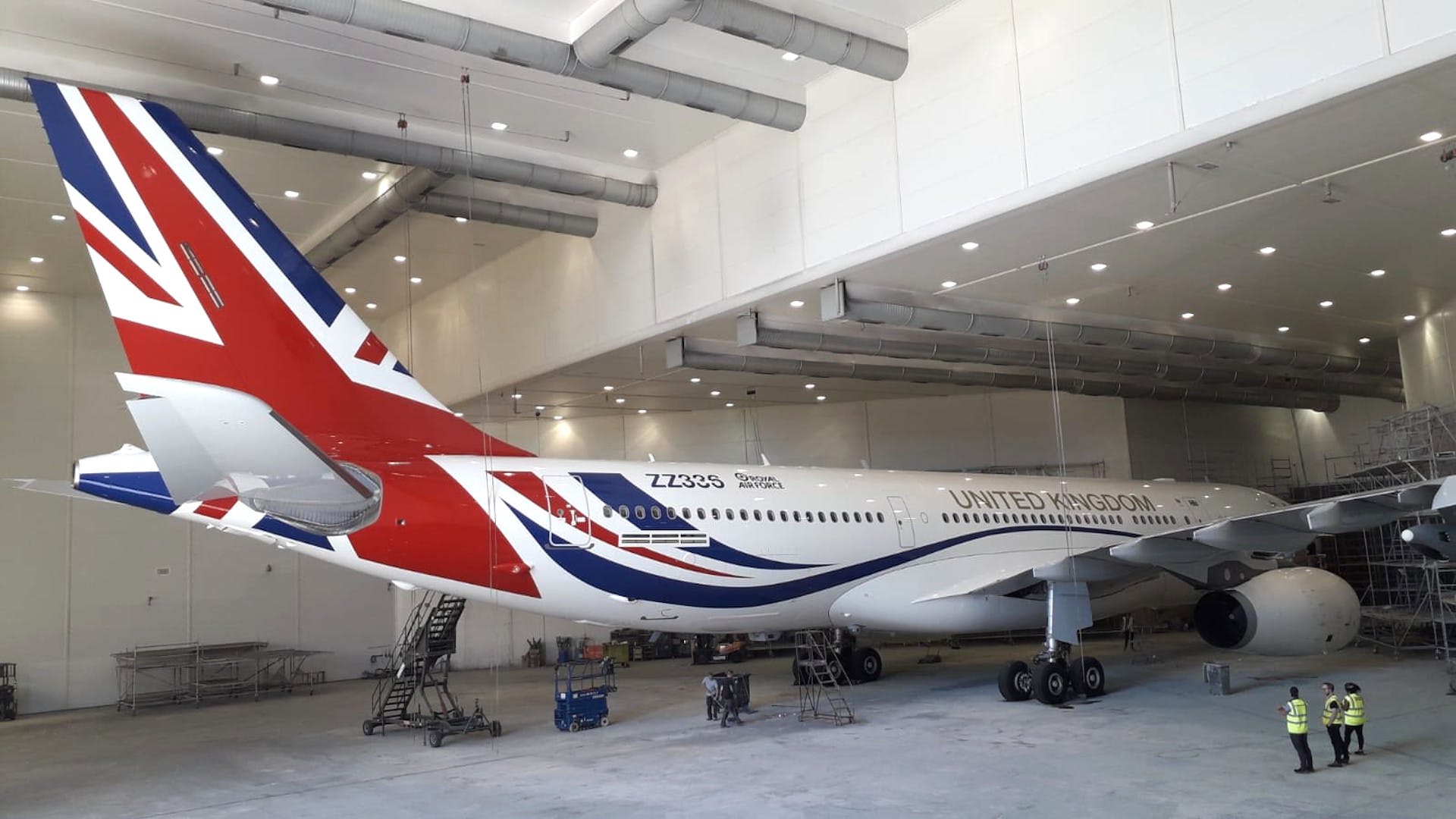
The United Kingdom has quietly introduced its own version of Air Force One and like in the USA, the red and white and blue color scheme is mired in controversy.
UK Debuts Its Version Of Air Force One
For years, the Prime Minister, Monarch, and other top government officials or members of the royal household have flown on UK’s Royal Air Force Voyagers, specially-configured Airbus A330 aircraft for official business. Unlike the specially-painted aircraft for top officials in countries like France, Germany, and the United States, these RAF aircraft were just painted gray.
But recently, one of these VIP-configured aircraft (ZZ336) was re-painted in a patriotic scheme with the Union Jack on the tail. The cost of the paint job was £900,000 (currently $1.1 million).
As you can see the theme of the aircraft somewhat resembles the Negus theme of British Airways, used from 1974-1980.

image: British Airways
Outrage Over Cost
Obviously, some people are going to be offended about anything, but the Labour Party has launched a particularly stinging attack against the government and Prime Minister Boris Johnson personally for what it calls obscene spending during a time of austerity. Labour believes the money should have been spent on jobs and eduction.
The government argues the paint job is intended to promote the UK abroad, with Downing Street stating:
“This will mean that the plane can better represent the UK around the world with national branding, similar to many other leaders’ planes, while also retaining its military air-to-air refuelling capability.”
A spokesperson added, “At every stage we have worked to ensure value for money for the UK taxpayer and all of the work has been undertaken in the UK, directly benefiting British suppliers.”
CONCLUSION
The exterior redo is a small fraction of the £10 million spent to redo the interior of the aircraft in 2016. But it is certainly a more cosmetic change. Stylistically, I must admit I think France, Germany, and the United States all have better designs, though I would not call this a bad design.
What do you think about the new “Air Force One” in the UK?
image: Crown Copyright


I think the Union Jack looks a little too informal. It looks like a theme plane for one of the airlines, and not stately and royal.
One can imagine Margaret Thatcher’s reaction.
I think that is a very beautiful color but it almost look like the new one the United States is bringing out soon.
Yeah that’s not going happen…cancelled as of November 4th
Thankfully. The new livery would have looked like a commercial airline. The change was made at the direction of a president who allegedly wanted the plane to match his plane.
Looks great, nothing “controversial” about it OR Air Force One, bravo!
And how many union tradesmen & women were involved with accomplishing the paint work. Labour leadership needs to stay in thier lane & look out for thier members.
Um that “Labour” would be Her Majesties Loyal Opposition ie The Labour Party, not union leadership
I like it.
God people love to complain. Looks fine to me.
$1.1 million of economic stimulus isn’t the worst thing during a recession… As long as they didn’t outsource the job during a stopover in another country
I’m with you. This looks fine, and no one has said so, but I wouldn’t be at all surprised if this was scheduled at a time when the aircraft needed to be repainted anyway.
This could be a new BA livery. The current one is ugly, and soo 1990’ish. With that wave in the union jack, it represents Microsoft Office 98’s wordarts.
Gimmicky – makes me think of styling for a UK entry in the Eurovison Song Contest
That flowing blue underline along the fuselage reminds of the United livery that does the same with the blue/gold.
It’s beautiful! Painting isn’t cheap so they might as well make it nice!
Another vote for it being a sensible use of money, but questionable taste.
I have no issue with rebranding the plane but this livery doesn’t do it for me. It looks too much like an airline scheme. It would look good on BA aircraft. I would have expected the coat of arms to figure prominently along with an unstylized Union Jack and smaller flags of England, Scotland & Wales somewhere as well.
Nice looking but not the best.
The US design is also nice looking but very dated. The Air Force One type design (ok, AF1 is a flight number that could be any plane, technically) is similar to the style more than 50 years ago. The tail is like the 1960’s Air France and the upswing in the front is like the early 60’s BOAC.
I would say timeless instead of dates. I love the current AF1 paint scheme and would hate to see it go (even though I don’t think Trump’s paint scheme looks to bad either).
I don’t have a problem with the expenditure. It’s not that extravagant. However, unless they were going for a Cool Britannia airlinesque vibe, the style does not look very official or befitting Her Majesty’s government.
I applaud the nations who scream Look At Me, we’re a powerful nation! Good for them for painting it.
Austin Powers! Yeah, baby!
much better than GRAY
I quite like the tail, but that swooping cheat lines suggest ‘budget airline’. As for the fuselage-centered word mark, I don’t care for the font. Plus, the letters are too close together.
Overall Grade: C
Prediction: The livery will quietly go when Boris does.
The only controversial thing is how hideous it is.
The paint scheme is bold, and the design is true to the flag with a hint of flair. It shouldn’t look too commercial. Leave that to the airlines (ie American’s Stars and Stripes variation).
Any tail design based on the Union Jack is always going to have some resemblance to a design of a BA tail, as BA designs are based on the Union Jack. This design is tied to the flag.
As for the ‘controversy’. Some are going to like it. Some are going to not like it as much. Call that controversy.
Labour opposition is a given – the non-governing party is called opposition for a reason. As for ‘austerity’ – that is a strange claim in a time where spending has rocketed over 100% of GDP, most of which is spent on jobs. I can see why spending £900k might appear to be frivolous, But this plane is the money shot when travelling the world and used by the government and the Royal Family. Grey wasn’t their colour!
My only question is “would Lady Thatcher have had a hanky large enough”?
NO question as to who we are.
Less quips about the complaining please….it’s all we have left other than the aircraft in question.
They should have just gone with Eurowhite across the fuselage and a dark blue tail with a circle that simply says “UK.”
That’s how you redisign a livery in 2020.
The British tend to be more understated and this is a bit too “flashy”. I support a scheme that makes a statement, but maybe something a bit more representative of the culture would be more appropriate.
I like this new design. It”s a bold statement and not hard on the eyes..
I think $1.1M is not unreasonable, but I am an American, and tend to spend frivolously anyway…!
It’s a bold marketing statement, the design doesn’t matter really. What matters is that the gutless “Politically Correct” previous Government that didn’t have the courage to project an image. Can you imagine Coca Cola, Apple or Amazon saying “we’ll do grey so to fend off any criticism”?