In an interview with ABC News, President Donald Trump unveiled the proposed livery for the next generation of Air Force One. The iconic blue is out and a new red, white, and blue livery is in. And not just any red, white, and blue design…but one that looks ominously like the final livery for US Airways.
In 2024, two 747-8s will replace the current 747-200s that are now 30 years old. The cost will be $3.9 billion and President Trump has hinted of a new, more “patriotic” livery for months.
Now that new livery has been revealed.
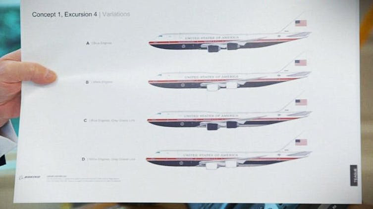
You can see the upper half of the fuselage is white while the lower half is navy blue, a darker color than the current hue. A red cheat line runs across the middle. The tail is white and features an American flag. One concept has the four engine casings painted navy blue while another has them painted white.
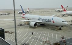
My first thought when I saw the aircraft was that this looks exactly like the final US Airways livery prior to the merger with American Airlines.
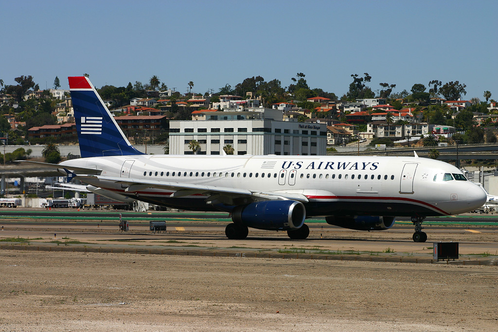
David Mueller / Wikimedia Commons
In fact, American Airlines even has a “heritage” livery operating in the same paint scheme:
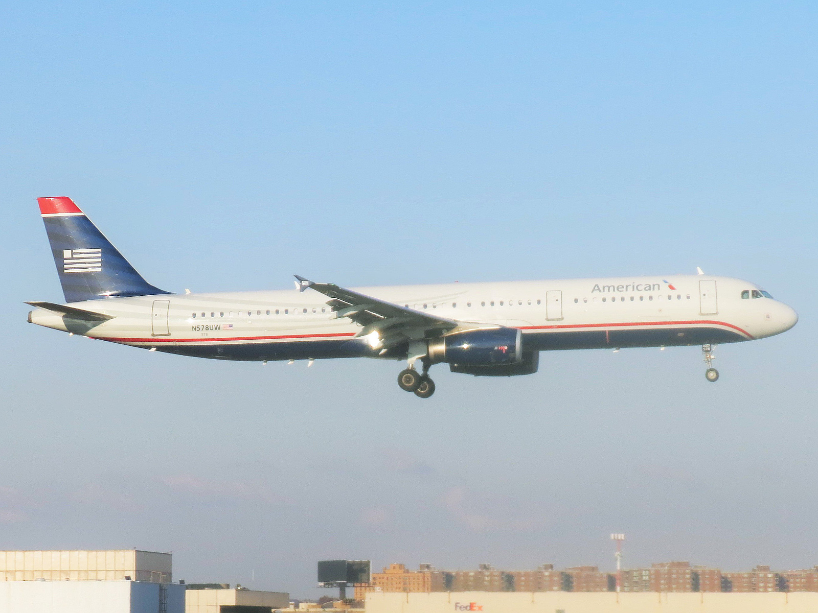
Adam Moreira / Wikimedia Commons
That’s not very original!
.@ABC EXCLUSIVE: Pres. Trump unveils his new patriotic paint job for Air Force One during one-on-one with @GStephanopoulos. https://t.co/as0f3beUNBpic.twitter.com/nCtOgoQqDh
— This Week (@ThisWeekABC) June 13, 2019
A Fascinating History
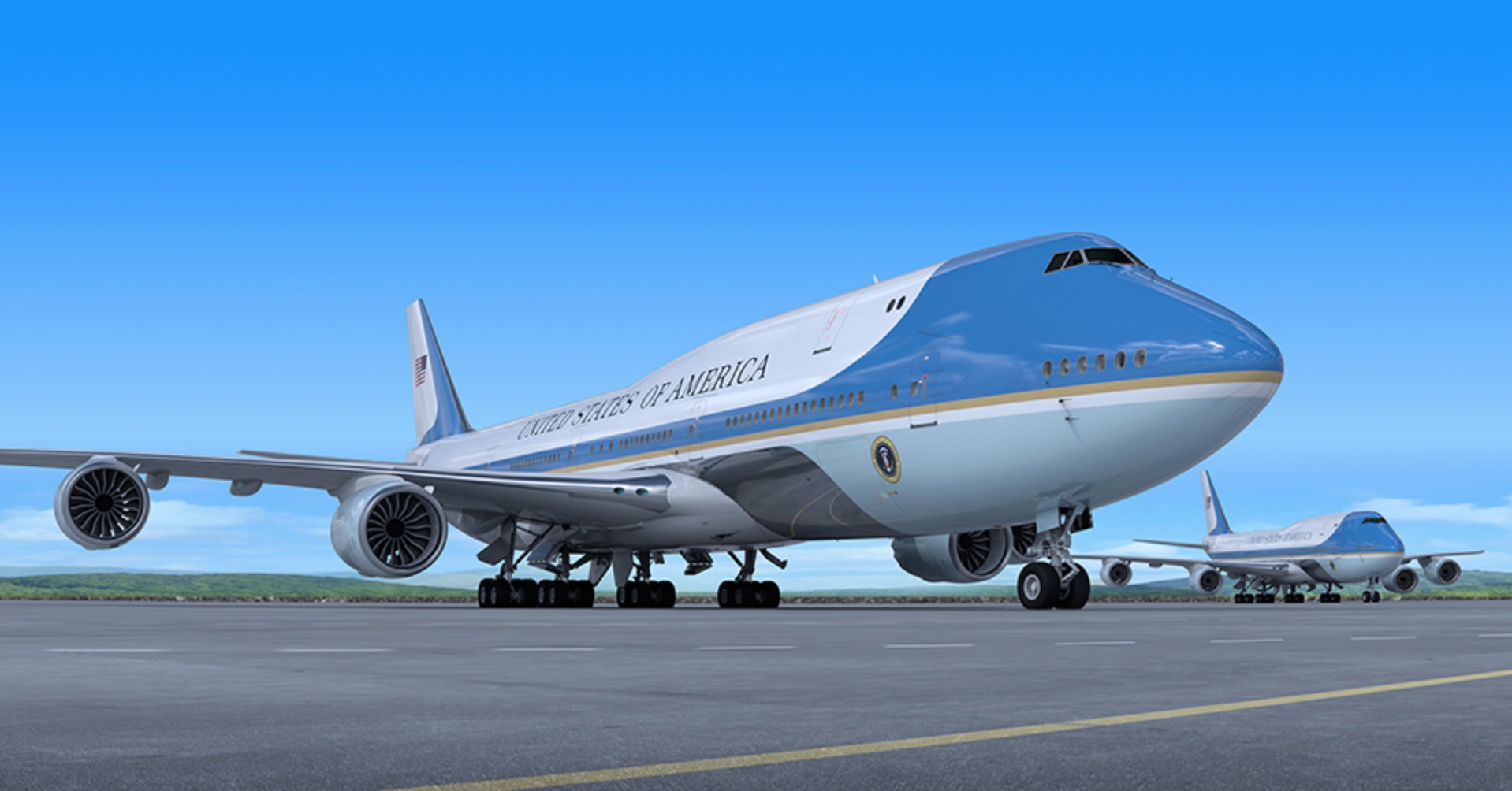
One Mile at a Time points to the story behind the current livery, which was influenced more by Jacqueline Kennedy’s color and design preference than anything else. And while that alone isn’t reason enough to keep or discard a livery, I cannot think of an aircraft with livery more distinct and frankly more elegant than Air Force One.
I have no problem with the new livery at all. But it just looks like US Airways or British Airways. The beautiful and unique lines were so iconic that the aircraft was always recognizable. The new livery is good, but the old livery is better. I hope it stays…
Meanwhile, Rep. Joe Courtney (D – CT) introduced an amendment to the 2020 defense appropriation bill to restrict any “major” interior or exterior changes (including livery) to approval from Congress. Courtney is worried:
[A]dditional paint can add weight to the plane, additional fixtures inside the plane can also add cost and delays to the delivery of the plane…
That’s a bunch of bull. Why not just say you don’t like the new paint job or the POTUS who proposed it? Congress is within its right to regulate the livery of Air Force One, but don’t play games like this…
CONCLUSION
There are many liveries that I love, but none I love as much as Air Force One. While the days of Jackie O’s iconic blue, gold, and white may be limited, at least we can look forward to them living on at a Presidential library.
What are your thoughts on the new Air Force One livery?


It seems the trump presidency can’t leave anything good unmolested. The new livery looks bland, uninspired and pedestrian. Unlike the grace and elegance of the old one. Let’s hope the decision to change it is taken out of his hands in 2020
Unmolested eh? It’s. A. Paint job. For. A. Plane.
Let’s get some perspective.
Is this not an Aviation blog? New paint schemes are big news here. And the loss of such an icon is a big deal, to me at least. But sure. Just a paint job. oh well!
Trumps new design is fugly!
You’re probably right – Trump will have that thing repainted before taking delivery in 2025. 😀
The old design was a classic, a sweeping, timeless, beautiful piece of jet-age design by Raymond Loewy the greatest industrial brand-designer in history. It’s unique, and had become synonymous worldwide with American presidential power. The very fact it doesn’t have all the colours of our flag on it is (was) a statement of confidence: we did not need to have a red, white and blue wrapped plane – we could afford to do something more inspirational.
The new design is frankly, boring. Just uninspiring all around. Who cares if it matches the colours of the flag? I also don’t care that it’s Trump himself proposing it. It’s not ugly it’s just average. A statement that America has long since passed its jet-age and space-age “dreamer” phase and is now so insecure it needs to paint red, white and blue all over everything, and keep it boring and (small c) conservative.
Why mess with a design classic??
+1. Well put
What was good about the old design. It was a splotch of an ugly shade of blue. Nothing classy or inspiring about it. I’ve been in both at Andrews AFB. The entire plane is bland inside and out and with fold out couches as a bed like in a trailer park. It needed to get some class at least on the outside. If the old design took a puffed up Designer to come up with it, then that shows how far off the mark it was. Its a humble plane with an ugly blue outside.
If you want a really cynical viewpoint, the livery actually looks like an exact inversion (with different colors) of the Trump plane livery. Talk about leaving behind a legacy…yuck
This was actually my first thought, along with BA’s previous livery. Honestly, it’s not bad and neither is Trump’s 757. It’s very professional but boring. Like United’s “Battleship Grey” livery. But it just seems glaringly obvious that Boeing, who aren’t exactly wunderkind at the moment, may be pandering to a someone who loves to have people tripping over themselves to prostrate to him. And what better way than to say, “Look! We took your private jet’s livery and basically put it on AF1! Aren’t we clever?! Now shower us with adoration and make up for that whole 737 Max 8 debacle so everyone forgets.”
Ah Boeing providing the paint job samples.
Plenty of time for changes and reversions on that front with 2024 (or later) delivery.
“There are many liveries that I love, but none I love as much as Air Force One. While the days of Jackie O’s iconic blue, gold, and white may be limited, at least we can look forward to them living on in infamy in a Presidential library.”
Why would you use infamy here to describe the livery if you say you love it? Infamy means being remembered for something bad. If you hated the current livery infamy would be correct, but as written it doesn’t make much sense.
You are correct and I’ve fixed it. Thanks.
Frankly, Air Force One should always stay how it looks. It IS the most recognized aircraft in the world! Why would we change it? Don’t fix it if it isn’t broken! Can trump not keep his small stupid hands off anything?
I have a friend who’s in a position to know, who shared with me the top-secret image of the redesigned Air Force one livery: https://tinyurl.com/y5haklxw
LOL
This is BULL the paint scheme on Air Force One is the only one like it. The commercial airliner look does not give the grace and prestige that the current color scheme does. The blue color is not of the Air Force colors or Navy colors it should not be tinkered with.
It’s so heartening to know that Trump has spent so much time on this and not running the country. I totally see him spending hours with crayons “designing” the livery all day in the Oval Office !
“This is fuuuuuuunnn”
Don’t you think it looks more like The last TWA than US Airways?
In some ways. I loved the final TWA livery with that beautiful golden world map on the 747. The only TWA planes I ever flew on were MD-80s.
You were thinking of what Roosevelt might have said re Trump “ November 8, 2016, a date which will live in infamy….”
On the plane: why does he obsess with his legacy, barely halfway through his first term? The economy’s in the toilet, climate change ever more urgent, security issues left, right and centre…yet he focuses on a paint job for a plane . Weird.
Dude, we’re in a key battle with China over fair trade. I’m hardly a big fan of Trump. He’s divisive with a Capital D, but he’s THE ONLY PotUS who’s been willing to take THE necessary steps to halt the blood loss.
At least you noticed this too.
I’ve always thought the current livery is not that good. The worse part is the upswing in the front is more suited for a plane without the hump, such as a 707, 757, 767, 777, 787. The upswing going all the way up to the hump is no good.
However, the proposals look like a black bottom. It should be more blue.
I thought this was fake news.
The only energy I will expend on this is to say: this design will never, ever happen. No reason to even worry about it.
It’s obvious! This is the Trump Air livery upside down!!! It’s staring right at you lol!!
We can’t afford it with the last round of tax cuts. Congress needs to use its ‘power of the purse’ to stop this.
We’ll agree to the change, if he agrees to leave.
It looks more like that “other” carrier that AA merged/destroyed/obliterated
https://www.google.com/url?sa=i&rct=j&q=&esrc=s&source=images&cd=&ved=2ahUKEwj36cGCnOniAhVnsFQKHfwmBBkQjRx6BAgBEAU&url=https%3A%2F%2Fskysthelimitaviation.ezreservation.net%2Fcatalog%2Fproduct_info.php%3Fproducts_id%3D6017&psig=AOvVaw0NRRG-jVp-7QyELsf8BYk9&ust=1560610136090422
Okay well I was trying to copy/paste the image of TWA’s last color scheme.
//s.imgur.com/min/embed.js
if this doesnt work i give up
I was thinking it looked a lot like the departed but not missed USA 3000 livery.
2.bp.blogspot.com/-fmH26GzXHuE/T5EsVMOeutI/AAAAAAAAAOo/jX6GGPYxMm0/s1600/2345.JPG
It’s near identical to Japan’s 747 Air Force One. I wonder if Donald Duck realizes that
I see some people are comparing the proposal to US Air’s last paint scheme. There are some similarities, but step back just a little more to TWA’s final paint scheme before they became part of American. Google TWA 757 and look for their last paint job which was red, white, dark blue and a gold stripe. Other than the Globe Image and how the striping turns to run up the tail, its a dead on match!
So many awful negative comments against our President by lefto LIBS..SAD You can’t hold your typing!!!
Their typing skills could have helped with your [lack of] punctuation…enough said there
Remember the kids that ALWAYS copied from others? Trump copies everything…..
It’s the Trump Airlines livery in reverse. He too had a red band in the middle. He had the dark blue on the top and white on the bottom. The chosen livery is the same but mirrored. Horrible.
Air Forcr 1 represents the United States of America. Its current livery has been around long enough to become an Icon recognized all over the Word. It is synonymous with [the[ USA and should Not be changed.
We don’t change our flag when we change our President and we should not change the livery of the Nation’s airacraft to satisy the whims or ego of any one President! Do what needs to be done to Stop this unnecassary proposed change.
The original Loewy Design was red instead of the current blue and the change was suggested by Kennedy’s spouse Jackie. Loewy agreed and I imagine the suggested change took less than a day to finalize.
Like most of Loewy’s designs, Air Force One did indeed become iconic like many others that he created and still touch our daily lives..
It’s a 1 of a kind aircraft that carries the leader of the most 1 of kind country in the world. Due to the circumstances that this world is going through I believe it would be best to paint the Airforce 1 aircraft to be more protective rather than being the beautiful diamond in the sky that it is. This aircraft sticks out when it is seen on the ground or whether it is flying in the air.
Airforce 1 could be painted beautifully using lighter colors of blue on the bottom of the fuselage to make it more camouflaged and difficult to detect from the ground and a more neutralized color on the top part of the fuselage so it would be more difficult to visually detect from other opposing & friendly forces from the air.
This type of paint designs would still enable the Airforce 1 aircraft to be a visually and cosmetically beautiful piece of equipment that America could be proud of as well provide protect for our leader.