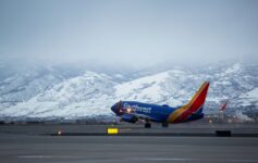
In a feature entitled "12 Awesome Airplane Paint Jobs," Autopia magazine brings us what they consider to be prime examples of airlines "deck[ing] out their planes with cool paint jobs." After examining their choices, however, I have only this to say: If I want to see to grafitti, I can drive to West Philly.
With the exception of the Bar Raefili Southwest paint job, I just can’t figure out what is so great about cartoonish, artsy, or commercially-sponsored (i.e. a Concorde with a Pepsi logo) aircraft designs. I am not impressed by their picks.
Stay tuned for my picks for "awesome airplane paint jobs" later in the week. You can bet there won’t be any Pokemon cartoons bedecking any of my choices.


A Pepsi Concord was certainly different.
Malaysia’s Hibiscus scheme on the 744 is probably my all time favorite.
@Randy: Different, yes, but nice? I think it looks horrible. I love the simple yet elegant BA Concorde livery.
@Bryan: But it looks so busy!