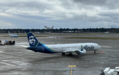
Alaska Airlines has revealed a brand-new aircraft livery, offering a first look at the design that will define its Boeing 787 Dreamliner fleet as the airline expands its intercontinental service from Seattle.
Alaska Airlines Reveals Stunning New Livery For 787 Dreamliner Fleet
The new livery takes inspiration from the aurora borealis and marks a bold evolution in Alaska Airlines’ visual identity. It features deep blues and vibrant greens with sweeping aura-like lines along the fuselage. A retro-inspired stripe along the midsection pays homage to Alaska’s heritage liveries from the 1970s.

This paint scheme will debut on Alaska’s Boeing 787-9 Dreamliners beginning in January 2026. Alaska expects to operate up to 17 Dreamliners in the years ahead. The aircraft are intended for international routes, including service to London and Rome, launching in 2026.
A Modern Look With A Nod To The Past
While Alaska’s iconic Eskimo will remain on the tail of narrowbody aircraft, the refreshed livery aims to position the airline as a global competitor. The aurora-inspired palette reflects both “the natural beauty of Alaska and a sense of forward momentum.” According to Chief Commercial Officer Andrew Harrison, the goal was to create something that looks modern and international, while staying true to the brand’s roots.
“Our new 787 exterior embodies Alaska’s transition to a global airline with beauty, grace and a nod to our heritage. As we significantly expand to new destinations around the globe, we’re eager for more and more travelers to recognize our new livery as being Alaska Airlines and appreciate the outstanding service we’ve long been known for.”
I love the new look…it somehow strikes me as both classic and modern at the same time, and that is hard to pull off.

While “Bob” the Eskimo (no, that’s not Bob Marley, but Chester Seveck, an Alaskan native and reindeer herder from Kotzebue, Alaska) is also iconic, the “northern lights” logo is perfect for a global marketplace. That said, I’m glad the Eskimo will remain on the narrowbody fleet. I also don’t think the name “Alaska” or “Hawaiian” is a problem for a carrier with global aspirations: people will be much more interested in the network, reliability, and comfort of the product.
It will be interesting to see what happens to the interiors, which currently have very Hawaiian elements…
> Read More: First Look Onboard Hawaiian Airlines 787-9
CONCLUSION
Alaska Airlines is signaling a shift in ambition with its new livery. As the carrier begins flying longhaul international routes, this refreshed design reflects a changing identity: one that embraces the airline’s past while looking to compete on the global stage. The 787 livery is just the beginning of what Alaska is calling its “new global experience,” and it will be interesting to see what follows next.


“While Alaska’s iconic Eskimo will remain on the tail of narrowbody aircraft, the refreshed livery aims to position the airline as a global competitor.”
I like the new livery but having different liveries for different planes for different routes looks very messy. They should slowly move all planes to the new one. Now, talking about airlines liveries, I just spent 3 weeks in Italy and I have to say that ITA’s livery is absolutely gorgeous. IMO, it the most beautiful livery out there.
“having different liveries for different planes for different routes looks very messy.”
JetBlue begs to differ.
British Airways Concorde has always had a different livery. In 1997, it was very different but around 2001, the rest of the British Airways fleet used a similar livery as Concorde.
Chester may be seen as a cartoon character to British and Italian, not knowing the history, so this livery is fine. It can also signal to Americans that Alaska Airlines to Europe is different from Alaska domestically. There should be a small Hawaiian Airlines decal by the door because eventually the 787 will be used for what people think are Hawaiian routes.
Let me clarify my point on Alaska. JetBlue uses similar colors and as far as I know the same logo. Patterns may be different but you know it is a JetBlue plane. Alaska will have different colors, the Eskimo on some planes but not on others. That looks messy to me.
Let me clarify your point on ITA’s livery . A blue aircraft with the Italy flag on the rudder . So what ?
If ITA wanted to be unique , they could have done a green plane , with an orange tail .
Southwest once had a killer whale ( orca ) painted on the aircraft body .
That was cook , but Brazil could have a tropical fish , no ?
That blue used by ITA is absolutely gorgeous.
ITA is as boring as pasta .
I like Vietnam Airlines livery. Alaska’s new one is good too.
We need some liveries with the old cheat lines.
Alaska needs to rebrand as Pacific Airlines or somet if it’s going to not confuse people (no foreigner wants to book Alaska Airlines to Hawaii or San Diego or Seattle unless you already are on west coast and familiar with the brand)
There are plenty of airlines with little brand recognition that do just fine.
ANA has long been known to have a brand recognition deficit to JAL in the US yet it does very well in the US. China Omnidirectional airlines do fine as do “eva Air” and “China Airlines” even though many have no idea EVA isn’t a cargo airline or don’t know know China Airlines flies to TPE vs the PRC. Many Americans in Delta’s redneck connecting cities have no idea what Virgin Atlantic, Korean Air, or LATAM is but DL is happy to sell to them and their customers buy it. Many Americans know what Air France is but have no idea what KLM is.
Northwest had the brand recognition in Asia, Delta never did and Delta’s brand in Asia consisted of shutting down most of the NW Asia network and leaving most NW Asia cities for many many years.
When people in Japan or London see an opportunity to earn points on a OneWorld carrier on a nonstop to SEA, they’re likely to be ok and quickly learn what the airline is even if they may prefer their own local airline.
But Alaska’s revenue strength alone, in OneWorld, or in a JV will never come from Europe or Asia, it will come from their hubs and their own point of sale which is extremely strong up and down the West Coast aside from SFO.
No story about the Heathrow issues? Or is it not risque enough? No arrests involved.
Exciting new liveries are all well and good, but I’m more interested in what’ll be going on inside the aircraft. Although Pan Am and TWA were worthy standard bearers in their day, it seems like all of the American carriers that have entered the international arena since have offered at best a very average hard and soft product compared to the Skytrax five star airlines. Here’s hoping Alaska will be different, though I won’t be holding my breath.
I love the examples of special liveries…. Alaska also used to have special Salmon liveries and a Disneyland plane.
For an international example, I guess EVA should dump EVA Kitty which hasb very extensive international services. ANA did some really cool things for Star Wars.
My favorite example of Delta is when they had something like five different liveries including a Song painted planse at JFK.
Even United and AA operate different levels of domestic service for “premium transcontinental flights” and nobody is arguing on here that AA should probably the same level of service on PHL – LAX that they offer on JFK – LAX. So, it’s entirely plausible for Hawaiian and Alaska to evolve together….
Without the iconic Eskimo this just looks terribly generic and devoid of any character.
Definitely. Did they just use AI to come up with something that when parked in a sea of tails at a large airport just looks like any other run of the mill cargo carrier? It seems more anonymous than identifiable.
Who cares about livery when they book a flight? Your not gonna fly a particular plane cuz you don’t like the livery?
Yeah it’s about what happens on the inside that counts.
I do like the new livery for Alaska 787s, though I hope they update the Hawaiian interiors when they paint the existing 787s, otherwise I think it’ll be weird.
Hawaiian design teams worked in so many great cultural details into their new 787’s. HA was genuinely excited when these were finally delivered with traditional Hawaiian blessings at HNL. It is sad to see now that all is going to be removed. As much as Alaska says they are going to keep the 2 brands, HA is already getting the short end of the stick. Virgin America 2.0…
The current management doesn’t want Hawaiian or Alaskan influences and will continue to push them away in favor of a new generic identity lacking any character.
Absolutely true!
SAD! The new livery sucks! It doesn’t look like the Aurora Borealis or anything reflecting Alaska. Now the company has three different liveries. Unheard of! The entire fleet will be changed eventually. Really.
Alaska tried this 20 years ago when the company management attempted to replace Chester and change the company’s name. It floated like a lead balloon with both customers and employees. Now, they’re trying it again. If the “leadership” wants to be creative, they should find a way to blend both Alaska’s and Hawaiian’s logos and designs. Combining United’s and Continental’s recognizable features on United’s livery worked well. Alaska could take a lesson from them. Completely abandoning both Alaska’s and Hawaiian’s identities will not work out well. If this goes well, next, we’ll see Ben and the boys trying to change the company’s name again because they feel it’s not relevant or recognizable to the flying public. Reminds me of the definition of insanity…
I think Alaska Airlines should apply this “Global Livery on 50 percent of its Horizon Embraer Fleet. The other 50 percent should get the same “Global Livery” but with the “Hawaiian Palette” of Colors… emphasizing NOT the present Hawaiian Livery but Hawaiian’s basic Palette of Colors. This would be really distinctive and regionally sync Hawaiian, Alaska’s and Horizons Global Airline Brand.