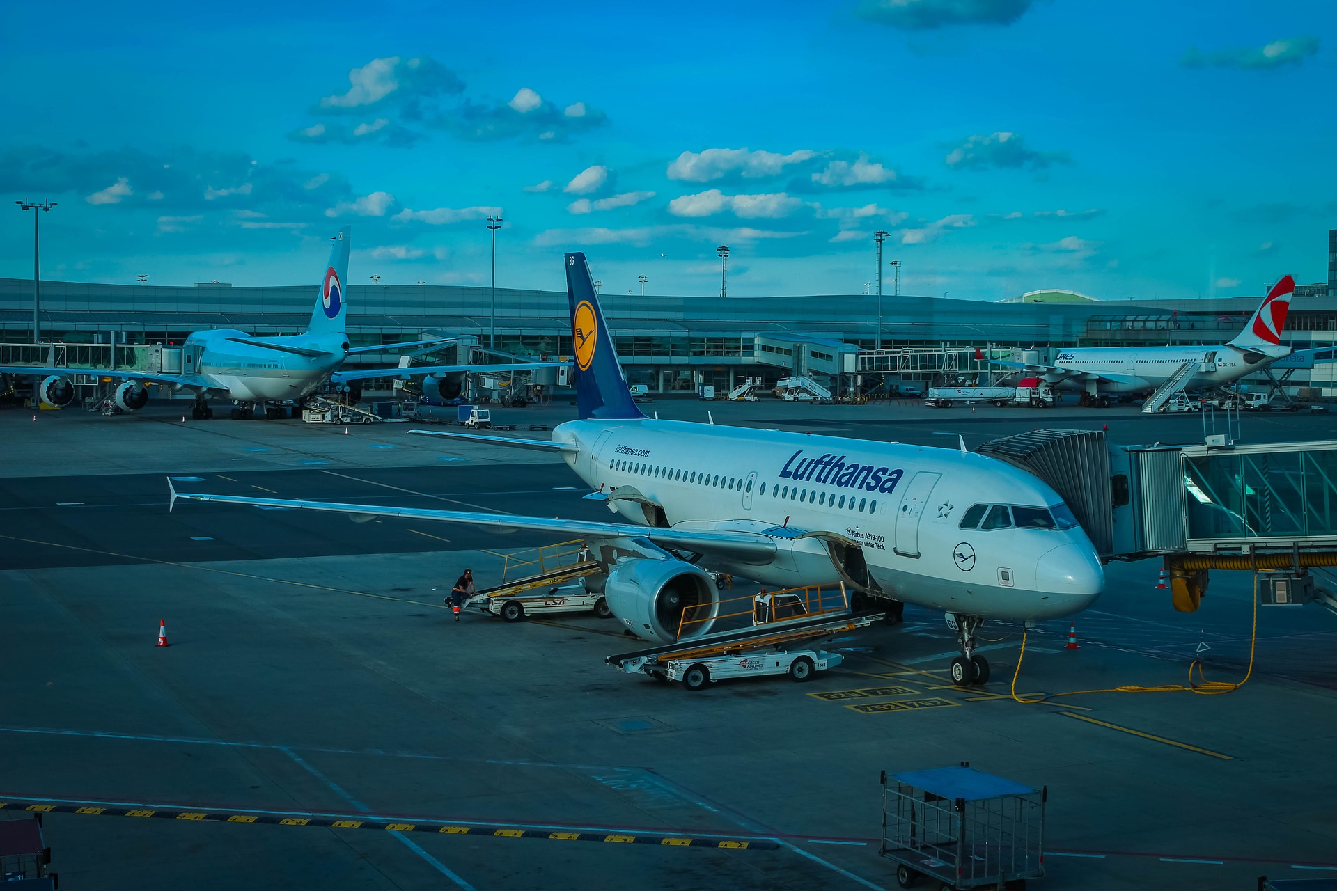
Rumors are swirling that Lufthansa will introduce a new livery next month. My message to Lufthansa: leave it alone.
When I defended Lufthansa’s five-star ranking recently based upon my own travel experiences over the years, I was clearly in the minority. Perhaps I’m in the minority on this as well.
But I like Lufthansa’s present livery. It is timeless. It is elegant. And it is does not need to be changed.
One insider on Flyertalk stressed the changes will be minor:
The new livery will be presented to the press in the week of February 5. No major surprises, its a minor facelift not a radical change…
Hopefully he is right and the changes will indeed be minor. Some designs that have been floated can be found here, though these are not from official sources.
With the exception of the horrific new Iberia livery, I don’t generally dislike changes. Air Canada’s new livery is nice. So are the new liveries of Hawaiian, Alasksa, and Kuwait. I just don’t see the need for it in the case of Lufthansa. Why not just leave well enough alone?
Anyway, we’ll see what Lufthansa unveils next month.
(H/T: Enoch from Point Me to the Plane)


While I strongly disagree with your assertion that Lufthansa is a 5-star airline, I wholeheartedly agree with you on this one. I’ve always appreciated the elegant simplicity of LH’s livery. Some minor changes might be OK, but it would be disappointing if they mess with it too much.
Change for change sake. I agree: LH has a beautiful, unique livery with a long history. And to boot there’s nothing that could, IMHO, be deemed to be offensive about it in this PC crazed world. I disagree re: Air Canada. The ‘old’ livery is much better. Iberia is a perfect example of banality and PC madness by eliminating the crown with cross. Is KLM next to knuckle under? Even Qantas opted to redo the Roo – a PC non-gender version. I think the banality of some of these new logos reflects the mentality of the executives running the airlines. Even AA’s ‘eagle’ is, well, what? But heck, consider the PR/Ad agencies making bundles on such ‘creative’ designs.
The Lufthansa livery on the 747-8 is my absolute favorite. Elegance doesn’t need to be complicated.
I really hope they just keep it the same. Lufthansa’s livery while simple is elegant and is timeless. I think a lot of airline’s have wasted so much money creating new liveries that look worse than their old one’s. Iberia’s new livery is so boring and Air Canada’s new livery while not terrible, in my opinion is much worse than their old one. Their old one was actually one of my favorite airline liveries, whenever you saw that light blue plane you would instantly know that it was Air Canada. I hope LH just keeps it the same.
I don’t care what Lufthansa does with the overall livery; JUST DON’T TOUCH THE CRANE!
I love the Lufty crane. It is the most iconic image in the history of airline branding. It’s the perfect symbol of class, speed and grace.
I’m sure many here will remember that executives at JAL decided some 20 years ago to abandon to their beautiful crane in favor of a stylized ink blot that supposedly represented the rising sun. Yeah, that went over well. Thankfully, JAL realized its egregious error and that big, beautiful bird is now back on JAL’s collective tail.
British Airways totally and frustratingly screwed up when they dumped the equally wonderful speedbird back in the 1970s. And what did we get in its place? Firstly, a made-up coat of arms. Then, a bunch of wacky paint jobs. And presently, those insipid ribbons. God, I miss the glorious speedbird.
I have always liked Air France’s seahorse, even though it is a rather overly complicated design. I wish AF would consider replacing those banal tail stripes with its majestic seahorse.
@Imperator: +1 on all counts!
I’ve always thought of the BA ribbon as nothing more than a flipped-over Nike Swoosh! Wonder how much was paid to the “creative” agency for that?
It feels like marketing people are justifying their existence with interminable changes.
Would actually love to see more of the old livery return in some of the planes.
What is long overdue is that old, dry, not warm and fuzzy, meaningless, 30 year old livery from Continental. But for the time being, their service and product offerings do match the livery … nothing and nothing. But UA should only introduce a new livery AFTER it has fully repaired/recovered/fixed its entire operation: from seats, service, reservation system, on-time performance, aircraft, routes, maintenance AND employees! Ok, so I guess that means we won’t be getting a new UA livery anytime in the next decade.
The only livery out there that should never be really undone; KLM. The oldest and most recognizable airline in the sky.
I would prefer to see yellow retained for circle and crane like on one-off 737-200 in the photo taken in 1983.
https://www.airlinefan.com/airline-photos/Lufthansa/Boeing/737-200/D-ABHD/1147305/
I still don’t get it why Lufthansa has to make crane looking like a ghost, sucking the colour out of it.
Somebody did the Photoshop fix, which improved the look…
https://i.imgur.com/h1CqQCU.jpg