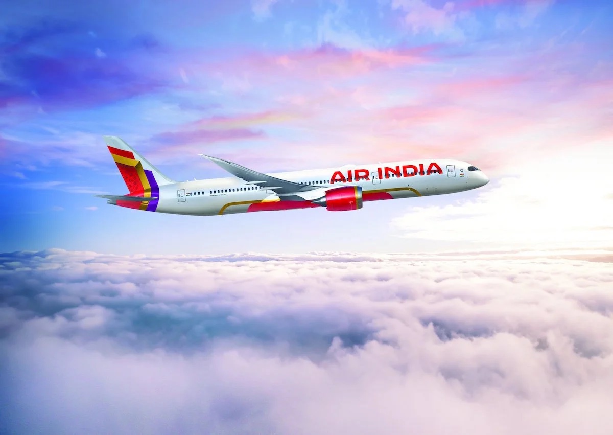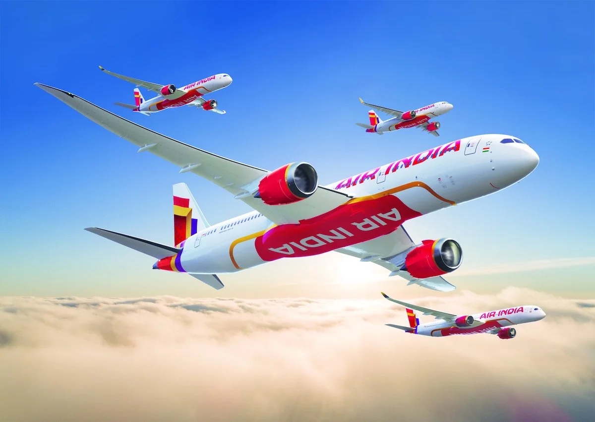
As Air India seeks to reinvent itself in the Tata era, it has debuted a bold and brazen new livery..and also offered a not-so-subtle jab against Emirates, its Dubai-based competitor.
Bold New Air India Livery + Dig At Emirates
Purely coincidentally, I published my initial impressions of a recent flight on Air India prior to the debut of the new livery today. I am excited for the future of Air India and think that with the right investment and leadership, there is the possibility of creating a world-class carrier.
> Read More: My First Flight On Air India…
Earlier today, Air India unveiled a new livery. While fresh and modern, my first thought was that the new livery looked more suited for a budget carrier (and heck, even that may not be fair because I think the Indigo livery is actually very attractive) than a full-service carrier that seeks to compete with its Gulf competitors.

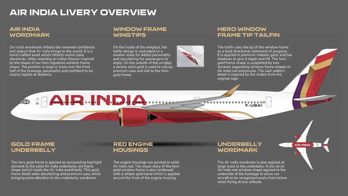
The tail stripes (red, gold, and purple) strike me as quite generic and the bold Air India logo on both the fuselage and belly seem to be even plainer. I get vibes of Avianca and especially Iberia, which make sense considering the flag carriers of Colombia and Spain, but less so for the flag carrier of India. I suppose the purple recognizes that Vistara will fold into Air India…
And then there is the F-UBAI registration code in the same aircraft (pictured below), which seems to me like a nasty jab against Emirates and Dubai. Like One Mile At A Time, I find it improbable that the code simply stands for:
- F-UB – FutureBrand, the company that created the new livery
- AI – Air India

Why would FU instead of just F be used? On the other hand, this strikes me as the sort of clever shade that can be denied as totally innocent. I simply do not buy that this was not deliberate.
Such childhood twaddle aside, Tata has made clear that it wants to compete directly with carriers like Emirates, Etihad, and Qatar. These three Gulf carriers are currently preferred by many Indian travelers, even if an extra connection is required, due to higher service levels onboard.
CONCLUSION
It may be that the livery grows on me over time, but at this point, I rather strongly dislike the new Air India livery. I understand a refresh was needed as the carrier seeks to shed its old image, but I think something that better encapsulates Air India’s role as the Indian flag carrier would have been more appropriate (i.e. national flag colors). Instead, Air India now appears as the latest budget carrier.


The tail art doesn’t seem to be a strong impression of Air India but maybe it will catch on. The old United tupli, Northwest, Delta, British Airways are examples of strong tail art. Continental’s current one is too generic to make an impression.
The last time the Tulip was distinctive was during the battleship gray era. But after United changed to rising blue, Continental had the more distinctive tail. United’s rising blue tulip was so zoomed in, it just looked like lines that curved towards the bottom and one had to know about the tulip logo to understand what was on the rising blue tail.
Matt…I disagree. The minute I saw the colors, my thoughts went immediately to a traditional Indian sari. Furthermore, IMO India has always been about bold colors, so the livery fits right in.
I’m not sure it’s premium but I don’t think it’s discount either. Sometimes simple is better.
That’s it – India is overwhelming in nearly every way, whether we’re talking about heat, noise, seasoning, traffic, dress colours etc.
Understated elegance might be appropriate for Air Canada or maybe CX, blue accents work for Aegean and muted greys suit SAS and Finnair, and there’s nothing odd about the Indian flag carrier using bold colours.
Yes, I tend to agree. While the huge letters on a plain white fuselage is the latest thing, it does look cheap. That said, most airlines are using some version of that. And the old livery is charming but very dated and with details that just doesn’t show up from a distance. This refresh is an improvement and a statement.
Like others, the tail art doesn’t grab me. I do like the colors, but the pattern is uninspired IMO. Perhaps it will grow on me, but I’ll say this: it’s such a different look that it gives the impression of a whole new AI. And that may have been the idea here.
Wonder what the interior will look like, assuming they redesign those as well.
What a hot mess!!! And why am I not surprised? There seems to be a downward trajectory of crass aesthetics that have been plaguing this airline since they decided to do away. with the original livery…they are so out of the loop and have done themselves no favors with this latest job.
simply removing the underbelly mess and enlarging the tail motif with the jali extending. down to the underbelly in gold would have made this more iconic.
“Why would FU instead of just F be used? On the other hand, this strikes me as the sort of clever shade that can be denied as totally innocent. I simply do not buy that this was not deliberate.”
Seeing as the India is the largest supplier of indentured servants to the UAE, my guess is someone felt empowered to throw a little shade at the emiratis…
I don’t like it. It strikes me as a cross between SpiceJet and Iberia. Really uninspired IMO. Though if the goal was to dump every vestige of the old AI, I guess it succeeds there.
Yep, I’d agree with you – doesn’t represent the Indian ethos – the tail stripes are a far cry from the partial ‘Ashok Chakra’ of today – my favourite livery had been the one they used on their 707s – this was re-hashed on the 747s. The one now envisioned seems to lacks innovativeness – quite mundane.
Doesn’t represent the Indian ethos – the tail stripes are a far cry from the partial ‘Ashok Chakra’ of today – my favourite livery had been the one they used on their 707s – this was re-hashed on the 747s. The one now envisioned seems to lacks innovativeness – quite mundane.
Completely disappointed with the new design inside an out. I travel 6-7 months of the year. Personally think Emirates service has deteriorated for what they charge and enjoy the travel via Doha on Qatar when pricing is competitive. With all the investment AI is making they better have something to offer if they plan to complete with the likes of (Qatar, Ethiad, Emirates, Turkish, Singapore) I dont see it from the looks of their interior and exterior. Good luck with that investment. SERIOUSLY!!!