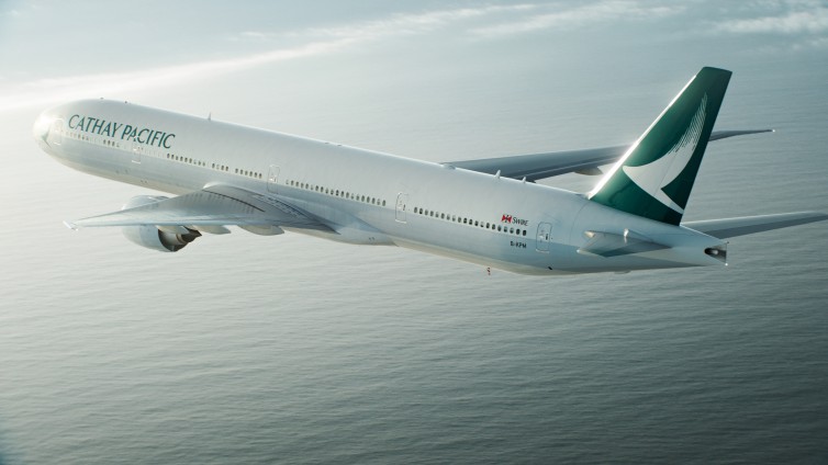
Airlines update their livery from time to time, often when the brand is in need of a similar refresh. For Cathay Pacific, flag carrier of Hong Kong, the brand is respected, financial are stable, and there has been no major disasters, mergers or other events that might prompt fundamental changes. Still, Cathay Pacific is in the middle of a subtle refresh to a “simpler, cleaner, more customer-focused” brand and has introduced new livery to reflect that goal.

Cathay Pacific has even produced a video concerning the new livery–
A Brief History of Cathay Pacific Livery
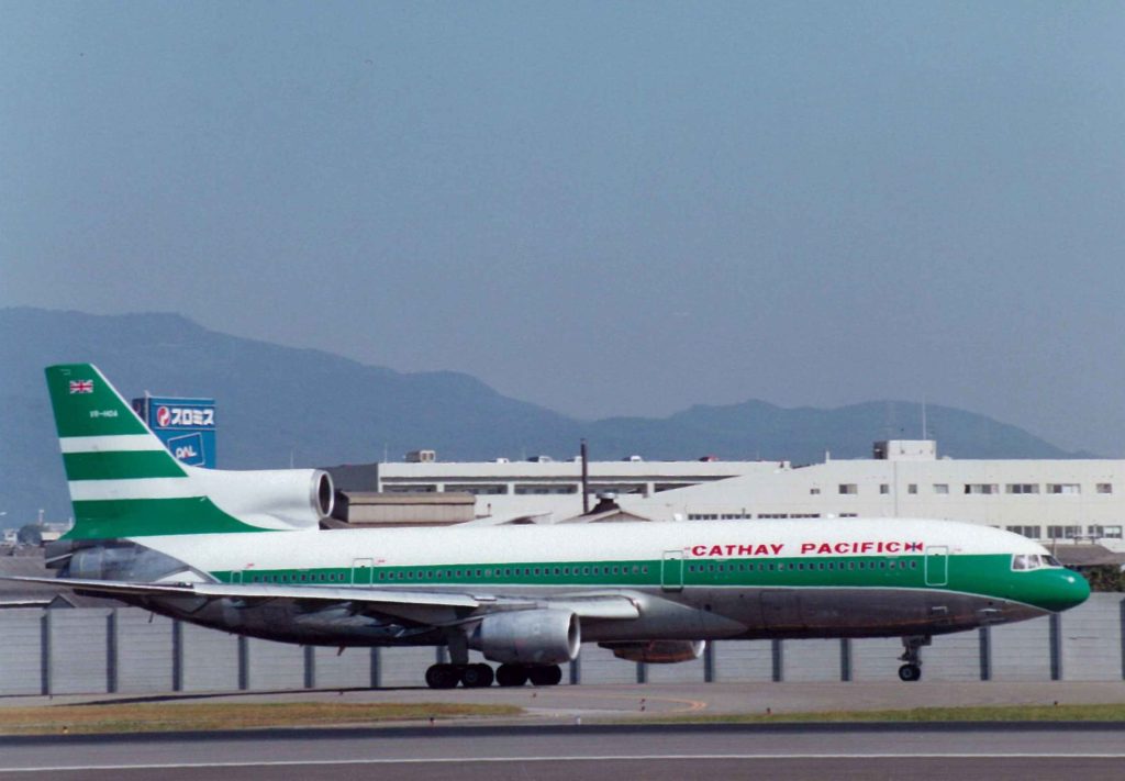
In the 1970s, Cathay Pacific introduced a new livery that included green and white stripes:

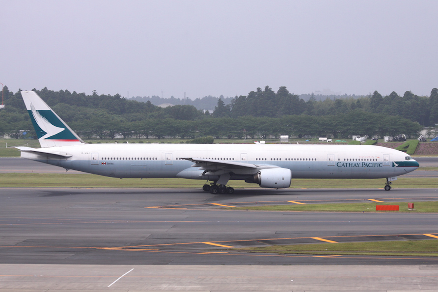
In 1994, the “brushwing” livery was introduced, featuring the now iconic Cathay Pacific logo with a mix of red and green to create a distinct logo:

 One cool tidbit — most carriers include national flags on their fuselages and Cathay Pacific included the United Kingdom flag until China re-assumed control over Hong Kong in 1997. After a sharp debate about whether to include the Hong Kong SAR flag or the Mainland China flag, a compromise was made — neither. Instead, “Hong Kong” is printed on the side with the Hong Kong Logo. The “flag” you see on the side of panes with the word “Swire” beside it, representing Cathay Pacific’s parent company Swire Pacific, a British firm (though note that Chinese flag carrier Air China is also a major stakeholder).
New Cathay Pacific Livery is Elegant and Simple
Personally, I like the new livery. While the livery currently in use is arguably timeless (i.e. it wasn’t bad at all), the shades of red and green were very 1990s to me, sort of like Hong Kong airport – one of the world’s greatest airports and yet still clearly a product of the 90s.
I love talking about liveries because I love to airplane spot at airports and in the air, but let’s be honest — it is not the livery that matters, it is the service and product inside. Cathay Pacific is in desperate need of WiFi onboard, but offers a tremendous product and elegant onboard service that the livery, both new and old, capture nicely.


I wouldn’t call it a new livery. It’s a very, very minor refresh at best. And somebody got paid a LOT of money to come up with it, I bet. I’m in the wrong business…
I miss the red – red is Hong Kong. Sad to see they removed it. 🙁
@Kevin: Great point — I totally glossed over that. Then again, at least there is no “Mainland China” red to replace the “Hong Kong” red.
@A.S.: Agree…I’d love to design liveries for a living