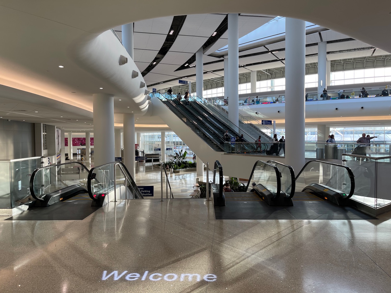
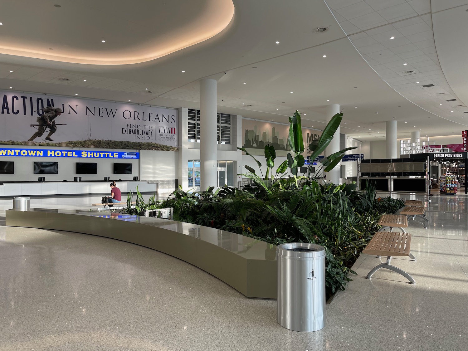
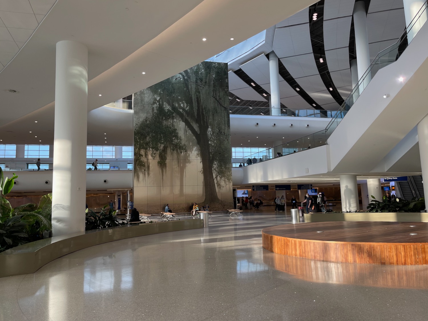
The new and improved Louis Armstrong New Orleans International Airport is really an architectural wonder and one of the most beautiful terminals I have ever set foot in.
New Orleans (MSY) Airport Is Beautiful
Originally on the grounds of the Moisant Stock Yards, hence the MSY airport code, New Orleans Airport was rather dungeon-like for decades. But a new world class terminal complex opened in late 2019 and I recently experienced it for the first time.
The true wonder is not the gate areas, but the terminal entrance and lobby, with soaring ceilings, curves, natural light, and even some greenery.


Pelli Clarke Pelli, the design firm which designed the new airport, explained:
“The building’s form evokes the geography of the Delta region and soft curves of the Mississippi River. Symmetrical in plan, the building forms a gentle arc on three sides. A monumental roof rises toward the building’s centerline, where it crests over a large central skylight. The terminal facades are primarily glass, allowing for views out to the airfield.”
César Pelli is an acclaimed Argentine-American architect who designed such world landmarks as the the Petronas Towers in Kuala Lumpur and the World Financial Center in New York City.
In short, an added bonus of visiting New Orleans is the lovely airport…it’s an architectural marvel that the city of NOLA should be proud of.


Great article and photos . I still think the new MSY terminal was a waste of money. The old terminal was fine, particularly concourse C and D.
What MSY lacks is city bus service. It is not available in the middle of the day and doesn’t go to where people want to go. I have taken the city bus to/from the airport 3 times.
Wow! That looks awesome.
The first time I went to MSY was 1987. The only thing I remember well was the baggage claim. It was the worst baggage claim I have ever seen– a very old school system of conveyor belts. I know a lot of them are kind of conveyor belts, but this was like something out of the Flintstones. The pulleys and motors appeared to have 6 inches of dust on them.
My memory is that the ceiling was unfinished (meaning it was just bare metal supports and whatever the ceiling material was– concrete, asbestos, boards, etc…) There were unsightly metal beams supporting the ceiling. It was hot. It was like getting your luggage in a dirty garage, on a flintstones conveyor belt.
It was very memorable trip.
It is a great, easy to use airport. Too bad they didn’t build a road to get to it. We hope to have an interchange for the interstate done in a year or so, but for now its a game of weave and bob through the neighborhood. Oh, and if you rent a car its a 20 minute shuttle ride around the airport too the old terminal.
I think they need to soften the tones of the whitewashed walls.
I have to respectfully disagree… I visited the new MSY earlier this year and found it disappointing on just about every dimension:
– terrible road access via roads that were punched through a neighborhood almost as an afterthought, with no direct ramps to/from Interstate 10
– a weird two-sided landside setup that bellies up against a parking garage and cannot be expanded without demolishing parts of the new complex
– a lot of wasted space in the landside lobby
– narrow passageways connecting the security checkpoint to the concourses that are as claustrophobic as the corridors of the old terminal
– retail plunked down in the middle of the concourses, forcing foot traffic onto either side
– sterile, clinical architecture that gives almost no sense of place, apart from a couple of murals depicting bayou landscapes
I’ll give the terminal credit for allocating tons of space to its security checkpoint, but that’s about all the good I can say for it. Literally everything else about it felt like a missed opportunity.
Agreed that the retail space in the middle of concourse is very annoying.
The lower arrivals pick-up area is poorly formatted. It’s constantly jammed with taxis, Ubers, and others waiting to pick up family and friends.
Upon arrival at the airport, we go to the upper departure area to get picked up by family or friends and coordinate via text messaging. Just use the two lanes furthest from the entrance. There’s also several benches available while waiting. It’s soooo much easier than the mess downstairs.
Also, I don’t think as many business folks come to NOLA as in the past. Back in the late 70’s and early 80’s, oil and gas dominated the business PAX. Widebody jest were parked at the airport overnight for early morning departures. Now, its mostly tourist and convention visitors in narrow body jets.
Ever try getting a rental car there? The old terminal was a 3-5 minute walk from the terminal. You could literally be in a car driving out within 15 minutes of stepping off the plane. With this new terminal – it’s walk to the main entrance, cross the street to get to a shuttle, wait 15-20 minutes to then board a crowded bus. That bus will drive a couple of miles at 25 MPH down the stupidly slow road in front of the airport through a horrible neighborhood. That bus will then take another road that can travel up to 35MPH for a few more miles. Then finally approach the old terminal where it will drive right past the old entrance and circle around the entire building before finally entering the area of the rental car center. Oh and at this point the bus has slowed to about 15 MPH. It will then circle the entire rental car facility then make one final circle at the back of of the building before finally stopping and allowing people off.
From stepping off the plane, it’s a good hour to get to the rental car. This used to be minutes, now it’s an hour. This was a significant downgrade.
Now for your return — you should add at least one hour minimum just to return the car as all of this will have to go in reverse.
Rental cars used to be very easy and seamless at MSY. Now it’s a complete and total failure. The airport is a waste of money and in the wrong location. Getting in and out is a disaster. It’s already sinking (literally). The rental car facility is miles away (have to drive to it through several miles of a slow moving packed shuttle). There was no reason to build this new building as the old building just needed to be cleaned and slightly updated. It was in a great location. This new one is in a neighborhood at the edge of a swamp and the neighborhood is quite unattractive and run down. It may look pretty on paper but the entire project was a complete waste.
SLC had the chance to build something remarkable yet they built and ugly brown box. Good for MSY for building something better
The airport is sinking badly. Sure it’s beautiful from the front. Ask about the sinking problem that forced repairing sewer lines, electrical lines, building ramps on top of ramps to allow for baggage vehicles.
Do you mean SLC or MSY?
Where is the cell phone lot? I can never find it only one sign then nothin! Pick up is always jammed with ubers cars etc.
As others have mentioned, the rental car shuttle situation at the new MSY is a true failure. I fly into Lousiana for business about every 2 weeks and have stopped flying into MSY altogether in favor of BTR or LFT. Our project sites are nearly halfway between BTR and MSY, maybe even closer to MSY, but the added time for picking up and returning the rental car is not worth it.
Beautiful…outside yes. Can someone explain why the electrical outlets underneath the chairs don’t work. Forget about charging your phone or any other device!!! Are they just there for decoration or to impress people??? Certainly not functional.
I grew up at MSY. My dad worked foe Eastern Air Lines. I spent many late nights at the old airports, yes, airports. I played many a night in the original MSY airport, a quonset hut before the new airport of 1957 was built. I used to ride up and down the baggage conveyers along with bags from the check-in floor to the bag room below. I even played in the plane cockpits in the hangers. Those were the days. No need for security.
Well, this is the only website where the airport seems to be honestly critiqued. I’m an architect now and I have to say the new airport is a real disappointment. It is soulless. It’s sterile. So much white surfaces poorly finished. The white will soon be marked so badly and not repaired since the budget overrun was huge. Seemingly unfinished ceilings which may have been designed that way, but it appears they ran out of money. Whatever isn’t white is gray. I had to sit on the floor while waiting for my flight and sat next to a westerly facing window. Not enough seating. You could really feel the heat from outside.
The renderings show an approach filled with landscaped curving roads. When I was there we approached via confusing side roads and signage. There is no glistening curving approach, only dodging other cars through a forest of industrial buildings and power poles. There is no dramatic arrival, only relief that we weren’t hit by other cars and a sense of dismay at the drab, soulless drop-off point.
You could have been anywhere, at any airport. Not a clue that you were in New Orleans. A sterlile passenger processing plant. The old “1957” airport had soul. The soaring parabolic arch with Jetson like detailing, the cathedral like main lobby with a wonderful sense of arrival up the escalator often to the tunes of jazz. You knew you were in New Orleans.
The intent of this new airport was good, but something, well, almost everything got lost in the final outcome. As others have mentioned the car rental process is a nightmare. The baggage movement is easier, true. The food courts seem to be the only saving grace. But I know New Orleans, these top notch food providers will, within a few years, decline to chain outfits with soulless food to match its surroundings.
The lack of bravos or even mention in architectural reviews or outlets reflects, I think, the disappointment other designers and users feel. It’s so hoo-hum. I wish they’d kept the “old” 1957 terminal. Even the quonset hut was a lot more fun.