United Airlines, sometimes subtly, sometimes overtly, is updating its brand design.
In a note to employees, United argues “a visual identity that reflects our new spirit as a thoughtful, modern and innovative airline will make us memorable to our customers.”
Indeed, brand image does matter and customers pay attention. Think, for a moment, about why people love Virgin Atlantic so much. I’d argue it is not because the product is superior, but because the airlines does such a wonderful job of marketing itself.
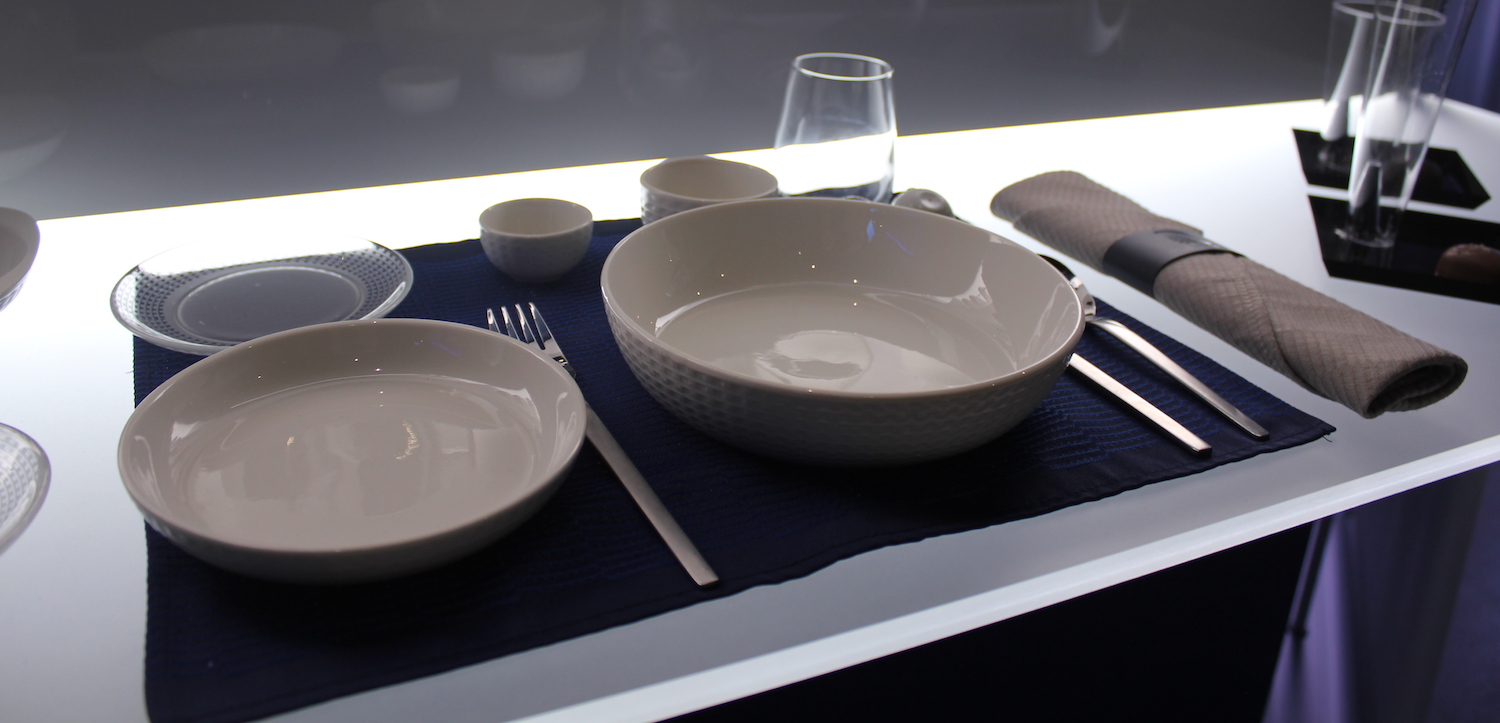
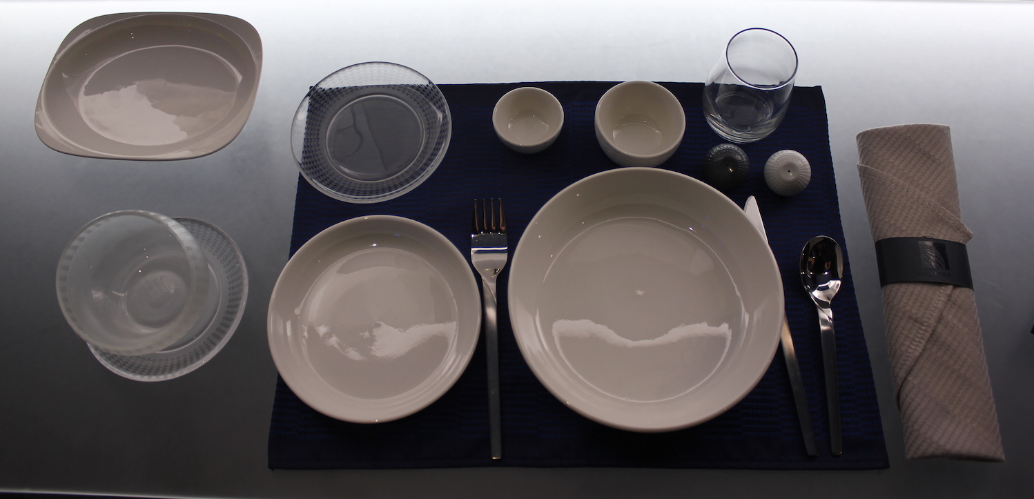
United is embracing the Continental Airlines globe across its branding. This is reflected most profoundly in its premium cabin crockery. United is also focusing on core colors, using “Rhapsody Blue” in uniforms across all work groups. Take a look at the infographic below.


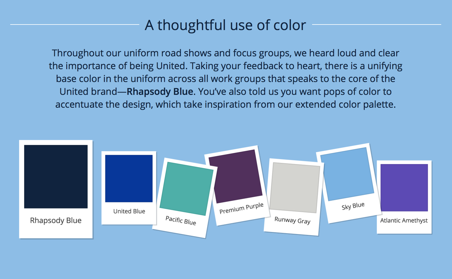

Other colors include:
- United Blue
- Pacific Blue
- Premium Purple
- Runway Gray
- Sky Blue
- Atlantic Amethyst
If you’re scratching head your head at purple, you’re not alone. But the “Premium Purple” is being incorporated into United’s new premium economy (Premium Plus) product, rolling out this year.

Finally, United noted that new uniforms are coming:
After gathering your feedback, we are designing new uniforms with comfort, durability and style in mind. Stay tuned for more information on the program later this summer.
I’m such a conservative when it comes to uniforms. I like the current uniforms and they are not very old, so I’m not sure why a replacement is needed. Hopefully there won’t be an AA-type issues…
CONCLUSION
I don’t think “Rhapsody Blue” will ever be synonymous with United like (trademark protected) robin egg blue is for Tiffany, orange for Hermes, or even yellow is for Lufthansa. But a consistent brand image is important and small details do mater. Think about the song Rhapsody in Blue…that song is inextricably linked to United for anyone who has flown United. So is its current typeface. As United continues a period of progress and growth, it hopes to solidify its mark of increasing quality through strategic visual identity. As much as I’d love to see a return of the tulip, the globe is here to stay. At least Rhapsody is too.
(H/T: Brian Sumers)



Lipstick on a pig.
Rhapsody in Blue is synonymous with George Gershwin.
But for flyers, United too. At least for me…
Gee, plain white china. Now THAT’s exciting. Exactly what I’d expect from America’s most boring airline.
So eight years after the merger, UA now wants to update its LLC and/or non-existent brand image? Well, we know Continental never spent a dime on its branding. That was clearly evident. Pre-merger UA did, and customers clearly saw the results – and liked the results. Personally, I think the current UA is still in the dumps. Any brand image changes will probably be laughed at – similarly to all other changes that UA tries to effect.
Bring back Pentagram! But, bring them back only when the current UA is in a proper position for a brand image change that can actually be achieved.
https://www.pentagram.com/work/united-airlines/story
Well unlike United, Continental already had an excellent brand image (all around). The horrible brand image that United had pre-merger has dragged on post-merger.
When you punch passengers in the face and drag them off the plane in a trail of blood, I don’t really think it matters what color the headrests are.
United employees didn’t punch anybody – it was the airport police and they were both fired for doing so. https://www.nbcnews.com/storyline/airplane-mode/two-officers-fired-after-doctor-dragged-united-airlines-flight-n811546
They consulted with customers? Who…? Legacy United had more customers than Legacy CO…. Everyone says that the legacy United branding and Image was more widely recognized outside of the US than CO was. I’m a tulip fan, but the new branding across the Board is ok. Unfortunately, seems UA management is behind the learning curve – they make changes, then h ear negative longterm customer feedback – then change things back to the way they were. This is costly. They need to listen to customer feedback BEFORE they make changes.
GREAT – Change those hideous uniforms that look like cheap Walmart specials! Speaking of a GLOBAL image – Can’t United have more European-style uniforms?
the only thing the tulip represented was bad customer service, old badly maintained aircraft, and bankruptcy.
I agree, NO MORE TULIPS.
The globe is such a generic brandmark and the ~30 year old CO livery is both highly dated yet not iconic in any way.
Yellow could be an interesting color accent (esp. as Lufthansa moves away from it) but other than GS agent neckwear they don’t do anything with it.
Purple is random and has no history w/CO or UA but at least it’s something other than endless shades of blue and grey.
better than a freaking tulip, LOL!