United Airlines has unveiled a new style of signage at San Francisco (SFO) and I cannot decide how I feel about it.
New United Airlines Signage At SFO
I recently showcased United’s new gate area furniture and flight monitor displays at Chicago (ORD). In San Francisco, United has unveiled a new style of signage in the airport check-in lobby. While the two projects may not be related. both represent a refreshed look for United.
> Read More: Swanky New United Airlines Gate Areas At Chicago O’Hare
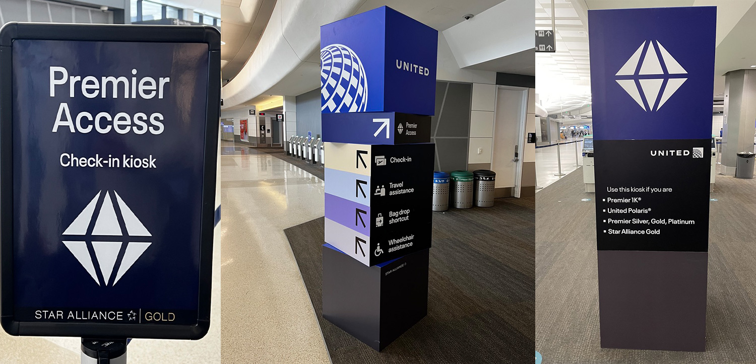
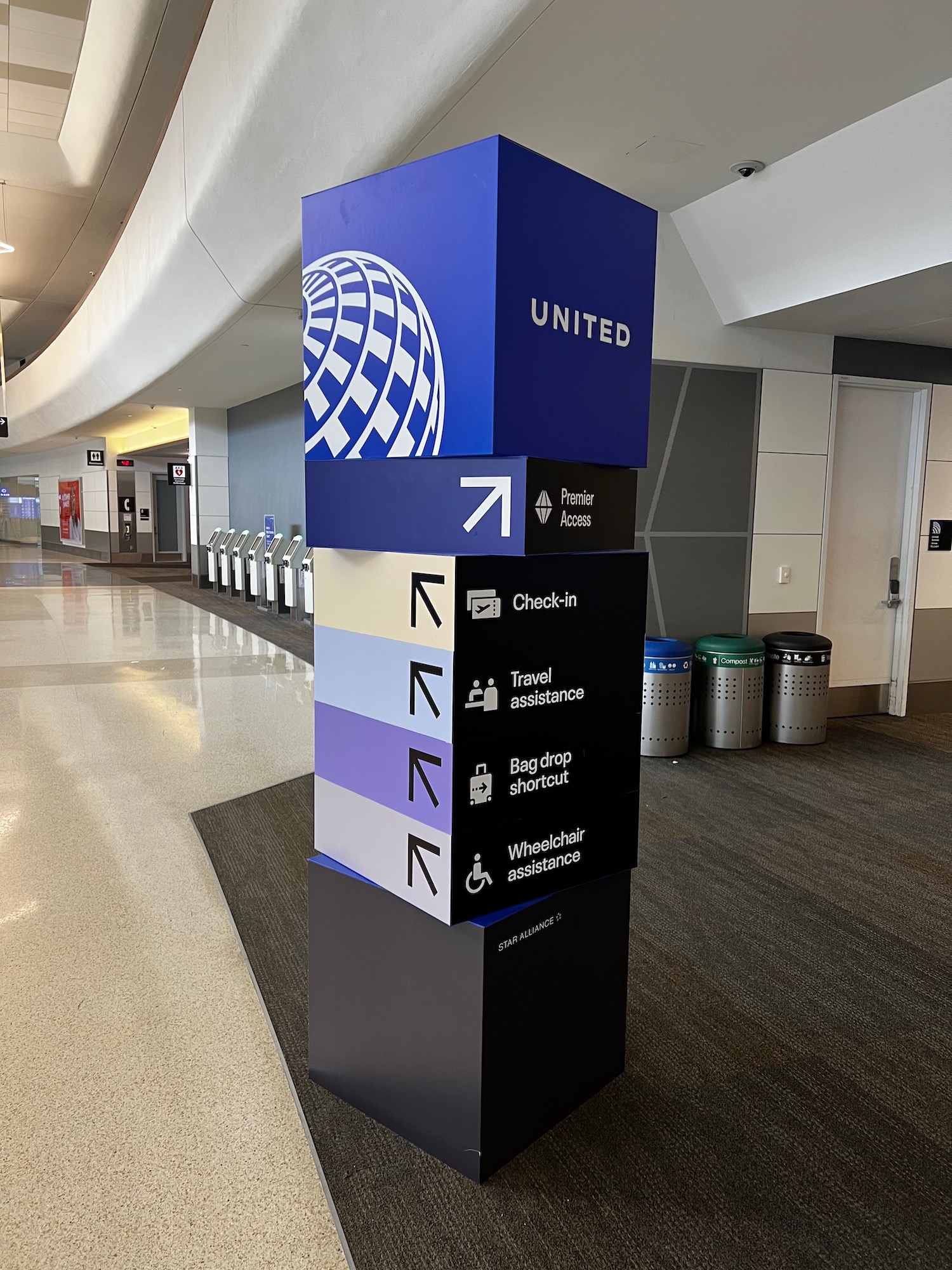
The Premier Access lobby, which represents the area in which MileagePlus elites or premium cabin passengers can check-in or drop off their bags, now has a diamond logo.
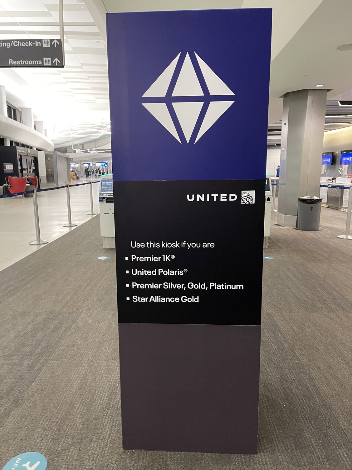
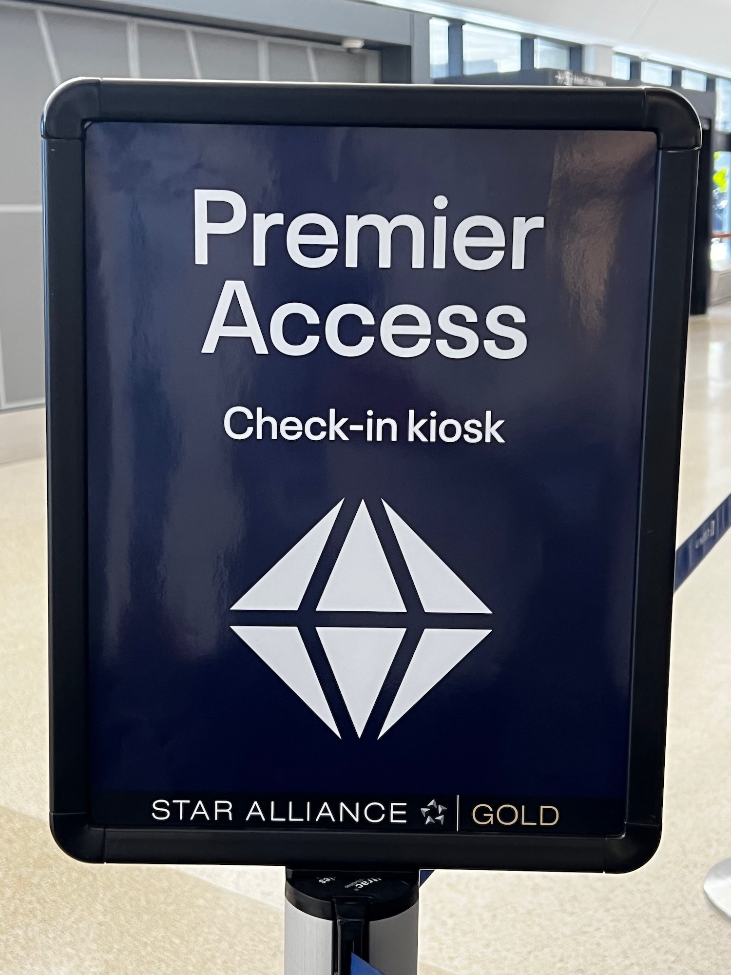
I’ve never seen this before, though it does look somewhat similar to United’s Global Services logo, which has been in use for many years.
![]()
I don’t quite get how the diamond fits into United’s brand style, particularly since Delta Air lines has Diamond status and United has no such status tier, but it is a noticeable logo. Perhaps this diamond will be play a much more prominent role going forward.
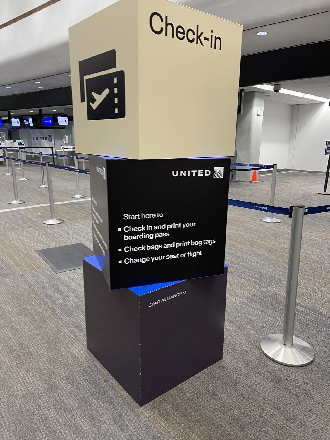
In addition to the new Premier signage, there are also new vertical signs that look like blocks stacked on top of each other. These point the way to various desks including the Premier desk, general check-in, those who might need a human to check in, the bag drop shortcut, and wheelchair assistance. The new pastel color scheme is something which we have not seen in the past.
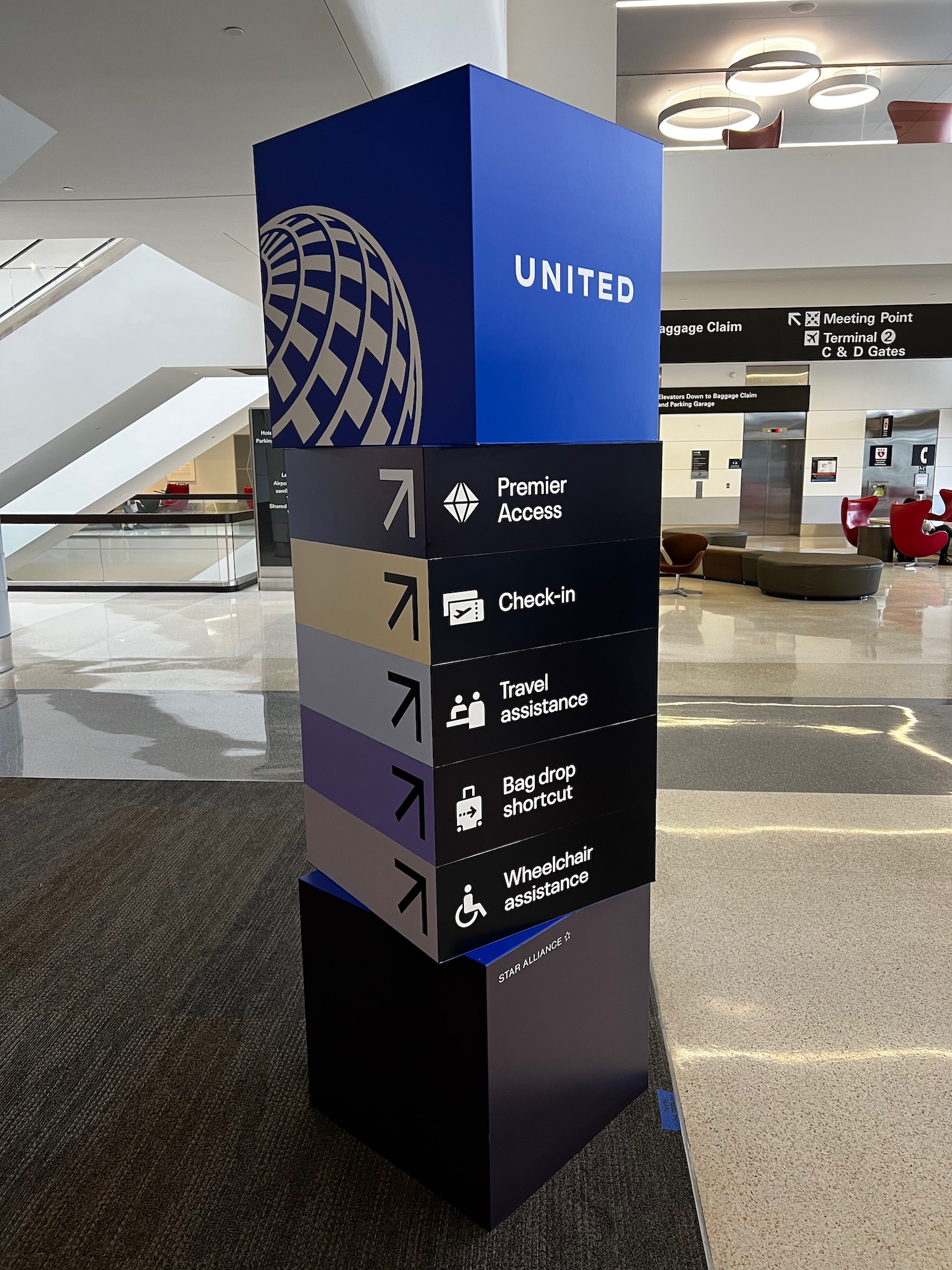
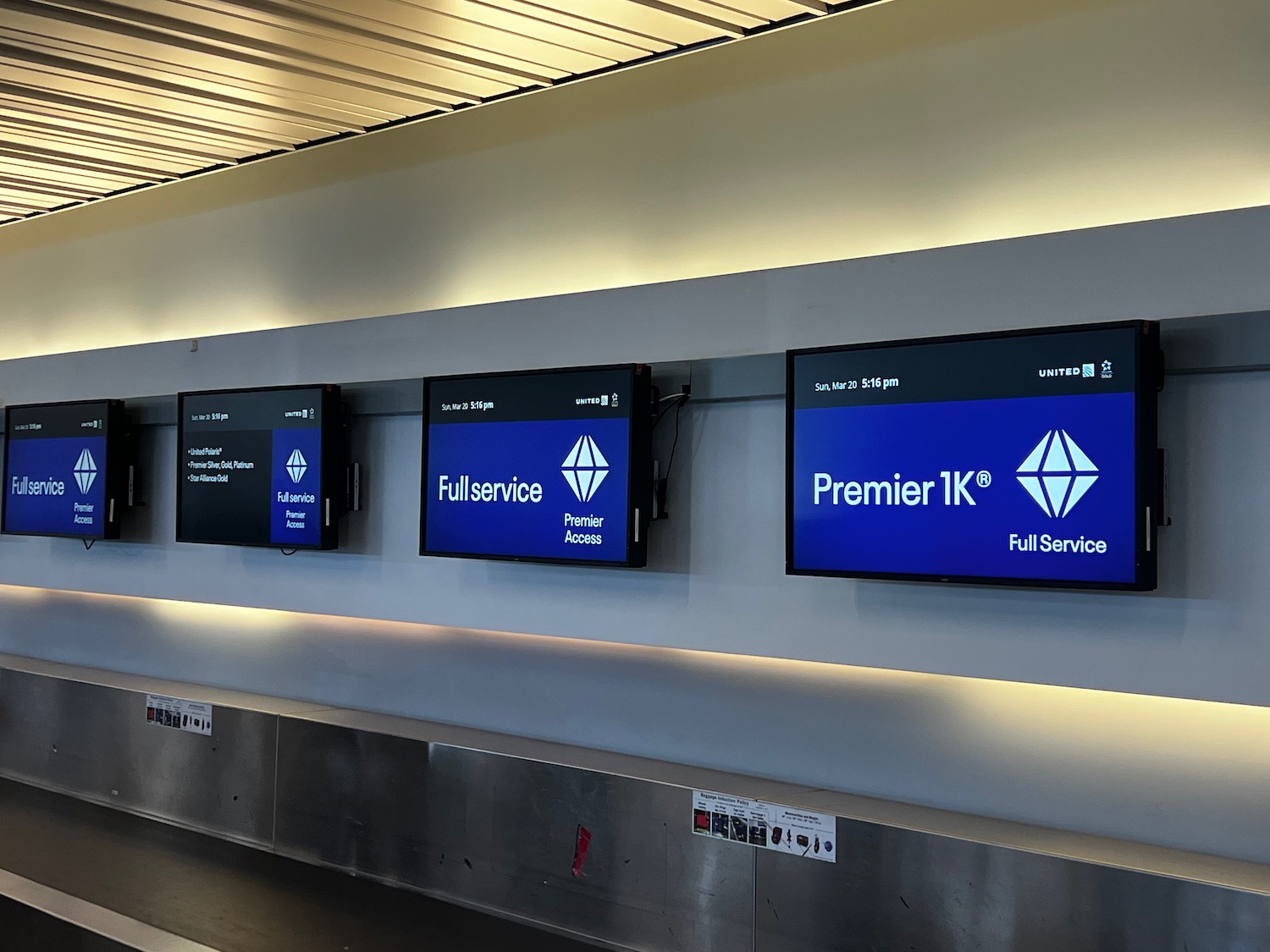
There’s some small changes that can easily be made. For example, the signage below includes “Full Service” on one screen and “Full service” on the other….consistency is key.
What I like about the signs is that the new font is clear and easy to read, the signs are simple, and I like the use of cubes to showcase the United logo. If you look closely at the picture below, however, you can see these new signs are already not aging well. That will probably only get worse if children view these signs as hands-on toys like a Wheel of Fortune game board.
But overall, I like the signage. It’s fresh and clean.
CONCLUSION
United Airlines has unveiled a whole new style of signage at San Francisco (SFO). We will see if this is a test, an airport-specific process, or something we might soon see systemwide.
What are your thoughts on the new signage?


One issue already evident in your pics – these signs are more or less brand new but have already gotten scuffed up. Imagine what it’ll look like in a month or two.
I much prefer the DEATH STAR look as we call it over this new Diamond or whatever……….
It looks devoid of any personality like something IBM would produce.
Totally agree. Extremely bland and generic. Then again, so is United’s leaving livery.
I like the cubes (poor implementation and scuffs aside), I like the font, I absolutely hate the diamond. It doesn’t connect to United at all, it very loosely connects to the plat/gold/silver tiers I guess, and it looks like microsoft clip art.
I thought diamond was Delta’s thing!
They should stick with the font they were using – it was distinctive to the United brand and easier to tell apart from airport-issued signage
This is generic like something at a trade show
As a visually-challenged person, I love the new background colors and font. Makes it much more easier for me to read.
Would anybody truly be upset to see the globe go? Maybe this is a bridge to a new logo that doesn’t feel the need to give any sort of nod to Continental.
I watched Up in the Air again on AA flying GIG-MIA on Sunday, and those AA planes in that movie sure looked like they were from another era. Not at all something I was nostalgic of. Sometimes moving on is good.
Disagree about the prior AA livery
Made by a timeless design genius – Massimo Vignelli – very much remains modern and distinctive
The ‘diamond’ looks like something out of a horror sci-fi movie. It just looks out of place within the overall branding.
The most annoying thing about all of this is how many fragmented groups there are that you have to listen to before 99% of the people can actually board “We’d like to welcome (triple platinum, double platinum, platinum, gold, silver, bronze, medallion, double medallion, quadruple gold, diamond, emerald, hexagon ruby) to board now”. It’s so ridiculous & a classic airline bottleneck. Airlines are their own worst enemy. CONSTANT changes. Dumb policies. Inefficiency. Inconsistency across airports. Impossible to keep up with processes, requirements, procedures.
I’m not sure about the Space Mountain with water reflection look but could be worse.
The diamond is a hard pass – it’s terrible and has no connection to UA or its Mileage Plus/Star Alliance. The cubes are devoid of anything, yet I can live with them. @john – yes IBM circa 1980 for the cubes.
can’t properly staff the 1K bag check at SFO but can spruce up the signs, great work
Didn’t I see those blocks in a mall or JCPENNEY decades ago?
Weird that the Premier Access sign doesn’t mention United First (domestic First).
They still get Premier access right?
Yes, I am sure of it.
although they look refreshing and clean crisp directions – I guess I’ll never see them as I never check-in at the lobby !I never check bags and always do online checkin !
It’s not a diamond, is a geometric, angular globe, doh
Am I the only one who looks at the slightly pivoted elements and wishes that you could spin them around just to mess with people?
Lol!
What’s the point of not having the alliance-wide GOLD TRACK signage? Isn’t priority security offered in the USA?
I’m afraid that Diamond is a new top tier for Star Alliance 🙂
Or is it a transition to new UA logo?
Matthew, can you not find out from your friends at United?
I could care less about how pretty the signage is. What counts is if the actual check in service has improved. More United staff mostly pointing to the self serve kiosks instead of being behind the counters…