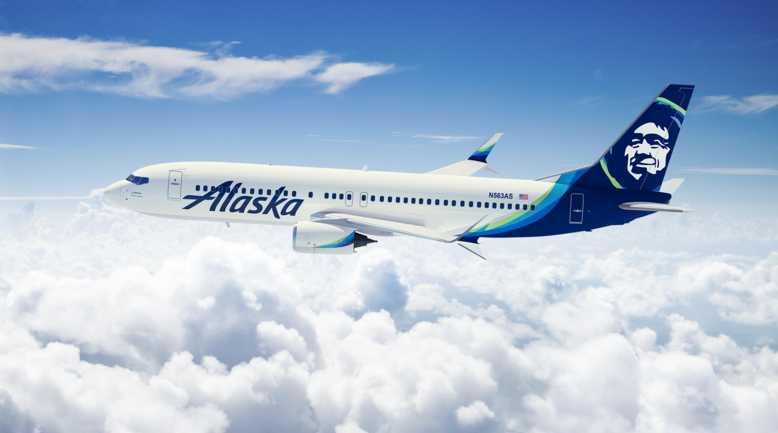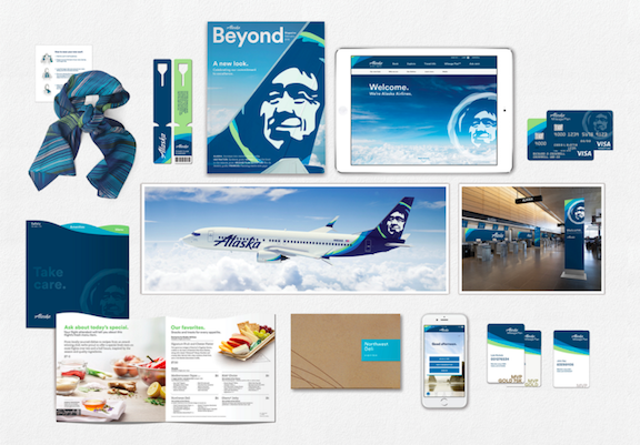
For the first time in a quarter century, Alaska Airlines is refreshing its brand image in a major way, with changes coming to everything from credit cards to aircraft livery.

Why the change now? Isn’t one of Alaska’s best selling points that while other carriers are changing (for the worse) it remains a beacon of stability? I sure think so, but then again I don’t think there has ever been a brand change that I’m enthusiastic about. Most of us tend to stick to the status quo unless pushed off the diving board…
Alaska gives the following reason for the new branding–
We want to make sure that the way we look and sound reflects the exceptional work of our employees, and the remarkable experiences they create for our customers every day. We’re excited, and we’re ready to show the rest of the world what our customers already know: we’re dedicated to understanding flyers, and to giving them the best experience possible.
Translation: We just felt like it.
Alaska will gradually repaint its fleet, with 40% of its aircraft scheduled for repainting before the end of 2016. Overnight we will see Alaska’s Seattle hub transformed with new signage reflecting the rebranding and there are plans to update all airports by the end of the year.
“Subtle” uniform changes (new scarves it seems) will roll out later this year as will the new look on Alaska-issued loyalty and credit cards.
Chester, the Eskimo you see on the tail-wing of all Alaska aircraft will remain as will the signature Indian-carpet bulkheads.
Check out the video below that discusses the re-branding and also a cool video about Chester the Eskimo:


I personally love everything about this. I think it’s a fresh and modern update but still holds true to their heritage. But then again, I’m an Alaskan fanboy so they can do no wrong in my book.