American Airlines is testing a new award search engine on aa.com that much more closely resembles the current mobile booking platform. That’s bad news…
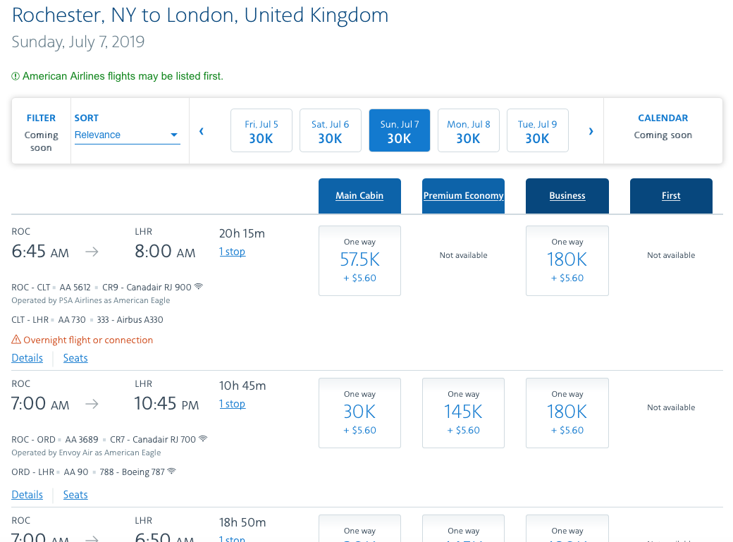
For the past couple of weeks, half the time I search for an award on AA.com I encounter a search results page that looks like this:

This appears to a beta trial because you can see it says “filter: coming soon” and “calendar: coming soon”. But note the green message. Yes, AA flight will show first, even if there are more direct partner options available at cheaper prices. If the goal was to create both confusion and frustration, AA wildly succeeded.
At least for me, clicking “sort” and choosing “price” still does not allow for stacking by price and the convenient month-long search feature that can easily be toggled between cabin is now gone.
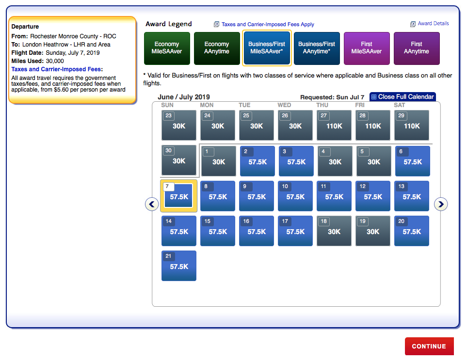
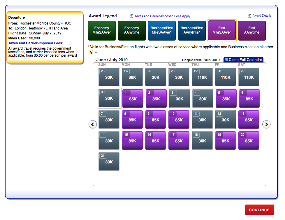
When I see this search engine pop up, I immediately switch to AA’s Canadian site, which still defaults with the old award search results:


In searching for award space this morning on the U.S. site, I see the “old” interface is back…but it seems to be random if you get the old or new search results.
I have also found, when switching between the two, is that the old search display picks up more options than the new one. I’m not just talking about the cheaper partner options being further down on the search results. I’m talking about connecting options that the new search engine does not even consider.
I sincerely hope AA is listening to customer feedback and will not implement such a monstrously consumer-unfriendly search engine. It will only drive more people to book via phone, overwhelming call center agents. Or pay more for AA redemptions, which is probably the true goal behind the move…
CONCLUSION
The important takeaway is this: if you encounter the new award search tool on AA.com, switch to Canada or another country (in the upper right-hand corner). Otherwise, you face the possibility of paying more for your award or missing out on key routings that the new system does not display.
AA’s award search website is not the only one that has regressed. United’s has as well…and arguably Delta’s too. I fail to understand why airlines don’t recognize that “simplifying” the interface does not help consumers…it only aggravates them. And considering what a valuable part of the overall business loyalty programs are, it also does not make business sense.
image: American Airlines


Fully agree.
For the past few years American Airlines is getting better in making things worse for their customers.
Come on Matthew, surely you realize that the objective of the airlines you mentioned is to make it as hard as possible for a person to use their miles. I’m not kidding or being sarcastic. I really do believe that they are constantly making changes to confuse and frustrate people so that people will give up and just pay for their airfare instead of using their miles. It’s a dirty business tactic deliberately employed to increase their cash flow.
That’s absurd. Every mile in your account is a liability on their balance sheet. They need you to redeem miles (or let them expire) otherwise they get nothing.
Best case scenario for the airline is for the miles to expire, is it not?
The search engine is bad because they’ll show domestic legs in first/business and international in coach. There should be a filter for searches that prevent those results from coming up
I don’t get why many airlines display a kind of mobile lay out on full screen. The overview is gone and one has to scroll like an idiot. SQ started with this nonsense. Avianca now also did it.
Not sure what’s next, probably sites in braille.