Korean Air has officially revealed its new livery. Once again, I’m asking myself why airlines cannot leave well-enough alone?
Korean Air Unveils New Livery
On March 11, 2025, Korean Air formally unveiled its new livery at a ceremony in Seoul. The night before, a Korean Air 787-10 was spotted landing in Seoul Incheon sporting what appeared to be a brand new livery (exterior paintjob).
Indeed, that was the new livery, with official photos below:
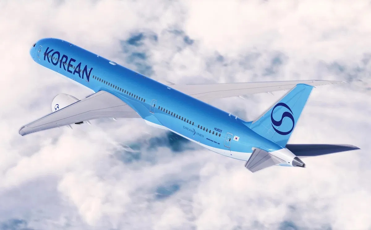

It’s a darker look, with “Korean” replacing “Korean Air” (perhaps as a sign of the Asiana – Korean Air merger) in a modern, thinner font. The red color is gone, most notably in the ying-yang (taegeuk) tail that also appears in the South Korean flag. That tail is now semi-transparent and all blue. We will see this new logo rolled out across all Korean Air stations:
![]()
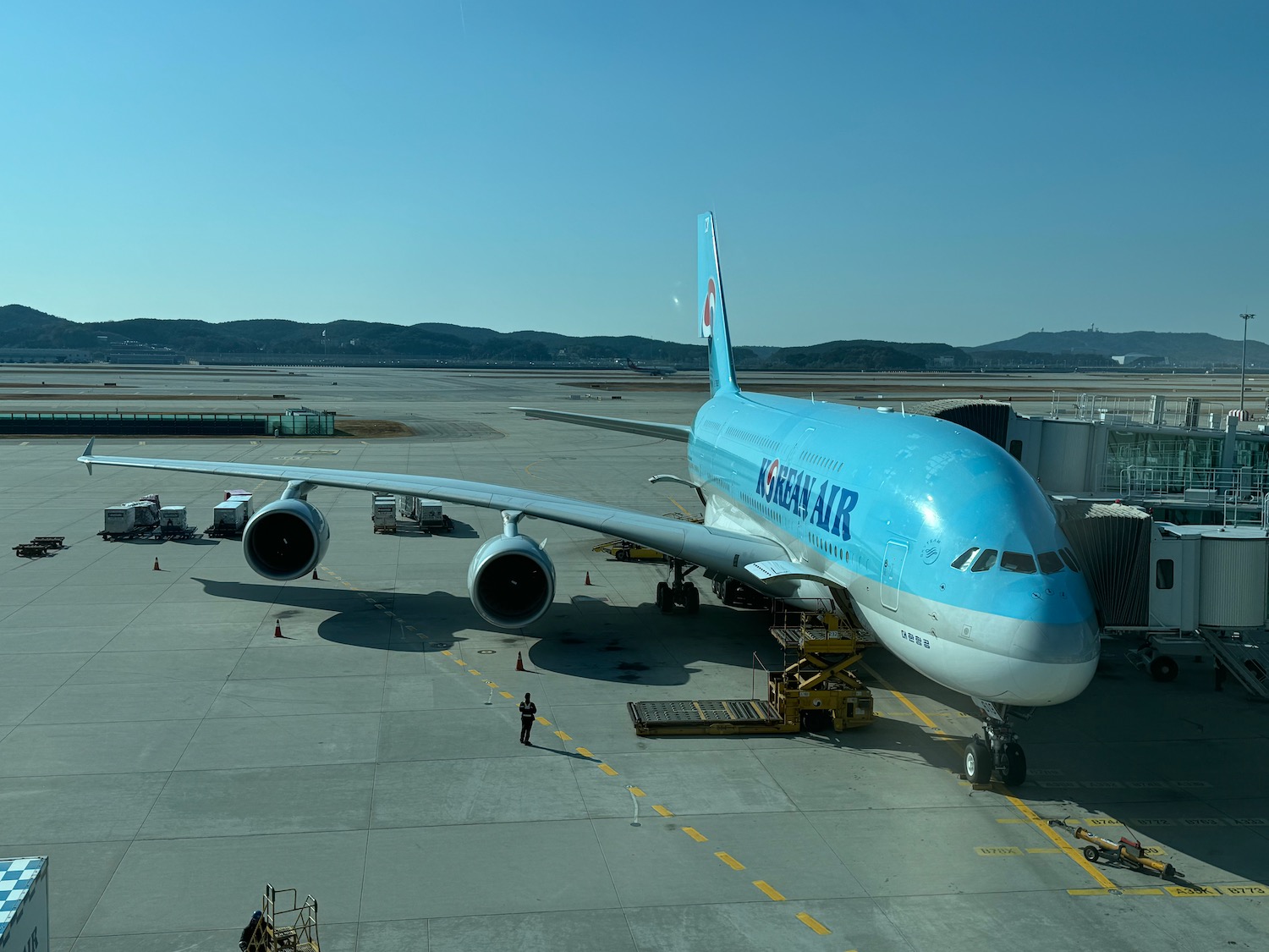
Korean last changed its livery after the crash of KAL007 on September 1, 1983 (shot down by the Soviets…) and has not changed it in over 40 years…and I have always loved the unique blue livery. For reference:
I feel like I am almost always against new liveries…and most do not grow on me over time (that includes American Airlines, United Airlines, Aer Lingus, Air India, Brussels Airlines, and Iberia to name just a new few) while there are some exceptions (I love the new Condor and Saudia liveries).
The new change strikes me as not only unnecessary but so pedestrian…it looks like a bit of La Compagnie, Norse, Riyadh Air, TUI, and KLM…come on, Korean Air! Incorporating the South Korean flag into the livery of the flag carrier is a nice touch and the light blue coloring was certainly unique…same with flight attendant uniforms.
I think changing from “Korean Air” to “Korean” is rather clever, recognizing the incorporation of Asiana into Korean. But the font is far too thin and far too plain…surely Korean could have picked a better font. In fact, I would have picked the pre-1983 font…a little bit of history and retro, much like the Saudia livery.
CONCLUSION
Ultimately, I don’t think anyone is going to choose a carrier based on the livery. Even so, I just don’t understand why carriers choose something so plain…this livery does not distinguish Korean Air. Quite the contrary, it makes me think of other liveries. That’s not a winning formula, though I’m sure we’ll get used to it if this is indeed the final livery.
What do you think of the new Korean Air livery?


It’s giving me Riyadh Air vibes
One photo looks like that but another with the landing lights looks more like the old tint of blue
Now they can equipment swap with fellow ‘Sky Schemer” KLM and nobody will even notice !
Maybe the new livery just needs the horizontal silver stripe from the old design that separates the blue (what appears to be metallic blue) from the white. Jackie Kennedy would not approve the new livery.
Agree Matthew. I’ll miss their iconic logo that gave their livery a uniquely Korean aspect. Why take that away?? I understand the need for a rebranding with the upcoming merger… But this livery just seems a bit too bland. Alas!
I’m not as opposed to livery changes as Matthew, but agree that the classic Korean Air livery is one of my favorites. I love that distinctive sky blue and taeguki. It really stands out. This reminds me of when JAL got rid of the legendary crane roundel in favour of a simpler rising sun. They eventually reverted back and I wonder if Korean will do the same.
We agree on the JAL crane – so happy it is back (just like the AF seahorse)
Looks like La Compagnie most of all. Too bad as KoreanAir was one of my favourite aircraft liveries
“The new change strikes me as not only unnecessary but so pedestrian…”
Absolutely this. I’m not in marketing much these days but this appears to be one of those “updates” for the sake of simply updating. Part of the “there’s no such thing as bad publicity” belief. I don’t dislike it, it’s just boring and unimaginative. At best, nobody will care and they’ll have spent billions of won for nothing. At worst (and most likely) it’s actually brand/reputation damaging because their planes now will just blend into the background of all the other boring liveries out there. The teal/turquoise/robin’s egg/whatever was very noticeable. Airline aficionados knew instantly what airline it was, and those less savvy would notice it and be curious. Nobody buy’s airline tickets solely on liveries, but generating buzz is a key component of marketing which *does* lead to sales. Silly move my KL.
It’s so bad.
American Airlines should have kept USAir logo, it was PERFECT!
US Airways who acquired them, not USAir, my bad.
@Lukas, the dark blue US Airways livery (penultimate livery) remains one of my favorite liveries of all time.
Very unremarkable. Should have kept the blue and red yin and yang part of it to make it stand out.
APRIL FOOLS!!!!!!!!! Oh wait, it’s March 10.
That looks awful. Don’t know what they were thinking… looks like I’m going to need snoop around to see what was going on
@Malik: Let us know what you find out!
Asked around but the people I know there are being very tight-lipped this time around. Basically, there are OZ loyalists in South Korea (some parts come down to regionalism as the Kumho-Asiana group’s founder was from the Honam/SW region) while KE’s parent group and thus KE is part of the “chaebols” which OZ loyalists/Honam region don’t like. But with KE’s iconic sky blue and taegeuk mark, KE wanted to tone it down a little and came up with this as a form of middle ground in addition to avoiding any political frays as there is some political instability and one side is using the taegeuk symbol (the red and blue circle that’s also in the Korean flag)/Korean flag as a rallying symbol.
Another person said that if the Korean public opinion is very negative towards the new livery, then they might reverse it or only keep the handful of planes with the new livery. This person wanted me to note that KE does change the liveries of a couple longhaul planes frequently based on promotions of k-pop bands, expos at Korean cities, and other cultural events happening in the country so they’re not complete strangers to repainting planes.
Again, this is only from a handful of people and some who I would have expected to know this weren’t even aware of the change, so we’ll have to see an official announcement to believe it.
Got some more tidbits from the same folks earlier this morning: The logo changes are permanent and are going full steam ahead. ICN, KE’s hub, already unrolled the new logo tags, bag stickers, etc today.
I think… it’s ok? Not great, but could be worse. As much as the old livery is distinct, updating it makes sense given the merger, and a refresh was due. It’s not like the current livery was so incredible it shouldn’t ever change. Is the argument that the old livery was incredible as to stand the test of time, OR that the new livery falls short of the mark?
I’d say both – I think the new livery certainly falls short of the mark, but current livery is unique and attractive; simple yet somehow sophisticated.
I don’t like what KAL has done onbaord either in repalcing the turquoise seats with the dark seatcovers.
Yeah. There’s space to consider that tastes/perspectives/attitudes toward brand design evolve, AND simultaneously our association to brands is very much grounded in the past and deeply rooted in nostalgia. While change for change sake should not be a driving force, I do think in this case it is warranted. Too bad the outcome was disappointing, but perhaps tue response would be the same no matter what…
If the new paint had an advantage of durability or something I would be more supportive of change. At least they didn’t go with k-pop colors. Look EVA has the freakish hello kitty, but thankfully only on some planes
That’s a fair point.
For my inimitable insight and perspective on this same topic, please see my comment posted yesterday on OMAAT. 🙂
It’s a darker look, with “Korean” replacing “Korena Air” (perhaps as a sign of the Asiana – Korean Air merger) in a modern, thinner font. The red color is gone, most notably in the ying-yang (taegeuk) tail that also appears in the South Korean flag. That tail (presumably the new logo) is now semi-transparent and all blue.
KORENA AIR????????????
WHAT IS THIS SUPPOSED TO MEAN????????!?!?!??!?!?!
PLEASE DO YOUR JOB AND BE A WRITER!!!!!!!!!!!!!!!
THANKS NICK. I’M SURE YOU HAD NO IDEA WHAT I MEANT!!!!!!!
It’s fine. I actually like most of the refreshed livery. I might have made “Korean” and the logo bolder so it can be better seen from the ground. I’m indifferent on whether they needed a new logo. I think the old one was fine, but this probably shows “harmony” or whatever marketing term you want to highlight the merger of Korean and Asiana into one.
But why the cheap fuselage font? It just screams tacky to me.
The tail is disappointing. I liked the (taegeuk) motif, it was very distinctive. The light blue fuselages had become a little passé, but the tail was great.
I’m sorry, but this is change for the sake of change. Merger or no merger. I believe too many people who design liveries nowadays focus more on making it “theirs” instead of making it actually look good. They have to put their little spin on it with no nod towards tradition. I too like very few of the new liveries rolled out in the past however many years. Delta is awful. United is meaningless. American is colorful but doesn’t come close to the last one. Frontier did a nice job, but I can’t think of too many that I like. This is sad.
Agreed.
At least with AA they could not continue the metallic with their new composite 787s, but I particularly detest the AA logo/livery.
Ditto the AA logo — Even now, every time I see that livery I think ‘cheap Greyhound. bus” — but, ironically it does convey reality these days …
Why couldn’t AA just paint the 787 silver/metallic and keep the classic livery? Their color now is close to the metallic color anyway. It wouldn’t have mattered if it was slightly off. Or just pain all their planes with metallic and keep the livery.
The old AA was bold and clean and proud. The current paint job of grey lettering on a grey fuselage makes it look like they are ashamed to be American – either as an airline or as a flag carrier of our country. Bring back the bold blue or introduce red. And the tail… jeez, a hot mess.
This livery looks like the product of a corporate committee, probably a decision celebrated with a pizza party or something. Dull, boring, uninspired – and utterly unnecessary.
I liked to old design better for sure but don’t hate the new one. To be fair to KAL, almost everyone hated Condors new livery & many have come around at this point. Agree with the font but it’s splitting hairs a bit.
I agree. I just don’t understand why fix something that’s not broken. Look at the Olympics rings — that logo has not changed in over a decade and it’s still iconic.
I am actually quite impressed with the new livery. I find it to be appealingly modern and dramatic. Did the I need to make a change? Probably not. But I’m glad they did and applaud the execution.