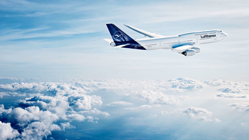
Lufthansa will be tinkering with its new livery once again, just days after revealing its new design to great fanfare.
In an internal memo (in German) posted on a German frequent flyer talkboard, Lufthansa concedes the livery appears too dark and pledges a pragmatic approach in moving forward with the new branding. Here’s a rough translation of the memo:
Since our first two planes with the updated livery landed in many places around the world, we noticed that for instance the blue plaint on the plane appears to be significantly darker than in the test environment – especially in poor weather conditions. In this regard, we will work on an optimization. Additionally we will also design a version which can combine the Lufthansa Group word mark with the crane logo. The combination of Lufthansa Group with the crane will then be used in clearly specified combinations.
For us this is part of a dynamic process. In the long run it is important that the new design works everywhere. Practical experience is better than any theory. Thus we will continue to collect hands-on feedback in all areas of application and readjustments where required.
I love the German candor. Indeed, the livery does appear black in bad weather, hindering brand recognition. I’m proud of Lufthansa for admitting the problem and promising to move forward cautiously instead of charging ahead with a bad design.
I’m not sure what Lufthansa means in stating it will somehow combine the Lufthansa Group word mark (the written Lufthansa logo) with the crane, but I hope it will return some yellow to the fuselage…
CONCLUSION
For now, don’t expect any further aircraft to be repainted. Lufthansa may just lighten the shade of blue…but it may well return to the drawing board.
(H/T: Wandering Aramean / image: Lufthansa)


While I understand the desire for a refresh, I’m quite surprised LH completely ditched their iconic yellow color. Even when BA tried out their ethnic er “global” tail designs, they still kept the Speedmarque ribbon.
If it ain’t broke, don’t fix it. This wouldn’t be a problem if they’d just left the damn thing alone in the first place.
Exactly. Another change for change sake. It’s already a flop.
I’m thinking that the braintrust marketing firm behind all of this has a time and materials contract.
Man, don’t fix what isn’t broken. I’m going to miss the traditional color scheme with whatever they iterate towards.
The blue is so meh, just not noticeable , why didn’t they try something with yellow? Hopefully they walk it back.
Might be good if they were equally open to making changes to their poor safery culture. Not much has been changed that led to the Germanwings crash. Relatives if victims have not been adequately compensated.
Wow… I didn’t know about this changing unit the day I traveled with my mother and we were booked on Bombardier having the new livery. I remember my mum saying “but it is not our plane” when we walked to the aircraft. I said, “no, no, it is our plane”. I think she was looking on the yellow on the tail and didn’t even realize that name Lufthansa is still where it was before. Then she asked if we changed the airline this time (as we always travel with Lufthansa in Europe). I honestly thought it is some special livery so being curious I checked for that and now I see they changed everything. I think it is not good for their brand recognition… just saying…
Finnair did the same some years ago – they darkened the blue too much and the result was just depressing. Shame about Lufthansa, their former livery was easy to recognise, familiar and exuded confidence. This new one – meh.