A couple weeks ago, I wrote a post entitled, Dear Lufthansa, Please Don’t Ruin Your Beautiful Livery. It was a plea for Lufthansa to leave well enough alone. Sadly, my letter fell upon deaf ears. The new livery is out and it’s…unnecessary.
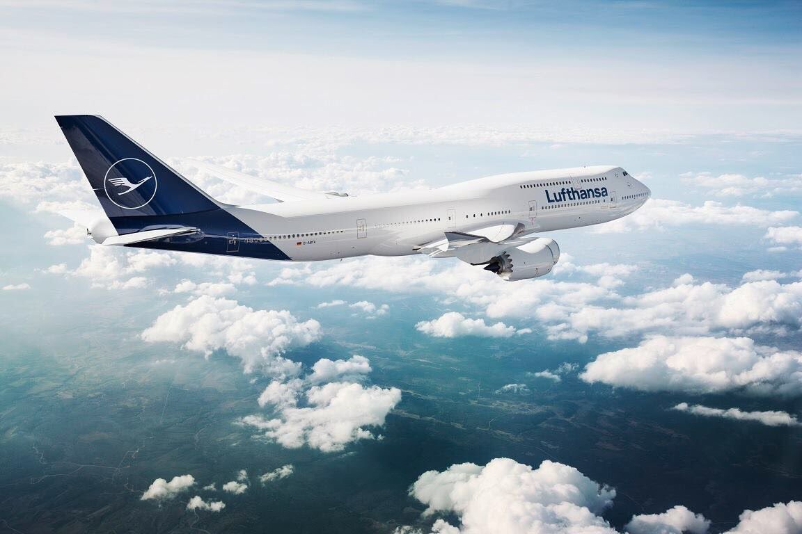
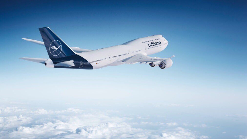
Per @AeronewsRO, the new Lufthansa livery will eliminate the iconic Lufthansa yellow that has graced Lufthansa aircraft for decades. Here are two official renderings:


As I stated in my letter to Lufthansa–
But I like Lufthansa’s present livery. It is timeless. It is elegant. And it is does not need to be changed…
Why not just leave well enough alone?
And I stand by that assessment. The new livery does nothing for me. I’m thankful the logo is not being changed. I’m also thankful the crane will remain on the fuselage. But why change it for the sake of change? Who DIDN’T like the existing livery? It’s not like Lufthansa is under new management or in the midst of a merger.
Put simply, this was change for the sake of change and a poor use of resources. The new livery is not ugly…it is just less unique (it virtually copies the Qantas livery) and now blends in Lufthansa rather than distinguishes it.
Sigh.
(H/T One Mile at a Time)


The old one looked a little too close to Ukraine airlines. It was a classic – losing a color is always a bit conflicting.
@greg I’ve never even noticed a Ukraine Airlines plane, and have flown through Lufthansa hubs many time. That couldn’t have been the reason for the change. The new livery is kind of blah much like the the current United globe.
I was never a fan of the diarrhea yellow… this is better.
Never enjoyed the yellow. The colour looked dated.
Basically looks like LOT Polish livery.
I find this much more elegant, the yellow looked sort of 70’s to me.
Those wings and engines on that 747 look like they’re from a 787 Dreamliner (with two extra engines of course).
At the end, nobody cares. Yes, people will complain BUT…. Same happened when AA changed their livery. People got used to, they still fly AA. NOBODY CARES!!!!!
I agree just leave it alone! Lufthansa is making so many budget cuts to survive in this competitive industry so instead of spending the money on the changes justify your cuts in other investments so those of us that lost our jobs would not feel so horrible!
BA ditched their new livery after customer complaints. Maybe the same will happen here.
An error, in my opinion. The BA livery is dull. The old livery, with vivid colours from around the world, united by the BA ribbon on the side of the plane, was perfect.
The new livery is lovely.
It still looks timeless.
I like this look, I find it cleaner, more modern, and like how they seem to have enlarged the crane by moving the logo closer to the bottom of the tail.
This is very similar to MALEV’s livery
Neat, classic and regal. Love it. Supreme!
Could have been worse like messy new Malaysian Airlines livery where they blended in their national flag.
I’ve been flying Lufthansa since their 707 and 727 days and will very much miss the instantly-identifiable ‘spiegelei’ (fried egg) on the aircraft tails.
I’m in total agreement with Matthew; this is just change for the sake of change.
I don’t mind it but it does resemble the Qantas style.
Like it. Definitely elegant – but I will miss the gold too. Seems like a lot of cost for not much benefit… and since all the departure dates have gold/yellow (and lounges), it’s all just a bit odd…
I would prefer to see yellow retained for circle and crane like on one-off 737-200 in the photo taken in 1983.
https://www.airlinefan.com/airline-photos/Lufthansa/Boeing/737-200/D-ABHD/1147305/
I still don’t get it why Lufthansa has to make crane looking like a ghost, sucking the colour out of it.
Somebody did the Photoshop fix, which improved the look…
https://i.imgur.com/h1CqQCU.jpg
UPS passenger delivery in blue .
Actually defunct World Airways with a bird in place of a corn cob.