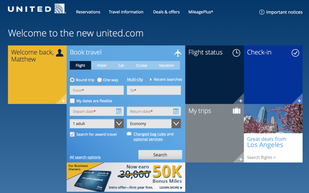
I have been testing the beta version of the new united.com for over a month now via special invitation but now United has opened its beta site to everyone, with a planned launch date of the “new and improved” United.com this summer. The website will continue to fluctuate during this beta testing period, but read on for tips on navigating the new website and for one trick that may make your award bookings much easier.
United promotes five key improvements in the new beta website–
- Search, sort and filter your perfect flight: Customers can choose what’s most important to them when booking a flight. Whether it’s Wi-Fi availability, preferred connection cities, aircraft type, in-seat power or the inclusion of nearby cities, customers can sort, filter, include and exclude a variety of preferences to narrow or expand search results.
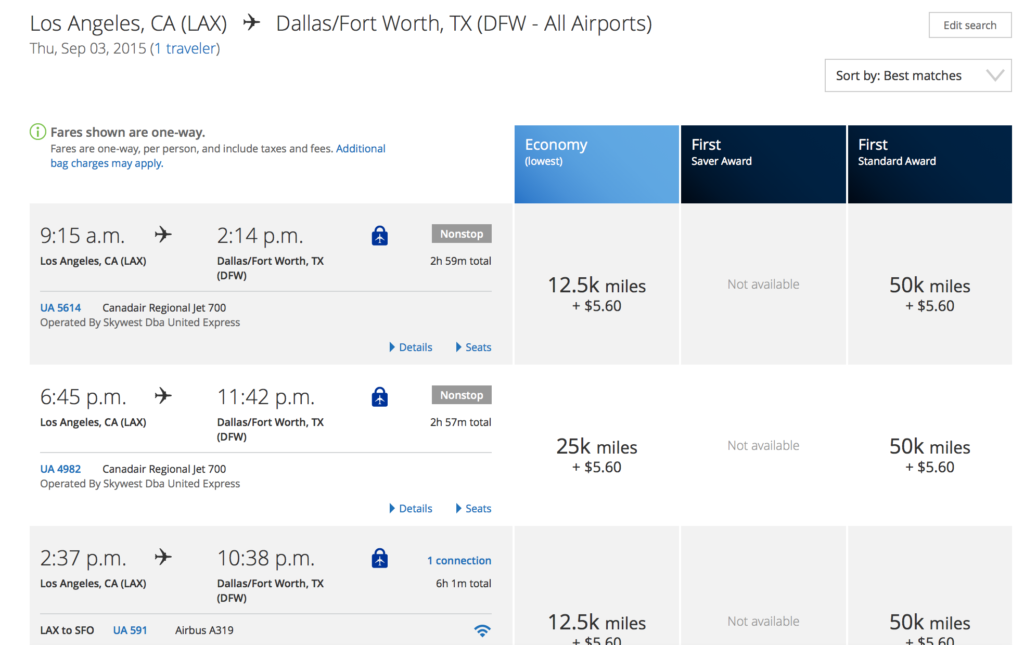
- Quicker view of fare and date combinations: Search results automatically display pricing for a 15-day window(7 +/-) to show customers more options, and fares are displayed in “each way” increments to give customers added flexibility and clarity when building their travel itineraries.
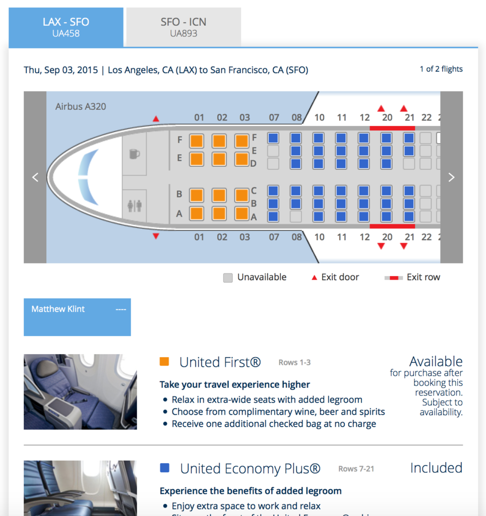
- Upgrade insight: Knowing if upgrades are available for purchase on a particular flight helps customers make more informed booking decisions. Customers can now view upgrade availability and redeem any MileagePlus upgrade prior to purchase on all eligible flights.
- Widgets working for you: The new homepage features widgets customized to MileagePlus members’ travel histories including a quick-view of upcoming trips, saved searches and alerts, to name a few. (Bonus: Users can select travel and aviation-themed photography for their homepage backgrounds.)
- Touch-friendly: No matter the device style or device brand, customers will have a seamless, touch-friendly user experience.
First off, United should be commended for offering a design that liberates united.com from the 1990s. Further, functionality on the new site will make some searches much easier than they are today. The 15-day window pricing (borrowed from Delta) and instant upgrade availability (borrowed from Alaska Airlines) are a great help in searching and finding the lowest fares and that elusive upgrade.
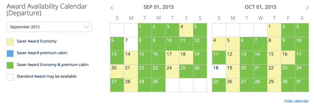
 The new award search page, however, leaves much to be desired. Thankfully, the two-month calendar review remains, just with slightly most pastel shades of blue, green, and yellow, but I find the display of flights a bit clumsy and less user-friendly than the existing display.
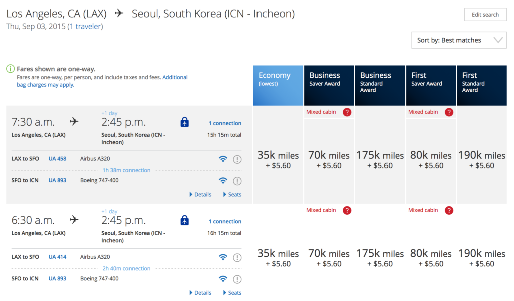
Reserve Awards Without Sufficient Miles on the New United.com
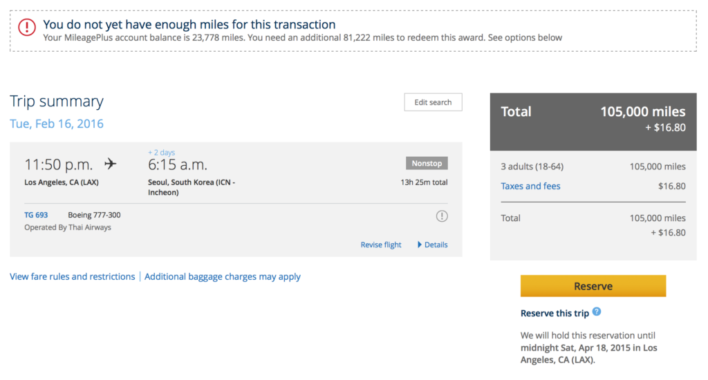
Going back to the pre-merger Continental website days, the new united.com allows complimentary 24-48 holds on partner awards when you have nowhere close to the sufficient miles needed to pay for the award.
For example, take the LAX-ICN search above. I’ve got 23,778 points in my account right now and three one-way tickets in economy class run 105K. Because I am 81,222 miles (i.e. so many) short on a partner carrier, I received an option to hold the award space until midnight tomorrow at no charge:
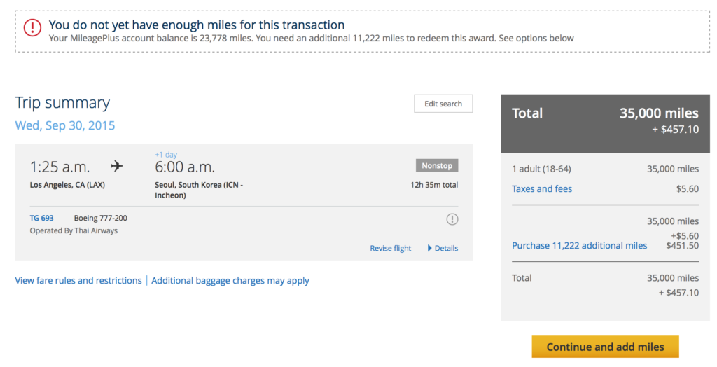
If I just search for one ticket, though, I have no hold option and am forced to buy the remaining miles needed if I wish to proceed:
And if I fly on all UA metal without sufficient miles, I am only given a (paid) Fare Lock option rather than a courtesy hold: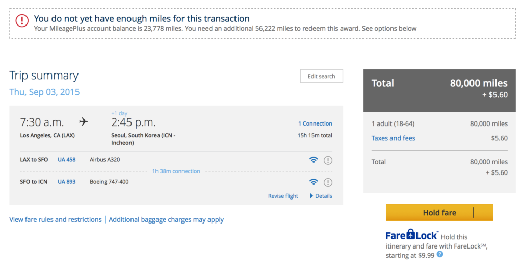
In all honesty, I have gone back to using the old united.com — not because the new website does not function, just because I am change adverse. The new website is aesthetically pleasing and perhaps more importantly, it is not terrible. That’s probably all we could have hoped for in a redesign intended to “simplify” things. Give it a test drive and let me know your thoughts on the new beta united.com. I will continue to evaluate and hope that United will listen to the feedback provided to make it even better.


The website does look nice, but I don’t like that they are showing the fare price for one-way, when I search round-trip. Just show me the entire price.
On the other hand, as I am often looking to purchase business class on overnight TATL flights and economy on the return, so I find the separate pricing of legs in different classes one of the things I like about the new site. However, I notice that when I look at an existing reservation, that page looks the same as before. I guess they have not gotten to a new version of that yet.