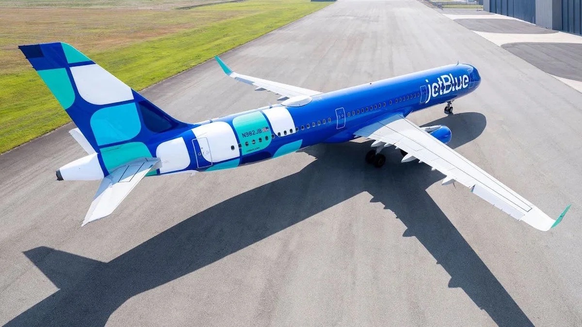
JetBlue finds itself in a bit of a crisis. Its partnership with American Airlines is in legal jeopardy and its merger with Spirit Airlines might also go up in flames. The answer, however, is not to start repainting airplanes, as if just to get something done. The new JetBlue livery is not horrible but strikes me as totally unnecessary and worse than the current version.
New JetBlue Livery: An Unnecessary Distraction
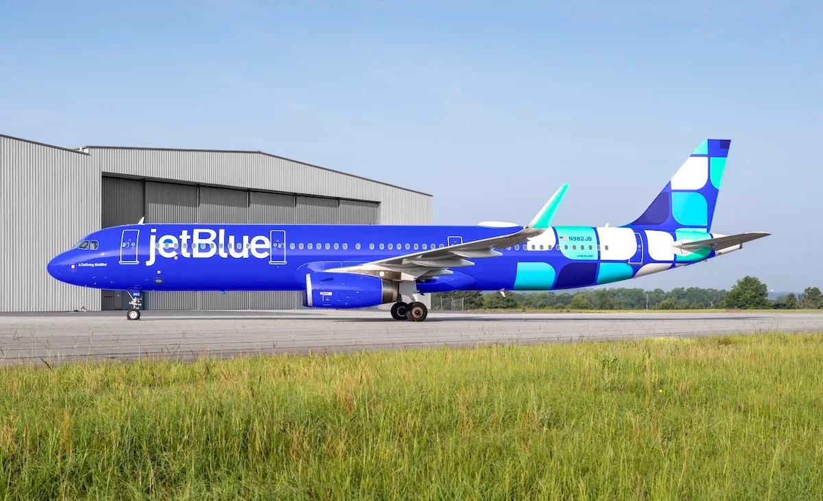
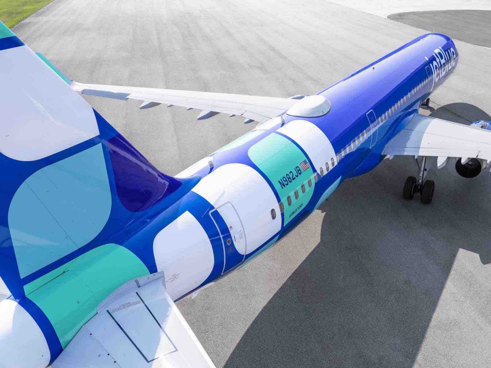
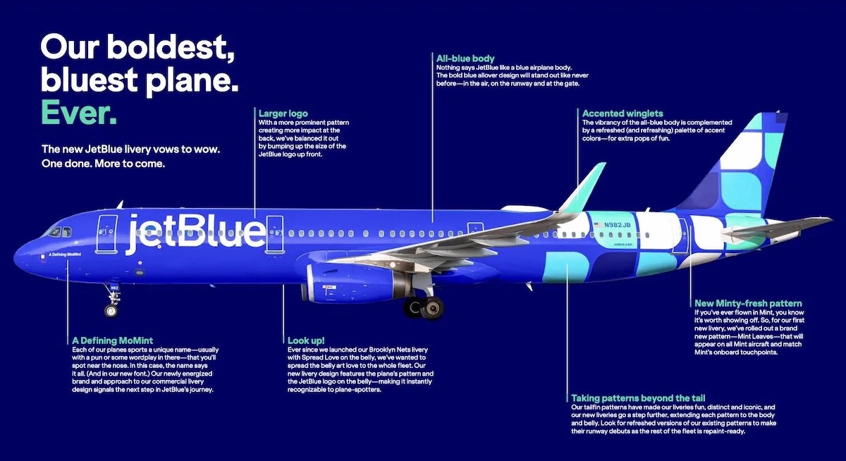
JetBlue unveiled a new livery today, a repainted Airbus A321 with Mint Business Class it is calling “A Defining MoMint.” Here’s how it describes the new livery:
- A blue allover fuselage that goes all-in on the company’s namesake color
- Iconic tailfin patterns now energized and extended to embrace the body and belly of the aircraft
- A larger JetBlue logo to represent the bold impact these aircraft have in the industry
- Colorful winglets that add an extra pop of fun with a refreshed palette of accent colors
- The aircraft’s pattern and the JetBlue logo featured on the belly, making it instantly recognizable to planespotters
That’s all fine, but the current livery (pictured below) still strikes me as clean, modern, and quite attractive.
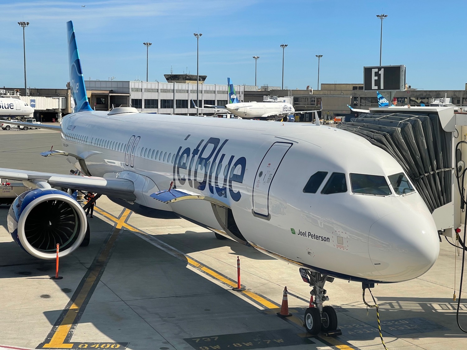
It isn’t clear to what extent JetBlue will update its existing fleet. The press release Live And Let’s Fly received stated:
The Airbus A321 with Mint, named “A Defining MoMint,” is the first to receive the new paint job and goes into service on June 15. The new livery, inspired by JetBlue’s heritage and unique personality, creates a standout visual design as it expands to new markets and brings customer-centric offerings across the travel industry.
Customers can look forward to spotting more new livery designs featuring refreshed tailfin patterns later this year. One done and more to come!
Meanwhile, the public press release simply states, “Customers can look forward to spotting more new livery designs with refreshed tailfin patterns later this year,” which suggests this will be a one-off design.
I hope that is the case. I will give JetBlue credit for the good effort here, but the blue looks too much like Southwest Airlines and think about how much heat that blue will retain versus the white on a hot summer day. There’s a practical reason so many aircraft are painted primarily white.
Bluer skies ahead! ✈️ Our iconic liveries are getting a fresh bold look just like the moves we’ve been making as a travel company. Get a sneak-peek at our first-ever Mint pattern (coming soon to all Mint planes). Read more here: https://t.co/bXhsEpknDkpic.twitter.com/ZYn85ByRWZ
— JetBlue (@JetBlue) June 14, 2023
CONCLUSION
It’s not that the new JetBlue livery is bad. Rather, it’s that the current livery is better…and more practical. The carrier has so much at stake in the next few months concerning its future with American Airlines and Spirit Airlines. While I realize that painting jets can serve as a welcome distraction, now is now the time to be distracted.
What do you think of the new JetBlue livery?


The marketing/creative teams need to make some large decisions to justify their existence. Too many people in this world forget that choosing to not change the livery is as much a decision as it is to paint the planes blue.
Unnecessary work to justify one’s existence with a CEO having too many other pressing issues on his plate to shut this one down.
I like the blue. I don’t like the rear. Paint it all blue and add the logo to the rear wing.
I don’t like it and prefer the old one. But this has likely been in the planning process for some time (JetBlue refreshed the look of its digital marketing earlier this year along with the design of its cobrand cards).
I think it’s fine. Every airline has name up front, logo on the tail. At least this is slightly unique
That’s where our baggage and other fees go.
Robin and Joanna already have made dozens of bad decisions-what’s one more to add to the pile.
Take a look at a blue jay from the rear. This can’t be an accident.
If only JetBlue’s top brass would concentrate on running the airline, shareholder value, and delivering a consistent product, as opposed to an illusion of one, that often comes with long delays, operational issues, it would have itself a better and more robust company. Instead, the focus is on overpaying (by a wide margin) for a competitor and then spending even more money to harmonize disparate fleets and staff, and concocting convoluted collusion with another major airline instead of just hammering out a viable commercial partnership. JetBlue’s future will be to be acquired. The new livery is idiotic. And wasteful.
Planes need paint occasionally. I can only assume the planes that need it will get this new livery at first
This is what you get when you don’t paint:
https://www.planespotters.net/photo/1206758/n48127-united-airlines-boeing-757-224wl
So, it looks a lot like Southwest, which is flattering to Southwest… at least somebody wants to be like them.
Repainting is often not a good idea (one gets a whiff of desperation) as the old logos and paint – think American, Delta, United, Iberia, Avianca, Alitalia – were iconic. In their current forms they are all are pretty anemic and uninspired basic white with a few touches; dull gray with a complicated, silly take on the American flag in the case of American which never should have surrendered the robust elegance of the 1967 Massimo Vignelli livery. Beyond painting, how about on-time performance, a decent flying experience and cabin crews who don’t bail out the galley exits?
Aircraft have to be painted every few years, so what’s the big deal if the livery happens to change in the process?
The back of the plane looks like Mosaic tiles ….
Inspired by their new loyalty program?
Corporations in general these days seem to work from the outside in. Imagine if they started working in the other direction? Fixtures never make you money.
I genuinely like the new livery, however I’d be happier if they would use those funds and replace all of the faulty TV’s on many of their 320’s, the same aircraft that seem to suffer from lagging internet.
Looks too much like Breeze…….hmmmm, coincidence?
I’m probably in the minority opinion, but I like the new livery. The dark blue is bold and patterns on the tail end of the aircraft remind me of “mint” candies. And if they’re bringing these ships in for re-paint anyway, as a part of scheduled maintenance visits, I don’t view that as a “distraction.”
This article is unnecessary. Who even asked for your opinion?
Welcome to my blog. I talk about what I find interesting. If you have a problem with it, we will refund your ticket price.
Aircraft are painted every 4-5 years for dark colors and every 5-6 years for light colors. While in the end, it will cost more to paint in darker colors, I am in favor of anything that gets away from the white fuselage (well, maybe not Spirit). So long as this is completed on a cost effective basis, I do not see this as a distraction at all and I would be very worried if they could not develop a brand refresh, paint aircraft, and defend and complete there corporate strategy simultaneously.
That paint job is to hectic!! It’s reminiscent of that hideous Calder aircraft that Braniff once flew.
The batches on the tail look like a skin rash.