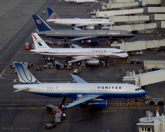
As United Airlines works to repaint all of its aircraft with the Continental globe livery, there are still a number of variations out there. United never got around to updating its gray livery on many aircraft when it introduced a white design about five years ago and United also introduced a heritage aircraft last year with a livery from the 1970s.
I have to think this was not deliberate, but last week in Denver the four liveries all happened to be on the ground at the same time, parked next to each other. A controller in the ramp tower snapped this photo:

The new livery is still my least favorite, but I am sure it will grow on me over time, just like the gray did.
(tip of the hat to Steve)


I kinda liked Steve Wolf grey.
Hopefully they will keep at least the 1970d plane!
Conveniently arranged good to bad, front to back too!
Thanks for posting this pic… gorgeous.
To bad, the 1980s version wasn’t in town.
Kind of a sad picture, really. It reminds me of the history of a once great airline.
I like the grey one. All of these white liveries are incredibly boring and unimaginative…
So glad i got to fly on the battle ship 777 before they were all gone during summer. The new livery sucks and so does Jeff. Funny thing is that Jeff reads everything and he does see clearly nobody like the new livery. Why is he not changing the livery to all United logo? Because when all the liveries are changed he will Most likely bring the name Continental back again and completely phase out United. United is an airline ruined forever. Rest in peace United Airlines. A once great airline out for good. Name will exist but the spirit is gone.
The globe livery sucks, I agree. It looks plain, cheezy, outdated etc. Blue Rising was one of the classier liveries I can remember and very befitting to the improvements UA was making. That with their extremely tasteful, evocative ads with Rhapsody originally done for each ad, really made UA feel a class above everyone else. It made this Chicagoean join their program. But this new United just feels like as inspiring as flying in a Hyundai.
Jeff won’t be changing the name. And he’ll probably be gone in 10yrs with a boatload of cash. United will be successful, and when there’s a regime-change and time for repainting, we should be ready to voice our choice for the proud overlapping U’s.
I’m glad I am not the only one who thinks the globe livery (and the whole Continental website) looks so 90s. Do others agree? I just find it so strange that UA would replace their much superior interface for COs.
As for the livery, it would not surprise me if it was all cost-driven. Recall, 1/3 of UA’s fleet was still gray and the other 2/3s had chipped and peeling paint. Whereas the CO fleet already all had globes. It seems to me this was all about cost.
Can any CO loyalist tell me exactly what was so good about the common globe/bingo cage? So common, so dull…
Very cool pic! Just one problem: couldn’t you have rearranged the planes to display the liveries in chronological order? 😉
@EsquireFlyer: haha! 😀
After touring the DEN ops center, and seeing how they assign gates, etc, I’m betting that one of the zone controllers arranged this unique photo op. Too bad they’ll all (minus the retro jet) be showing the CO livery by next summer~.
@matthew you realize it was Tilton and Smisek sitting in an office when Smisek took a Continental plane and with the same font change “Continental” to United. It was just that – no branding company no focus groups, etc. it was a finance guy with no creative vision. The only change was instead of using the same font as CO, it was changed to a block font. Just awful.
Here is an airline that clearly does not know what it is. The airline itself was great in a bygone era.
United’s service leaves much to be desired, and so does their paint scheme. The Tulip design and the globe design have nothing to say.
Of the 4 designs, the only one that still speaks “United” to me was the original design.
It was strong, classy, and represented a great airline. It especially looked good on the Caravelle’s and the DC-8. You had strong identification with it.
These latest designs are all as confusing and as weak as the present management team.
United Airlines used to stand for something. Today it stands for absolutely nothing.