UPDATE: United Denies Link To Leaked Livery
United is set to unveil an “evolution” to its livery later this month, but we may already have a very good clue as to what the new design will resemble.
While it all could be just a coincidence, some new design work has appeared on the website of the David Scott Design Office. The San Francisco-based design firm has not done work for United in the past, but check out what now appears on its webpage:
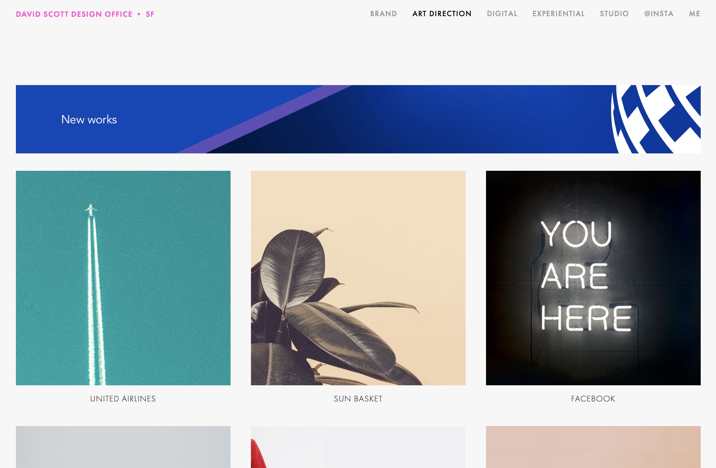
Click through and you’ll find eight images along with the following description:

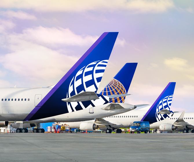
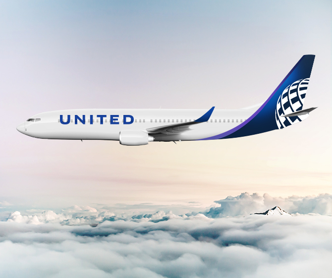
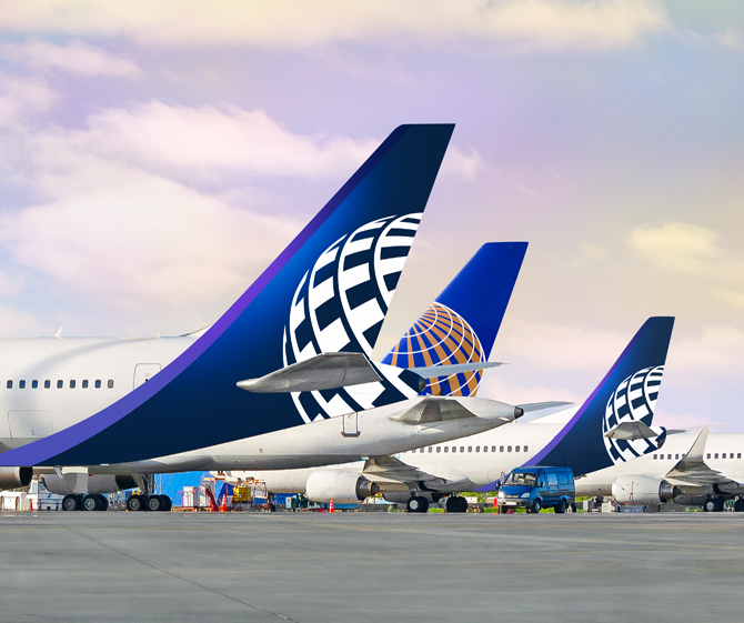
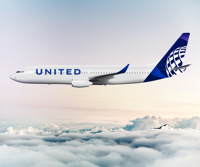
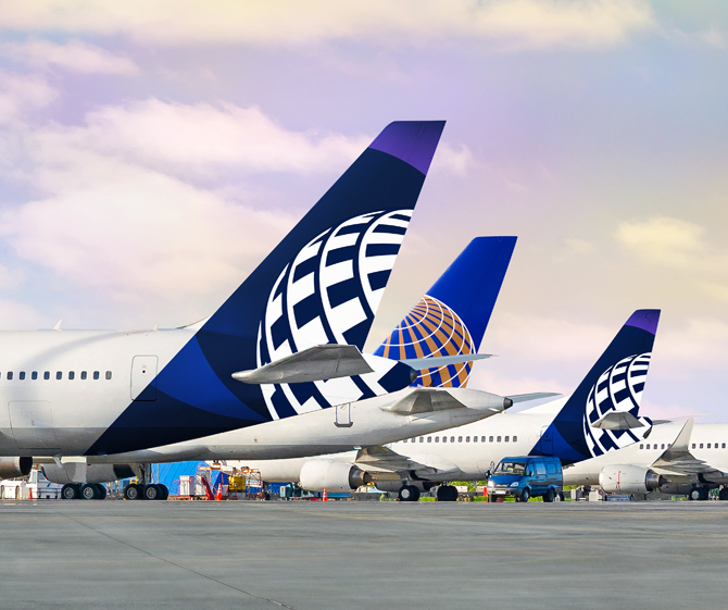
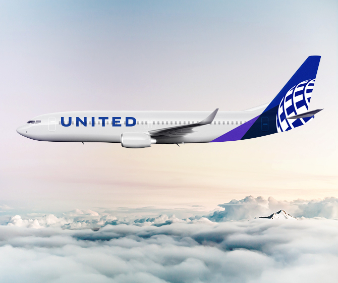
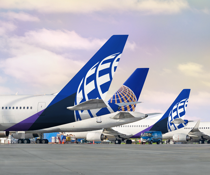
UNITED AIRLINES X BRAND LIVERY
Design the most iconic piece of branding in aviation—the livery. Refine the historic globe of Continental Airlines giving it new life as a modern brand element for United Airlines. The old becomes new again for the combined airline.
Role:
Lead Design Team—design, art direction
It appears we are down to the final four!
CONCLUSION
I think there is a very good chance this could be the new livery. It includes the new purple stripe, the gold is gone, and it certainly appears to be a more of an evolution than a total change.
What do you think of the (likely) new livery? Which one is your favorite?
> Read More: United Will Introduce New Livery Next Month
> Read More: United Should Invest In Polaris, Not Livery (Op-Ed)




Someone’s getting fired…
Ugly AF
Still horrible. The globe is cut off too much and it still looks so dated/1987. They should have made it another shade of blue so it’s more subtle.
United has the worst logo in the airline biz. They should have taken this opportunity to do a total rebranding.
There are actually 4 different liveries with two photos each on that website. If you click though you will notice that the tail will change and the purple is used in different ways for each one
Interesting. That wasn’t there earlier. I’ll add the other three designs shortly.
I hope this livery is an April Fools joke… It looks pretty much like Lufthansa’s with an addition of purple and different name
Alaska Airlines much?
+1 And their’s looks good with the Eskimo but UA doesn’t have any indigenous people!
Excuse me, but that’s Bob Marley on the tail of Alaska.
Excuse me, but that’s Bob Marley on the tail of Alaska.
Just follow the crowd I suppose with the livery. The LH, WN, and AZ liveries all have the stripe. I guess no one wants to be unique anymore. Let’s also waste a few millions unnecessarily 🙂
I hope no one actually paid money for that design. While the current branding could use a refresh, I think the wavy cheat line on the 787 does wonders for it. It this gets a green light, it’s like AA and UA are having a contest to see who can have the ugliest planes. T
Wow, the other half of the globe as the new livery. Groundbreaking.
Sorry, haters. I actually like the possible new designs. They are both more modern and suggest motion more than the current design.
Bring back the tulip
Yes!
I th8 k I like #2 because of the “glow” offset to the NW. But wouldn’t the firm be under contract to keep this company confidential? I didn’t check for any April 1 disclosures.
Unimaginative. Uninspiring. Characterless. Colourless. Unmemorable. Uninteresting. Dull. Unremarkable.
If that is what UA is going for, then they achieved it!
It looks like internet explorer got an airline.
Why purple?
I like the second one with the purple swoop edging the traditional blue tail. It makes the plane look fierce and fast.
I’d note that in all designs there seems to be a disconnect between the squared off simplicity of the United font on the front of the plane and the complexity of the design on the back of the plane. It looks like the front and back are almost two different companies. It also “weighs down” the back of the plane with a lot of color while the front looks plane Jane and naked.
I think it’s extremely unlikely this is the new livery for several reasons:
1: This designers portfolio features several re-designs of various real companies – yet I cannot find these designs anywhere on those companies actual websites. I suspect these are fantasy ‘what-if’ designs, as it’s pretty common for budding designers to take a crack at actual companies branding needs in an effort to put themselves out there
2: A designer putting up an unrevealed product on their own website before their clients is a HUGE no-no.
The first and second could work. Don’t know what’s going on with the other two, they look like the work of a freshman design student.
Oh God no, not another freakin’ livery with the tail swipe and nothing but white on the rest of the aircraft. Boring and ugly as hell and a testament to the lack of imagination of today’s designers (generally millenials). No wonder we all swoon when BA has a couple of aircraft painted in classic liveries.
These are all terrible, sorry to say.
Aircraft liveries are a connection between the Airline and the passengers and show the Airline personality
My favorite? What, between hideous and horrible?
Looks like the new AS livery. Just substitute the Eskimo man for the globe. Color schemes are very similar. Prep for a merger?