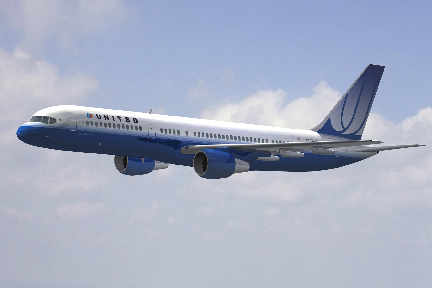
When United Airlines and Continental merged, the United name may have survived, but the Continental livery did. Now comes the chance for true reconciliation.
I say that facetiously, of course, since the paint on aircraft is like the old adage about not judging a book by its cover or that looks can be deceiving. I never much liked the Continental Airlines “bingo basket” globe logo that seemed more fit with a double-breasted blazer banker’s cut blazer than a new global entry for the 21st century. But it grew on me over the last several years. I still miss the United tulip, but it’s fine. I’ve adjusted.
But now United will introduce a new livery in April. Per Flight Global, United CEO Oscar Munoz is calling the new livery an “evolution” rather than “revolution” adding, “I think it’s pretty cool.” We’ll see if we have different definitions of cool. I do hope United leaves the sans serif font alone. The globe is welcome to go.
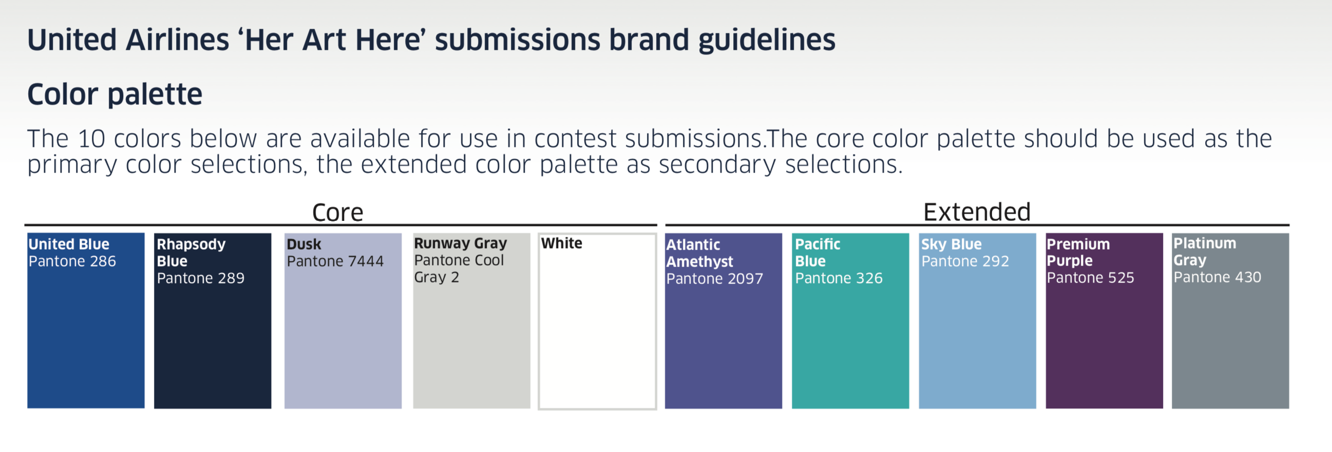
More realistically, however, the update “will incorporate some of the colors United has recently added to its branding palette that, for example, include the purple used for its new premium economy product and a new shade of blue dubbed ‘Rhapsody Blue’. One color that is likely to feature less prominently is gold, which is currently used as a cheatline between the white upper fuselage and grey belly, and in the globe on the tail.”
Here is United’s latest color palette:

You can see that gold is gone.
We may find more clues in the “Her Art Here” contest which gives women the chance to design a United 757 fuselage. Although a smaller project, design elements from the winners of this contest may find their work incorporated into the new fleetwide livery.

My guess is a new purple stripe, a globe without gold, but just a minor change overall.
No aircraft will be taken out of service to change the livery. New deliveries, as they come, will have the new liveries and other aircraft will be updated when they undergo routine maintenance.
> Read More: United Airlines’ 2019 Fleet Plan
CONCLUSION
I’m not opposed to a new livery but, I do think United has far greater priorities, such as the state of onboard Polaris business class dining. I’ll address that in a subsequent post. But if anyone cares for my design input, I’ve come up with a little schematic below:


Bring back the Tulip!
No
Need me some tulip
no. We move forward not dwell on the past and nostalgia
They should do a complete overhaul and go with the bloody nose look.
Hilarious!!!!
They should put Bob Marley on the tail like Alaska Airlines.
When will they be introducing better customer service? I can only assume that’s next on their list.
I actually like the livery they have right now. My laptop background is a photo of a United 737-700 taxiing in Newark with the NYC skyline in the background and I think the livery looks great.
Really! This is what you write about? What a waste.
The only thing most passengers want is low fares, enough seat room to not be mistaken for sardines, and the promise not to be removed from our seats after we’ve paid for them and boarded. Oh! One more request is not to be assulted by the staff or other passengers.
The rest of all that nonsense you write about is worthless.
I am so sorry that you are angry about his article and you even spent time writing the comment considering your time is very precious. Although you don’t care about how other people feel, I care about how you feel, Kirk. I am sorry this article hurt your feeling and wasted your time. Stay happy!!
You fly United that much to be such an angry moron. Why did you continue reading? You could have just stopped . It’s not possible for a writer to change anything. Your credibility lacks, first get your facts straight. The incident you speak of is long over and united’s staff did not assault anyone, in court records, second the passenger agreed to give up seat , then boarded. The incident spiraled out of control. Many incidences are reported everyday of violence , verbal or physical , most probably from angry people like you. It’s simple, angry person, don’t continue reading. Your a joke.
I’m in the middle of flying 200,000 PQM of TPACS in two months on United after hardly flying them at all last year. So I’m getting a full reckoning of airline operations out of SFO and LAX. I’m finding the airline so much improved, they can make a mess of the paint job if they want to. Hopefully they won’t, design taste has been getting better at United not worse for a change. Gate agents, FAs, lounge agents, phone agents, everyone has been so proactive and professional to get people where they need to go. You can find still mistakes but after dealing with AA horrible operations and employee moral the last year and a half, almost every flight is a pleasure. Hoping they impress us with not screwing up the new design.
I hope they know that TULIPS come in many colors including purple !!!
Bring back the Tulip !
Its never coming back pal because they do r let nostalgic feelings get the better of them over realty and evolving futures
Interesting proposed color palette. Just looking at those colors, I’m reminded of the Las Vegas Sands aircraft fleet: https://www.reddit.com/r/aviation/comments/2ts39x/boeing_747sps_las_vegas_sands_corp_1200x819/
Then there’s the United Charter 747 : https://www.youtube.com/watch?v=Uat_rtcXVDY
which actually looks a lot like the new Lufthansa planes.
Maybe a Star Alliance theme …?
I hope they do like DL did and somehow incorporate both logos to make everyone happy. The sideways Delta widget was based off of the last NWA compass look.
UA – Evolve the globe in a way that old elements of the tulip show and truly unite both brands, or just come up with a new logo completely…
Agree!
They could make the globe a flat map to appease the flat earthers.
Scratch that actually, it would bring the anti-vaxers too.
I come from the pre-merger United side and understandably I was sad to see the Tulip go. I did respect the Globe though as a symbol of the carriers’ marriage. That said, with the energy building up within the company I am looking forward to a new livery. I wouldn’t mind keeping the Globe but I do hope it’s tweaked or refreshed creatively infusing the Tulip subtly into it.
an insufferable diversion from the true mission….get the bloody company on track, stay on track, and teach the employees the golden rule along the way. Oscar is weak if he can’t control the boyz in the C suites.
Get rid of that ugly bingo cage! NOW! I cringe whenever I see that nasty Continental livery. Seeing that livery just makes me angry. Very angry.
Is United working with any real companies to develop their branding? Or are they doing it on their own, as their marketing budgets have always been cheap?
I’m assuming they are using the same company Marriott did to create Bonvoy !
Preach! Although I wish they would partner with Pentagram again to bring a sense of real style into the branding. A La Rising Blue…
I’m guessing it will include Oscar’s face. “Historic”
An entirely new logo. Please.
Even though United needs a new logo and livery, since I always flew Continental, I’m attached to the globe.
The Color code of professionalism is what United has now … it’s a professional airline not a Disney trip plane … LEAVE IT BE
I agree with you Matthew, they should bring back the tulip… at least on a retro livery.
Well lots of clues from Oscar…I predict a much simpler blue icon for the globe sans gold. Also no cheat line (gold gone) and use of purple as a secondary color…and the United letters blown up a la Virgin and American. Basically, a much simplified scheme (hello Eurowhite) and purple supplants gold and maybe even the grey. If so, what do I win??
Worked @ UA for many years & never liked the Tulip.
I think it was a nice change with the Continental livery after the merger. Its plane & simple.
I say let sleeping dogs lie…..dont change anything
Bingo basket really? It’s a globe which represents a global airline. It is clean and classy.
U/C merger is without a doubt the sloppiest merger ever done in the history of Corporate America. It’s almost like an arranged marriage where the two can’t stand each other even years after they have been forced to be together. Continental no longer exists – it has failed as a company with 3 bankruptcy filed cases. What else do you want? Burry the damn thing already and everything that would remind us of it.
Either your CAL or Legacy UA at this point it doesn’t matter. CAL is Dead but UA faithful hate that we kept OUR colors and there name on our plane. I thought the TULIP was out dated anyway but I hope Oscar kills everything and starts a clean fresh new look. WeAREUnited. 1 company. For those employees who are stuck in the past get over it or retire already….Now back to work