The rubber blue chairs in the gate areas are a staple of the United Airlines terminal at Chicago O’Hare (ORD), almost as iconic as the neon-lit underground walkway separating the B gates from the C gates. But during a recent trip through I was pleasantly surprised to see the gate areas are undergoing a total refresh.
Refreshed United Airlines Gate Areas At Chicago O’Hare Invite Passengers To Stick Around
Those blue chairs carry many memories for me, some happy, some not so much. I love Chicago and so seeing these chairs means I’m in a city I love. But it also reminds me of the days of my youth, when I would spend nights in airports instead of in hotels to save money. The chairs themselves were not uncomfortable, but it was always a challenge to find a section of seats that did not have rigid metal armrests (which made slumber impossible).

And of course it was off these chairs that a pizza thief stole my beloved stuffed-crust pizza.
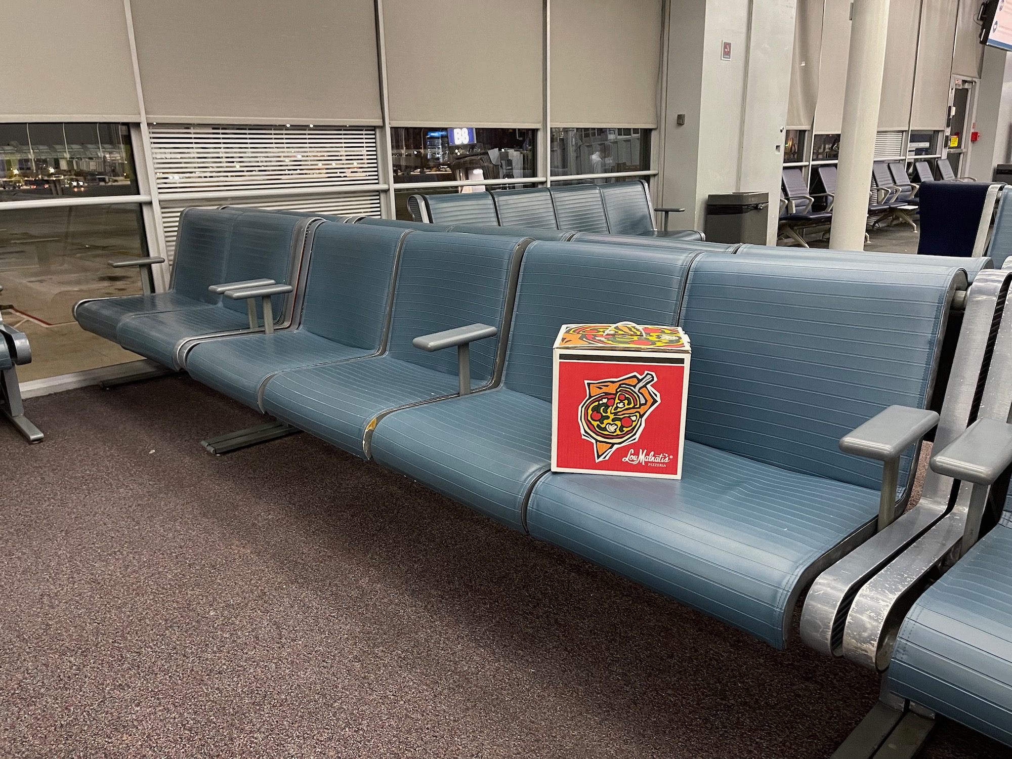
> Read More:I Set A Trap For The Chicago O’Hare Pizza Thief
But the fact that these chairs have been around for as long as I remember probably suggests they are getting past their prime. While United has experimented with charging ports and refreshed gate areas at Chicago O’Hare, I noticed a totally different look being unrolled in both the B Gate and C gate area during my recent trip…and I liked it.
The big difference between U.S. airports and European or Asian airports, in my mind, is that the latter wish to make you comfortable, not just encourage you to spend your money. Now that’s a bit simplistic, but case in point are the chairs in terminal concourses and gate areas. Yes, the U.S. has a homeless problem, but it’s not like vagrants can simply access the secure area of airports without a ticket. In so many major US airports, you see exclusively immovable armrests, which prevent people from sleeping in chairs.
While I understand you don’t want to encourage people to sleep in airports, sometimes people do face flight delays or cancellations in which having room to stretch out and charge your devices would be nice. United seems to have that in mind with its latest gate area design, which includes comfortable couches, more charging outlets, and even some chairs designed for lounging or sleeping.
Monitors have also been refreshed and new status screens installed at the entrance to gate areas. This all looks great and I know passengers will appreciate the extra comfort.
I snapped these pictures:
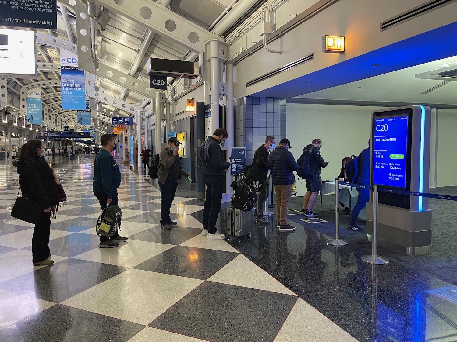
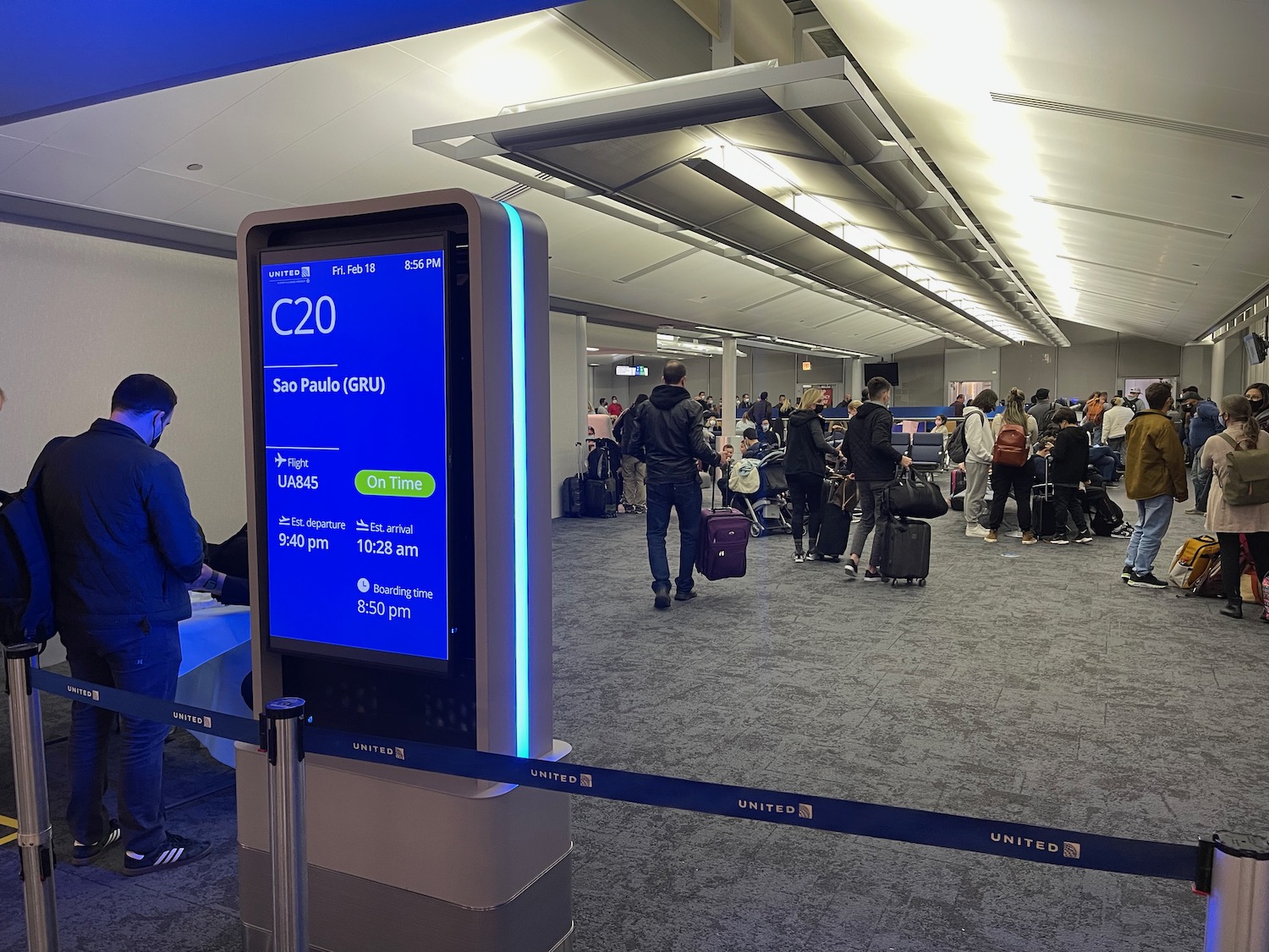
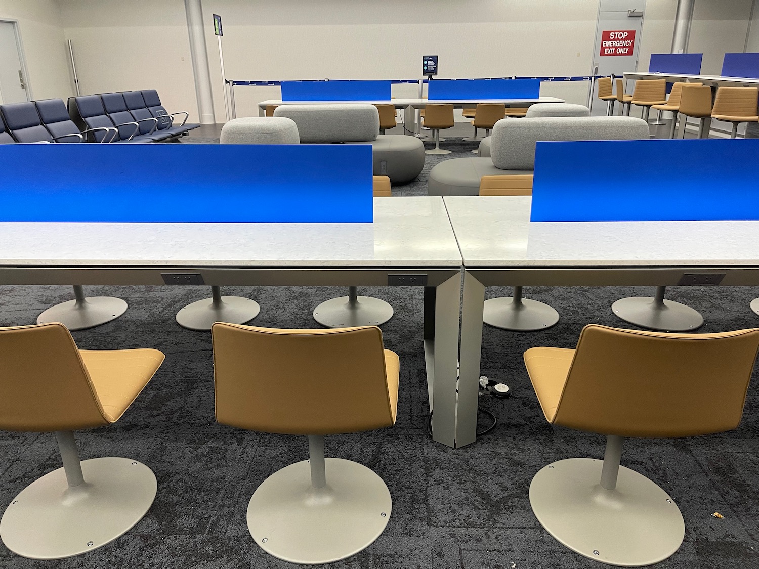
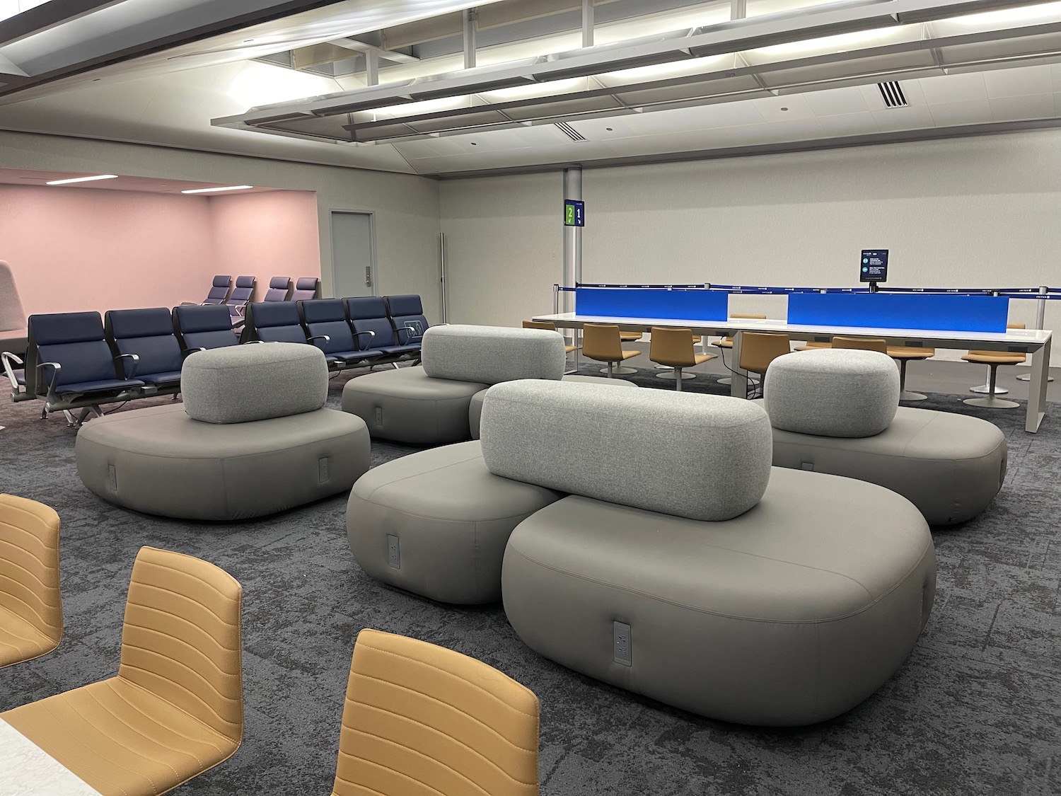

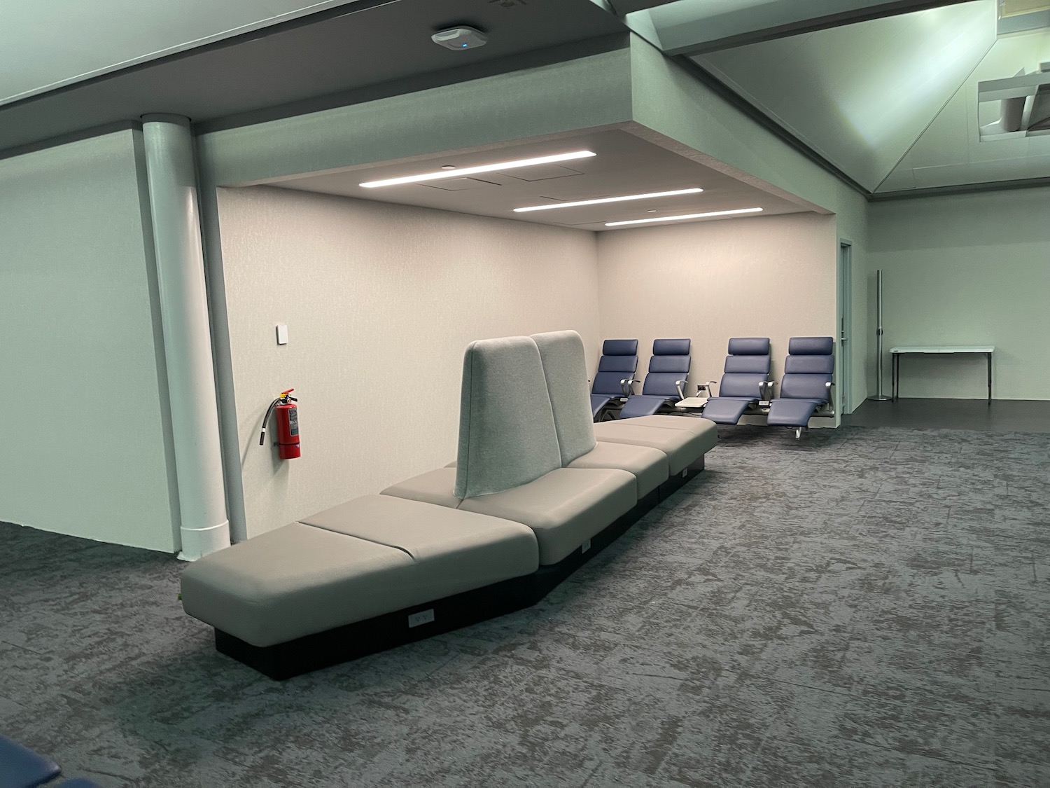
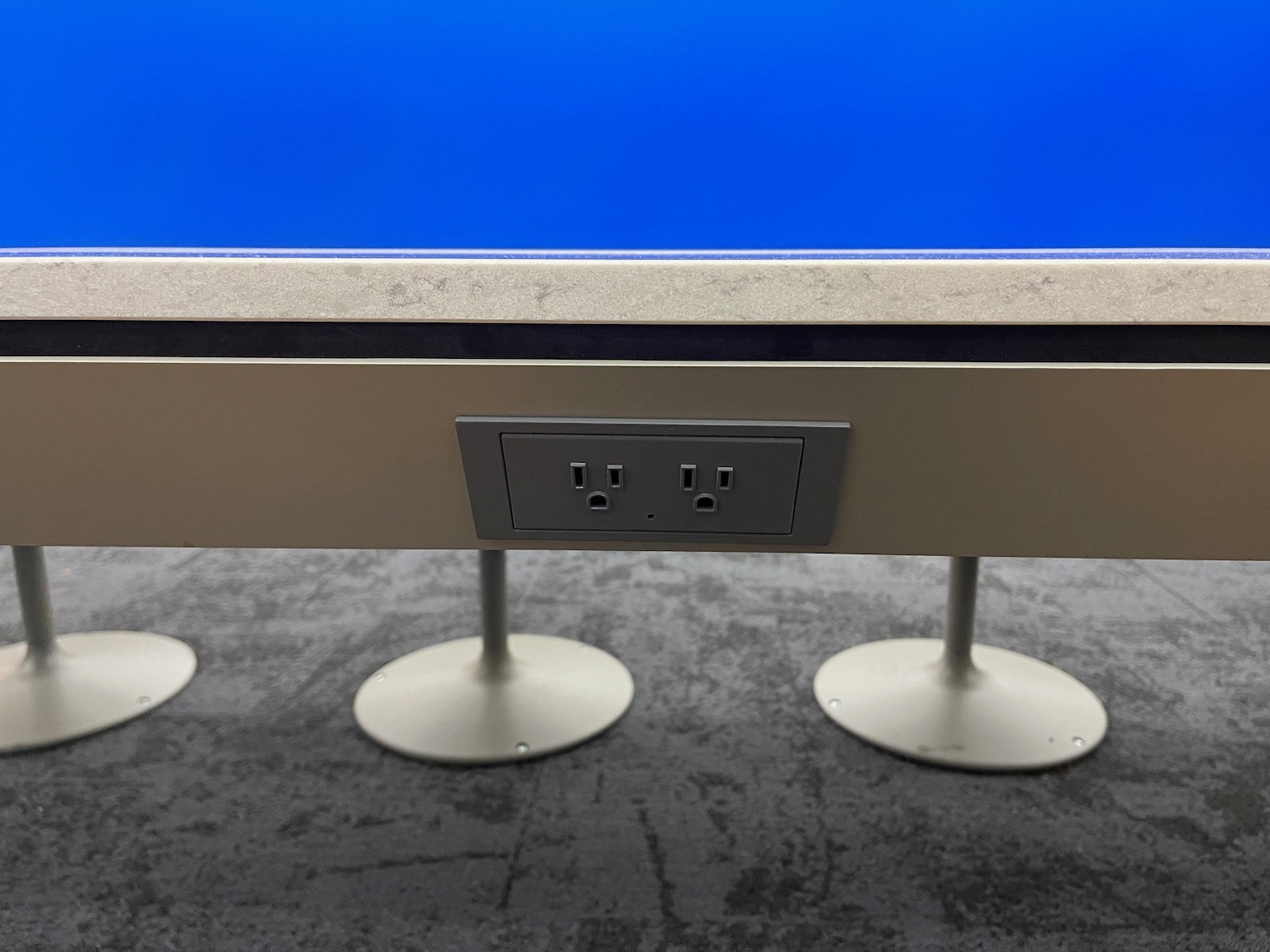
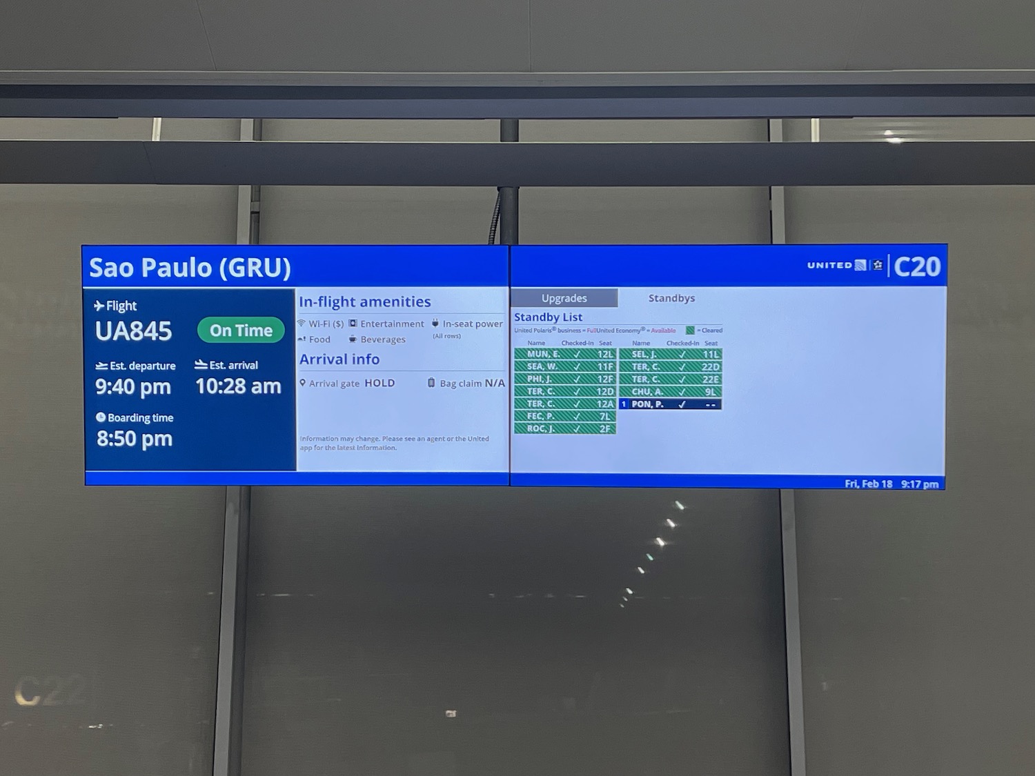
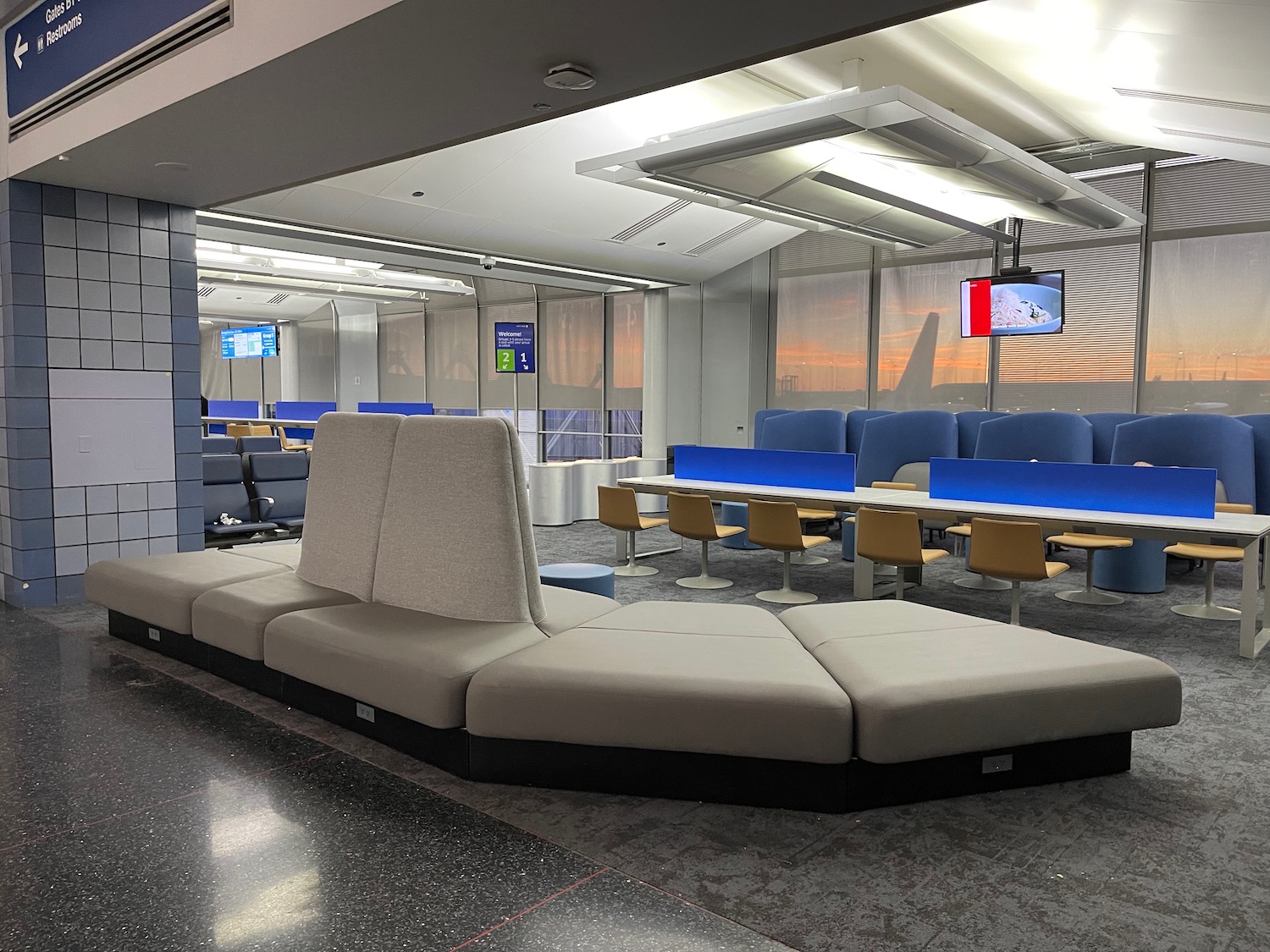
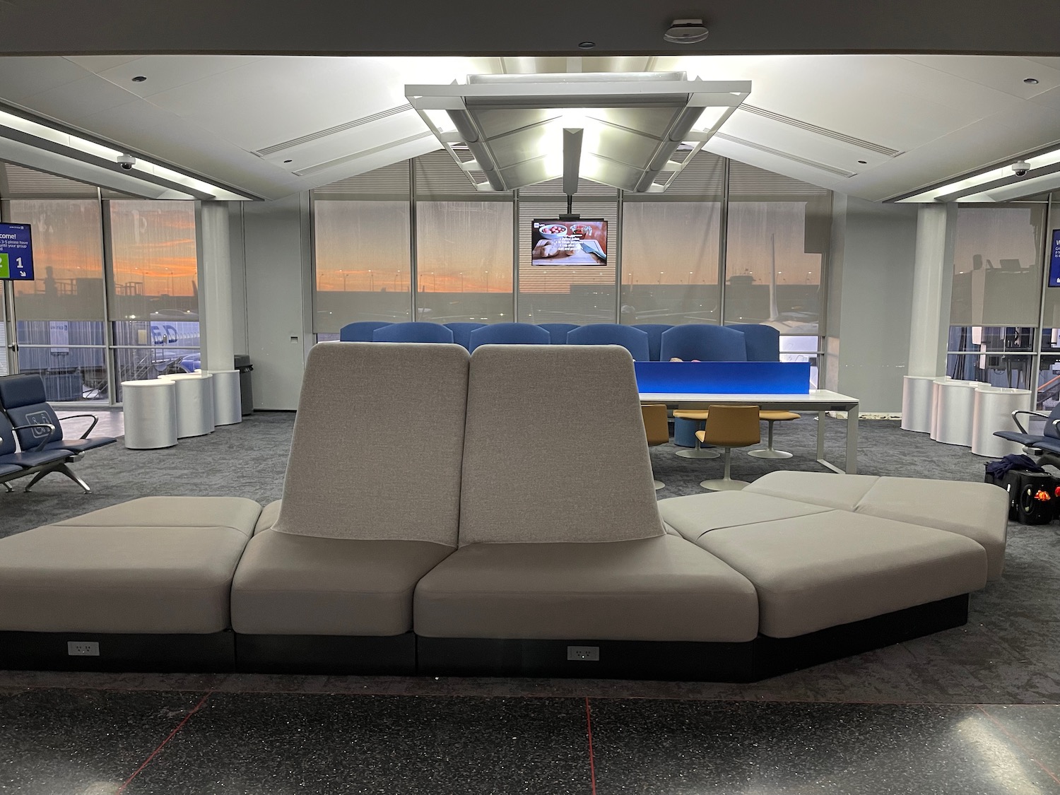
I do have two concerns. First, I’m not sure who thought up the placement of boarding zones, but prior to my flight to Los Angeles (gate B2) the zone was boarding was smack in the path of…a row of immovable chairs.

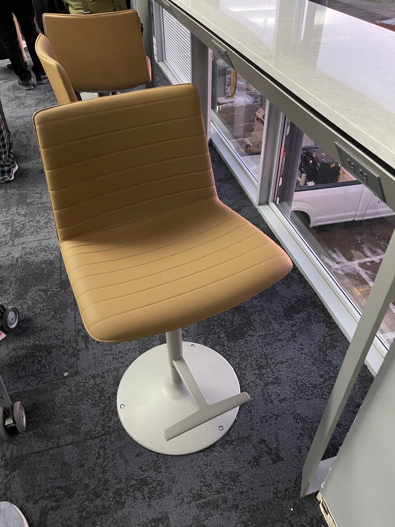
Second, will this furniture age well? Let’s hope these are very durable, because they will no doubt endure a lot of abuse.
CONCLUSION
United Airlines is refreshing its gate areas at Chicago O’Hare, adding couches and power outlets that make the space more practical and comfortable. Turning gate areas into hospitable zones helps to win loyalty too. Well-done, United.



I saw this while flying on Monday. Looks pretty nice and agreed the boarding lanes are placed terribly. Maybe they have a plan to address that. Facility wise, ORD just needs to fix those leaky ceilings and open up that new UC in C.
I can’t really say I’ve ever noticed an effort at European airports to make me feel comfortable
Really? Outside CDG I love European airports.
Now all they need to do is have staff available somewhere in the B Concourse. You can only check in there if you have carry-on only, and if you have a question or issue you have to walk from Terminal 2 to Terminal 1. The QR-code app is great in theory, but keeps dropping the conversation and when you call back, you get a new person and have to start over.
I would once again like to welcome United to doing what Delta has had for the last five years.
United’s App functionality blows competitors away, particular Delta.
These LED screens show that labor costs are so high that it is easier to be pro-global warming by using electricity consuming signs. Up to even a few years ago, the gates in US airports used plastic reusable letters and numbers, particularly Southwest Airlines.
Of course, part of it is also technology. I remember seeing the flight departure board in Santiago, Chile in the old terminal where it was a video feed of a board. You could see a human hand take down numbers and put up numbers!
Hello time traveler. ORD haven’t had manual gate boards for at least 20 years. Southwest ended their usage of plastic boarding cards shortly after 9-11.
He’s referring to non-digital gate displays, not the old plastic boarding cards.
Does Southwest still use the non-digital displays? I feel like I’ve seen them recently, but I don’t fly Southwest. If they stopped using them, it’s been very recent.
As of last month Southwest still uses one at BUF
I prefer gate agents focus on serving and interacting with customers rather than have to change numbers on a sign. Given how often flight info changes at times, the ability for instant electronic updates is far preferable for keeping customers accurately informed.
Have you seen the united express area of Terminal B is completely redone like this and it’s pretty nice. Even at the end of Terminal B where the international flights generally leave from there is an entire area that has been retrofitted and is pretty comfortable. I spent a few hours there one night/early morning.
The boarding lanes – as mentioned above – are horrible! They make preboarding groups walk past everyone already in line for 1 and 2…. It’s beyond stupid.
What is your favorite airlines to fly?
Now if only United’s IAH hub will upgrade their gate areas like this, (seating and gate information displays).
C North has monitors behind their gate counters, while C South and all of E Terminal still use the old red LED boards behind the gate counters.
Hi guys! I hope you like the new gate design at ORD. (I’m part of the team that helped innovate and design these new gates) as it is currently in trial at ORD and a modified version will be rolled out at other hubs eventually based on customer feedback. So please let me know your suggestions and options on this.
This looks great! Would love to see this at the other United Hubs like SFO!