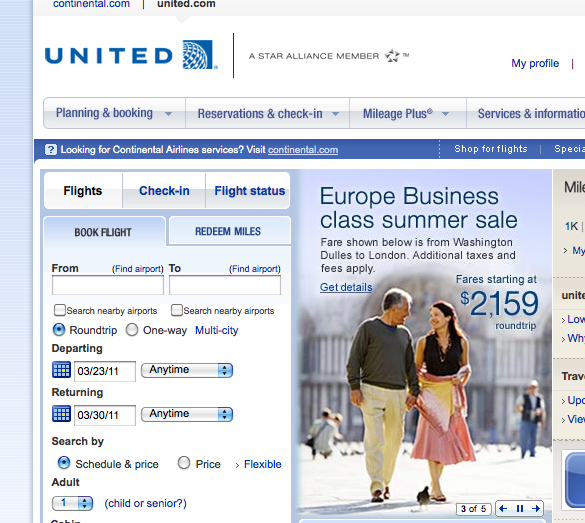
While Damian already pointed out changes to the United Airlines’ website that popped up today, I must briefly add my euology for the United tulip, now formally phased out of United’s brand book.

Thankfully, the new look to united.com hasn’t lead to any “real” changes on the website, a website that I will miss despite all its problems once it is rolled into continental.com.
That’s about all I have to say on this topic–I just couldn’t let the passing of the tulip go without mention.
If you’re mourning the loss, head on over to Facebook and join the Save the Tulip campaign. While I doubt that is going to do a lot of good now, something in the back of my mind tells me we haven’t seen the last of the tulip.
Do you ever notice how labeling often reverts back to its old form? Take Coca-Cola for example. After years of experimenting with different contemproary designs, Coca-Cola brought back the classic red and white can. I hold out some hope that UA will one day bring back the tulip. It’s a classic logo that has become ingrained in American culture and is recognizable around the world. You can’t just relegate symbols like that to the dustbin.


Leave a Reply