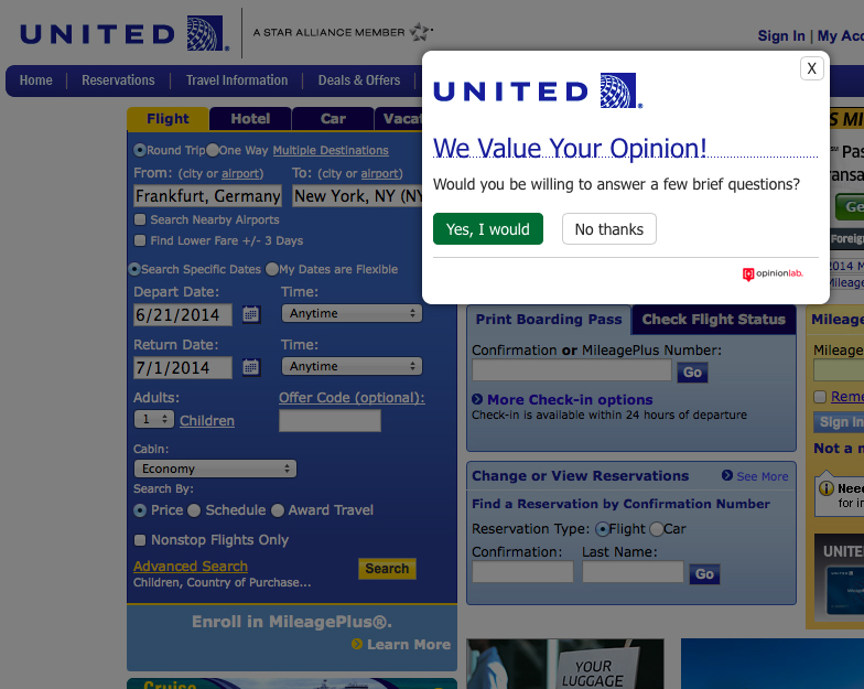
Last September we caught a sneak peak at United Airlines’ new website in a television advertisement, but eight months later it has yet to roll out. Perhaps United is still working out the kinks and has launched a new survey this week that randomly pops up when you visit united.com–

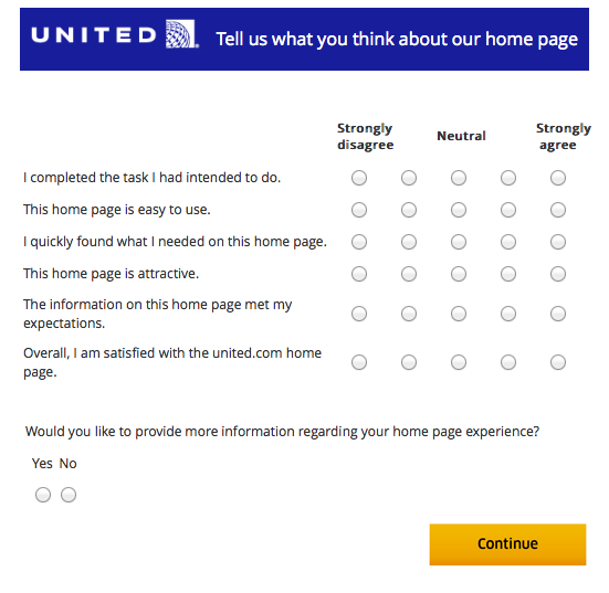
If you opt into the survey, you are asked a series of general questions about your satisfaction with the the home page (not the whole united.com website):

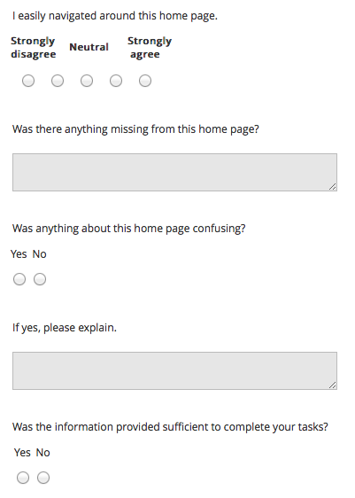
You then have the option of answering a series of additional questions and providing written feedback:

As with anything United, it is anyone’s guess how much weight will be placed on survey results or if it will even be closely looked at, but here’s the thing about me–I am pretty adverse to change. When I get used to something, I don’t want to see it altered.
I dislike both the delta.com and aa.com home pages – I think both websites have a simplistic, aesthetically-pleasing design but lack functionality. I hate having to click through to the “advanced search” page to search for premium cabin award space on Delta. I hate that the AA.com home page makes you scroll thought month by month when searching for a flight in the future.
In that respect, the united.com homepage is great – it loads quickly, has a very easy search tool, including for award space, and you have everything you need on the home page – up to five reservations, your mileage balance, flight status, and of course the flight search tool.
So when I filled out the survey, I said I was satisfied with everything and in the written feedback portion I wrote a note begging United not to reduce functionality in the name of sleekness. I really am satisfied with united.com. Sure, it would be nice to see Singapore Airlines, LOT Polish, and Shenzhen Airlines award space online. It also would be nice to see both outbound and inbound options on a r/t booking on a single page, like the legacy united.com used to display, but other than that I am content with united.com and would hate to see it changed for the worse.
What would you change on united.com?


This is the closest remaining site to the old, glorious nwa.com. I need clear functionality, not social media inspired goofery.