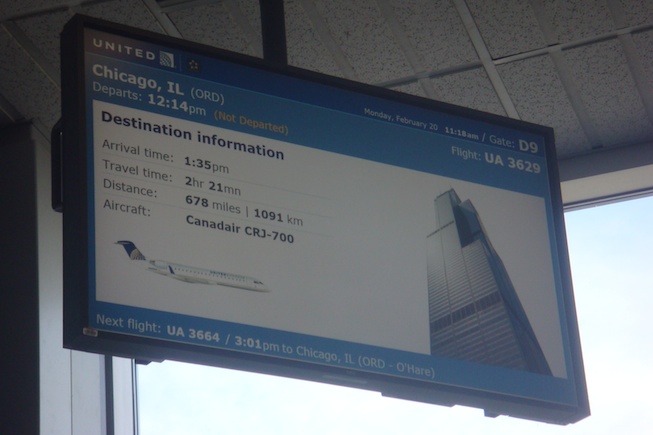
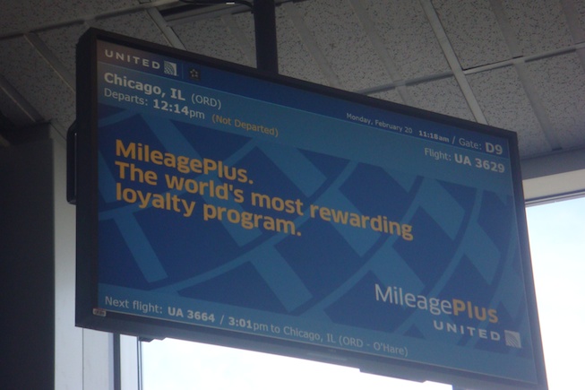
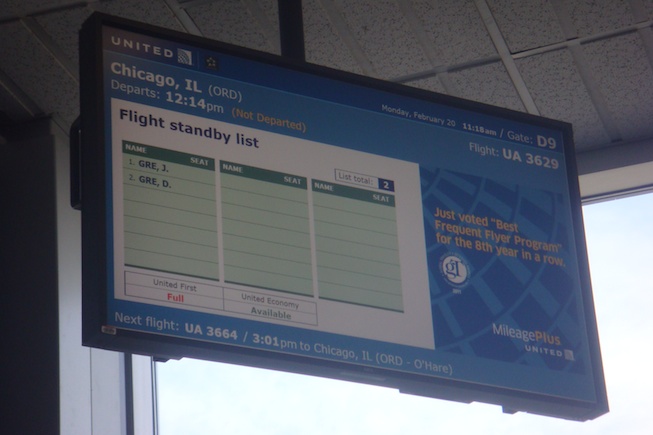
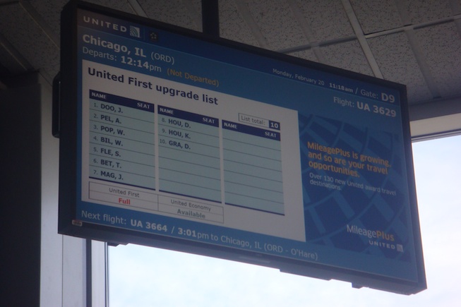
As the 03 March 2012 Continental-United integration date moves closer, we are already seeing what the new “United” will look like in some stations. Philadelphia, for example, rolled out the new Continental-esque flight display screens for United flights last week.
Take a look:


Here’s my observations:
- We no longer know how many seats remain on the flight and in each cabin of service; instead, economy, business, and first class will either show “Available” in green or “Full” in red
- We have lost the “Confirmed Awaiting Seats” screen, helpful when trying to gauge how oversold a flight is
- Though a matter of personal taste, we have lost the smooth interface of United, in favor of a more busy format with smaller text
- More advertisements–the blue Mileage Plus screen above flashed up between every other screen, meaning it took twice as long to get a look at the upgrade waitlist
Could things be worse? Absolutely. At least we still have a flight status screen, but it does seem like a step backwards. Hopefully a little tinkering will result in a screen that looks more like legacy United…


That is why I really love the Delta information screens. They present all of the information cleanly, but also allow for ads to be included next to the information so they can promote products and generate extra revenue, without appearing ugly or pushy.
Why am I not surprised?
So much for a “merger of equals”.
Seriously, this is what you guys complain about? What about the fact that you have all this information now available on your phone or computer?
With United, I’m tied to watching the monitor when I’m waiting for an upgrade. With CO, I can be anywhere and still have access to the same information. I know CO has the monitors, but I don’t think I’ve ever had the need to look at them as the website is far more convenient.
@Fozz: Come on! I don’t have a data phone right now, so I depend on those screens at the airport. And even CO’s nifty iPhone app doesn’t have “Confirmed awaiting seats”.
More fundamentally, I’d rather not have the info and still get the upgrade on my K,L,S,T fares! But UA’s business model is finished.
The smaller text has been here for a while (but perhaps this is even smaller). The old status screens from, say, six months ago had three columns of names and were easily read while standing out in an O’Hare hallway. When they went to four columns, the names got small enough that I could no longer read them without entering the gate area and squinting.
Or maybe I just got older fast.
I’m not even going to comment on not having a data phone. But surely you spend time in the lounge and have a laptop, so being able to see that information is still better than the current offering.
While I agree we lose “Confirmed awaiting seats”. Aside for the person looking for bumps, the screen is useless. So, I can see why it’s going away as I’m pretty sure the airline doesn’t strive to enable bumpers anymore then it already does.
It’s quite possible that the number of available seats will come back once the systems are fully integrated. The Continental app has always shown this count, and the United app never has. However, I know once the systems are merged, the mobile apps will have the exact seat counts for all flights, regardless of whether it’s United or the former Continental, operating the flight. I wouldn’t make any assumptions about the final configuration of the gate displays until after everything has been fully integrated.