Check out the official United-Continental merger website.
“Work hard. Fly right.” and “It’s time to fly” weren’t great slogans, but “Let’s Fly Together” is a lame and uninspired slogan of the new combined carrier. It’s not even cute.
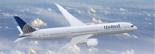
Even more disappointing is the new livery. While I don’t dislike Continental’s current livery, it outmoded–stuck in the ’90s. United’s livery is sleek and classy. Whether the new livery is compromise to appease the CO loyalists or a practical way to address the fact that United cut corners and did a sloppy job repainting their current airplanes, the new colors strip UA of its identity.


photo courtesy: http://www.unitedcontinentalmerger.com/
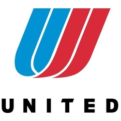
I already miss United’s tulip:


I too find the new livery to be a bit of a disappointment. I too think it had something to do with appeasing the CO loyalists as well as it would be cheaper to just have to repaint in their entirety only the UA planes. I would like to see them keep a few planes with the tulip in the current livery as a type of heritage plane.
I think that they should have resurrected “Fly the Friendly Skies” for the slogan. Hopefully they’ll keep the Rhapsody in Blue.
I really like the Continental Globe. Even some of the RCC reps have commented that they really like the looks of the CO PC card. I too will miss the UA colors as well as the font. Seems like a step down to lose all CAPS
Personally, I like the fact that they took parts of both companies to make one image. It demonstrates that the companies are at least trying to merge the brands and not stomp one out.
I’m pretty sure the UA folks would complain just as much if the tulip stayed and the company name changed to Continental.
The only issue I have with the new livery is the awful Photoshop job they did putting United on the plane. There’s no curvature to the logo so it looks awful.
As for Rhapsody in Blue, I pray to god they get rid of it. I’ve heard it way too much in my life, it’s like a prison sentence in itself. Though, on the flip side, the constant advertising CO subjects you to isn’t any better.
Maybe it’s that my company is way too serious about brand image, but does no one else see the problem in their corporate name being in one font and their slogan in another?
The font should at least be in the old CO style.
@John: I hate that font!
Stop transporting primates for research labs and torture you evil airline you.
I have just learnt that you shipped monkeys to their deaths. Other airlines refused to be party to such cruelty to animals. I will not fly with United Airlines again and urge my family and friends to do the same!
Can I have your miles?
😀