Dear United,
It’s me, one of your most loyal customers. In fact, some accuse me of being a United “fanboy” (and I can see why my love affair article played into that…).
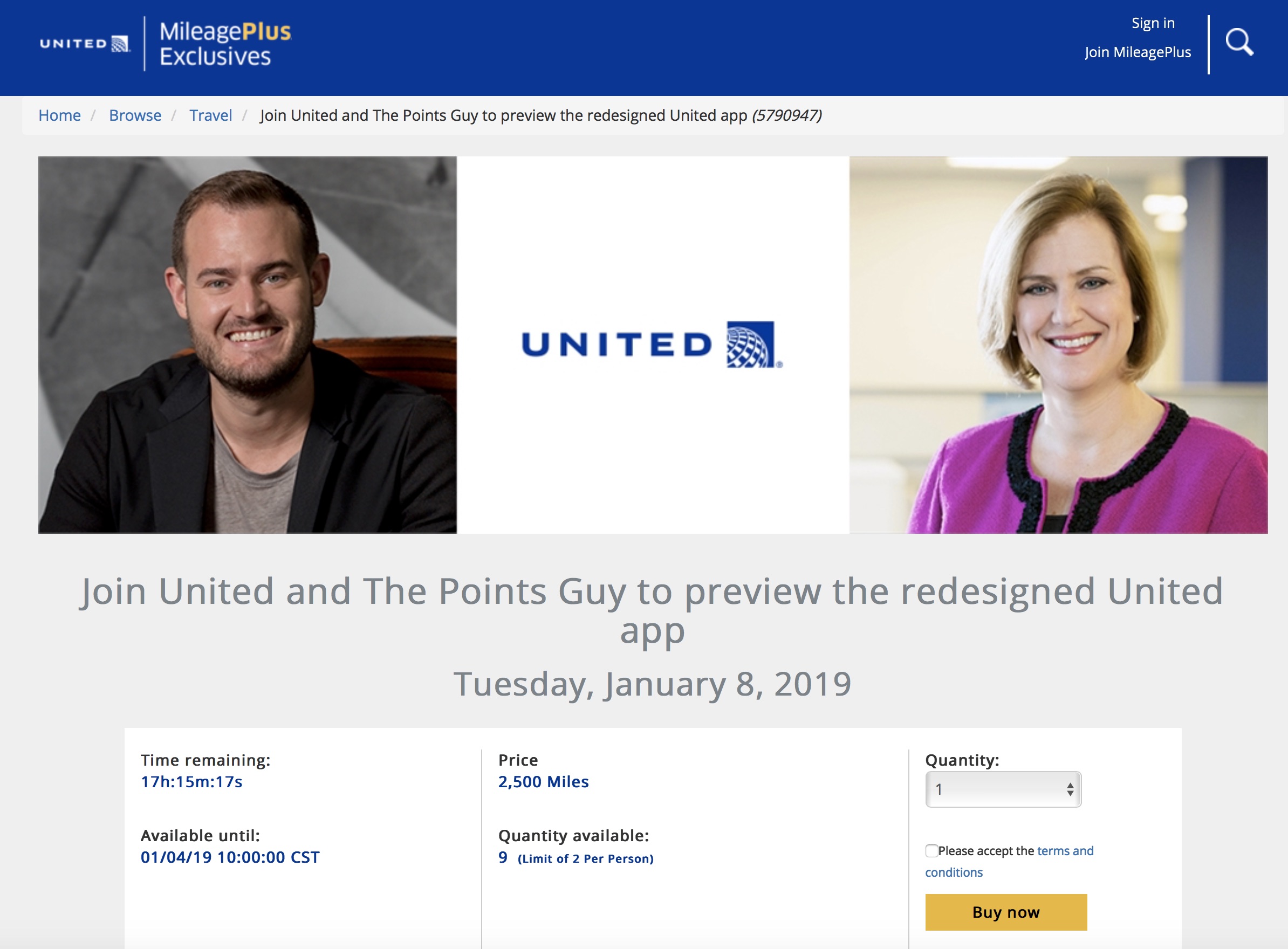
I understand that you are redesigning the award-winning United mobile app. In fact, you’re debuting the app with The Points Guy in New York City next week. It seems that there are even some tickets still available.

Can I ask you, as delicately as possible, WHY? Why would you touch an app that functions nearly flawlessly most of the time? An app that you have invested so much in and that works so well? What needed to be changed, especially when the app is already far better than the Delta and American Airlines apps?
Some may call me change adverse, but I sure do miss the old website. I sure do miss the old award booking system agents had access to over the phone. I believe in leaving well enough alone and I think most customers would agree, especially the ones you deem most important. Will I soon be saying the same thing about the app?
Please don’t let me down. Don’t take away functionality. Don’t take away ease of use. Just keep working at it. I love the current format. Not only am I used it, but it very practical. Checking in for a flight, checking flight status, booking tickets, streaming IFE: it’s all so easy now.
If you want to make a few minor changes, I’m all for that. It would be nice to be able to apply upgrades on the app and be able to self-offload from a flight. But there are minor issues. It sounds like you are going to debut a totally re-designed interface.
Again, I plead with you to be perspicacious in making any changes. We really don’t need a new app.
Love,
Matthew Klint
Premier 1K MillionMiler


I’ve been beta testing the new app and it’s not bad. The same functionality remains along with some new features (like showing fare classes a la expert mode when booking).
That would be a great addition! I hope they are just adding functionality to what is already the best airline app in my opinion. I share Matthew’s sentiment: Don’t ruin it! Pllllllleeeeaaasssseee!
I’m glad to hear about expert mode (anyone remember when they took it off the web site way back when?!). But, if I’m not mistaken, isn’t it already available via the current app?
I’d prefer the same functionality and more (partly because I am new to UA), but the interface looks like it was designed by a Middle Schooler in Computer Science 1. Delta has a much more appetizing interface and that’s what I think UA should be following.
Oh HELL no
The DL app is constantly jamming up valuable screen estate with worthless cross sell junk. Like under MY TRIPS, I had to click my same reservation TWICE to get me the info. ESP the middle page in between ….. my goodness it’s like they’re afraid someone might miss their scam offerings and have to constantly remind folks of all the cross sell.
UA’s app show smaller cross sell bars BELOW your flight itinerary info. UA’s app is customer first. DL’s app is their income statement first.
I have better things to do than fall into DL’s blatant “marketing” attempts that only work on losers from flyover states.
I love the app too but wish you could see the lowest mileage options at the top like on the web version. Scrolling through endless options to see the partner airline awards is painful on the phone.
I am always amazed at how far behind United’s app Delta and especially American seem to be. Don’t ruin the progress from the stroopwaffel return by screwing up the app!
Dear United, also please keep the app as accessible as you have for the visually impaired. If you mess that up, you will really regret it, keep in mind that my brother works for you, and will have more than strong words for you about that. Kind regards Alan Brint, brother of Zacko Brint Senior Analyst Network Planning Transatlantic
I second Alan’s sentiment!
off-topic, but ugh, seeing BK’s smug face makes me want to throw-up, just a little, in my mouth
Thank you! I can barely read TPG anymore because of all the terrible, terrible writing and utter lack of decent trip reports (coupled with the terrible writing) available. And the shit-icing on the turd cake is BK’s mug EVERYWHERE on the site. Every time he’s mentioned the writers feel the need to place a terrible staged photo of him in the copy of the article. We know who he is. We don’t need (nor want) to see him every 15 lines of text. He’s not photogenic. He doesn’t add any value to the site anymore. Just leave him off of it.
If the new app fixes the issues I always have streaming inflight movies to Android devices, I’ll take it.
Since it appears that the PointsGuy is tight w/ United, maybe you should write him instead? Perhaps he could intervene on your behalf?
I agree.
I agree, the app us fine.
Tweaking yes revamp no!! Its leaps and bounds better the. AA or DL. Maybe tracking luggage like DL but please please don’t mess it up.
Matthew, I spent six years at Continental & United and the user experience of the app was primarily my output. I’ve moved on from United and now design apps for big data applications. I wanted to let you know that your letter really made my day. I’m super happy that the work I did is still appreciated. I love the app too. Thanks!
Chris, you did great work. I so appreciate the United app. Thanks for your comment!