Lufthansa has unveiled its new livery, but don’t expect to see it across the fleet anytime soon. In fact, you’ll need to wait seven years for the final aircraft to be repainted.
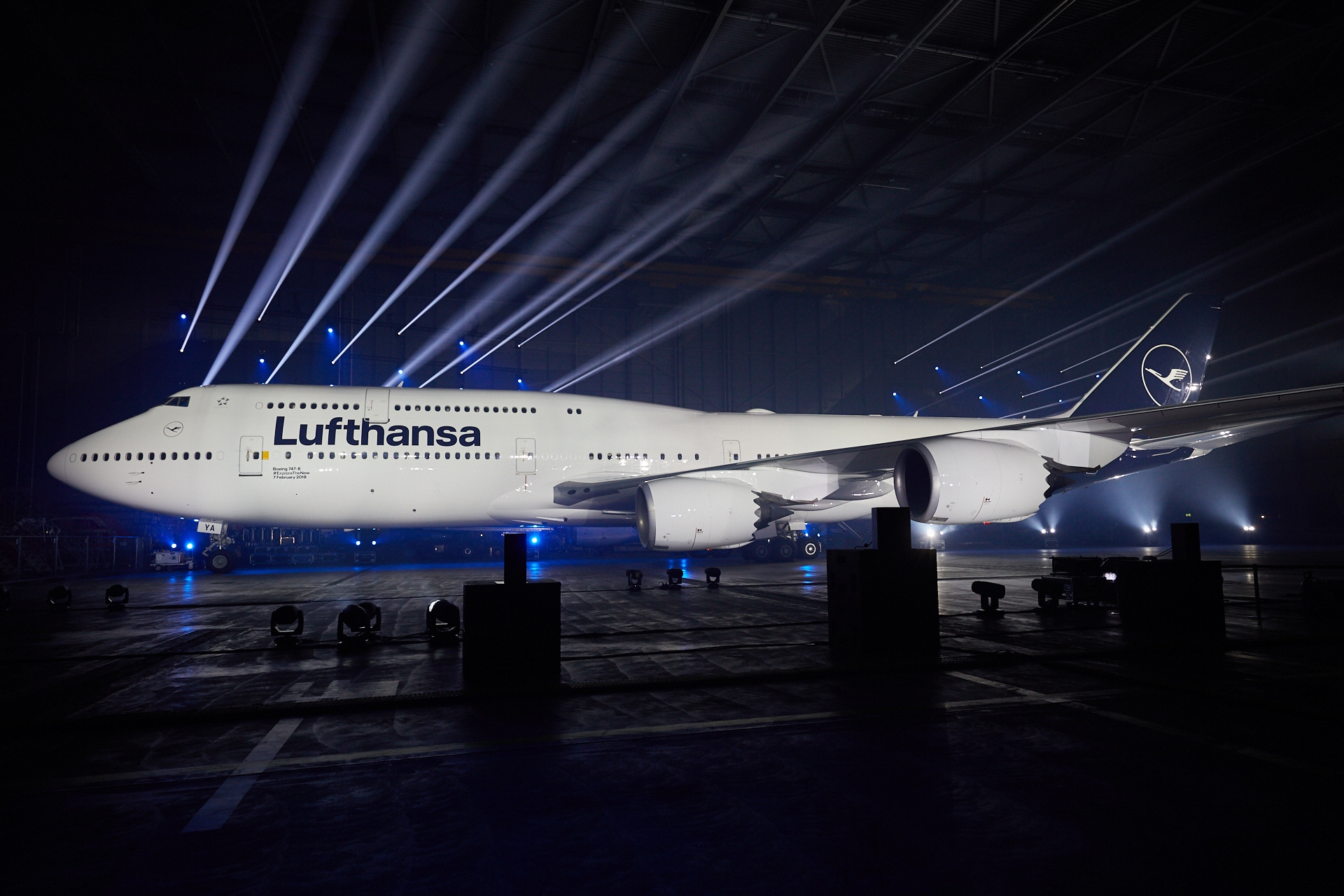
In a spectacular light show (see video below), the new livery was formally unveiled in Frankfurt last week on a 747-8i. Unlike the beautiful multi-colored light show, the livery will be only blue and white. Although I still believe the livery update is unnecessary, the new livery is undoubtedly attractive.
But Lufthansa seems in no rush to get the job done. In fact, Flight Global reports that the repainting program will take seven years. 40 aircraft will be repainted this year.
CONCLUSION
German efficiency meet German cautiousness. We’ll start seeing the new livery very soon…but progress will be slow.
I still don’t understand why Lufthansa felt the need to update its livery. Is this really their best defense?
The company needed to modernize the aircraft appearance in order to remain up to date.
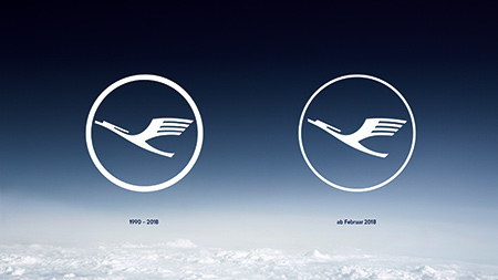
Ad Week asserts the move is predicated on Lufthansa’s desire to appear more digital. The iconic crane may look identical, but is now slimmer and “more fit for the digital world.”

images: Lufthansa
Does the new logo appear more digital to you? Not to me…
> Read More: Lufthansa’s Unnecessary New Livery
> Read More: Dear Lufthansa, Please Don’t Ruin Your Beautiful Livery


What a sorry joke and performance by LH’s ‘top’ ‘leadership’. The only thing stunning is the roll out as if this was a monumental event. Non event, waste of money, resources, time, effort, energy. Simply amazing how lameness is pawned off as greatness.
Maybe it’ll give enough time to come up with something better before all the planes are repainted!
Haha! that is about as fast as United is with Polaris rollout – I think they picked a wrong role model in star alliance,..
I suppose you could call it more “digital”, but to me, it smacks of a desperate attempt to copycat the cold, lifeless minimalism that every big company feels the need to emulate these days. Which is too bad, because the old livery was actually a great example of how to be minimalist the right way, IMHO.
It is definitely doubtedly attractive.
I believe the “digital” refers to the ability to display the feathers of the crane in apps etc. LH felt there was some “smear” effect around the wings of the “old crane” and they felt such was unbecoming of a 21st century global company… Hence they labelled the “new crane” more digital.