With much trepidation I downloaded version 3.0 of the United app yesterday. As I wrote about earlier this month, I just don’t like change…especially unnecessary change. The app worked fine for me. So why change it?
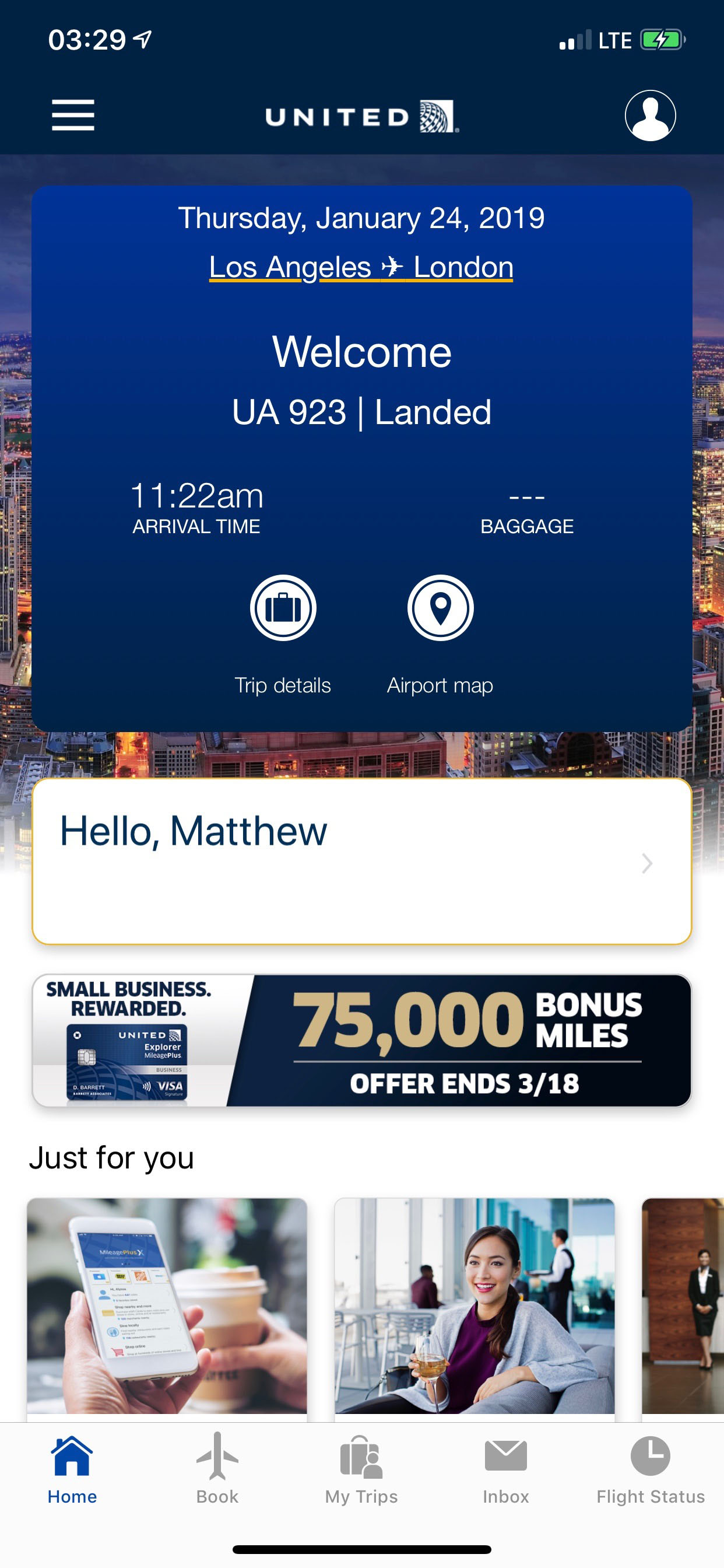
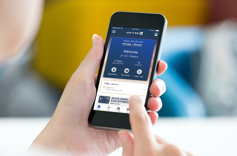
But, much to my relief the new version of the app is just fine. The “classic” home interface has been replaced by a new homepage with a picture of Chicago, a small box with my status and mileage balance, a banner of United ads toward the bottom, and a number of tabs on the bottom.
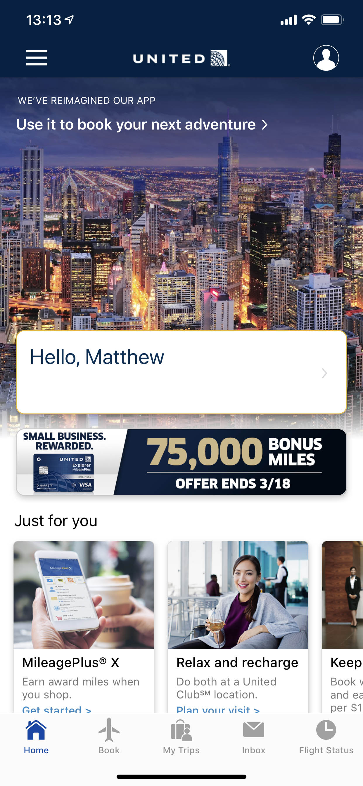
The flight booking, check-in, and flight status features are virtually unchanged. I am glad about that, because these remain highly functional.
A More Dynamic Experience
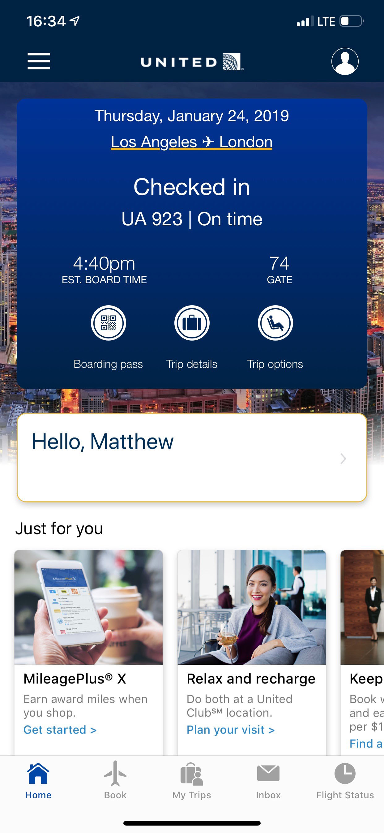
I found out what really changed when I checked in for my flight to London, yesterday. The boarding pass popped up right on my homepage with gate and boarding time information.
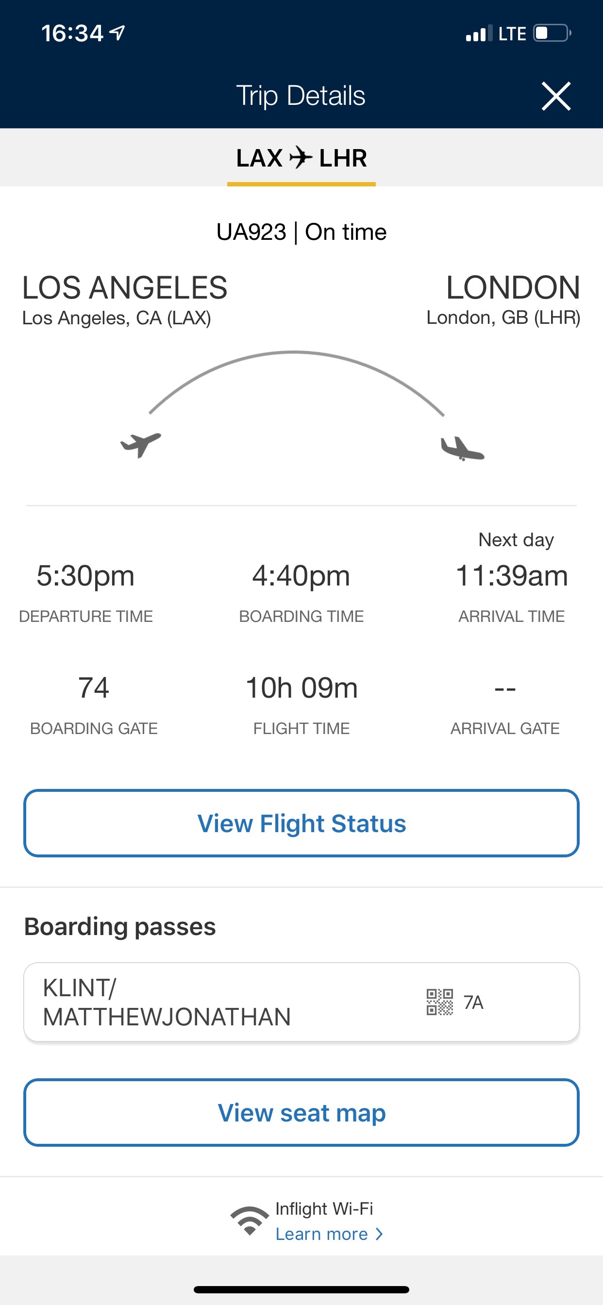
Clicking on “flight details” displayed more details about the flight.
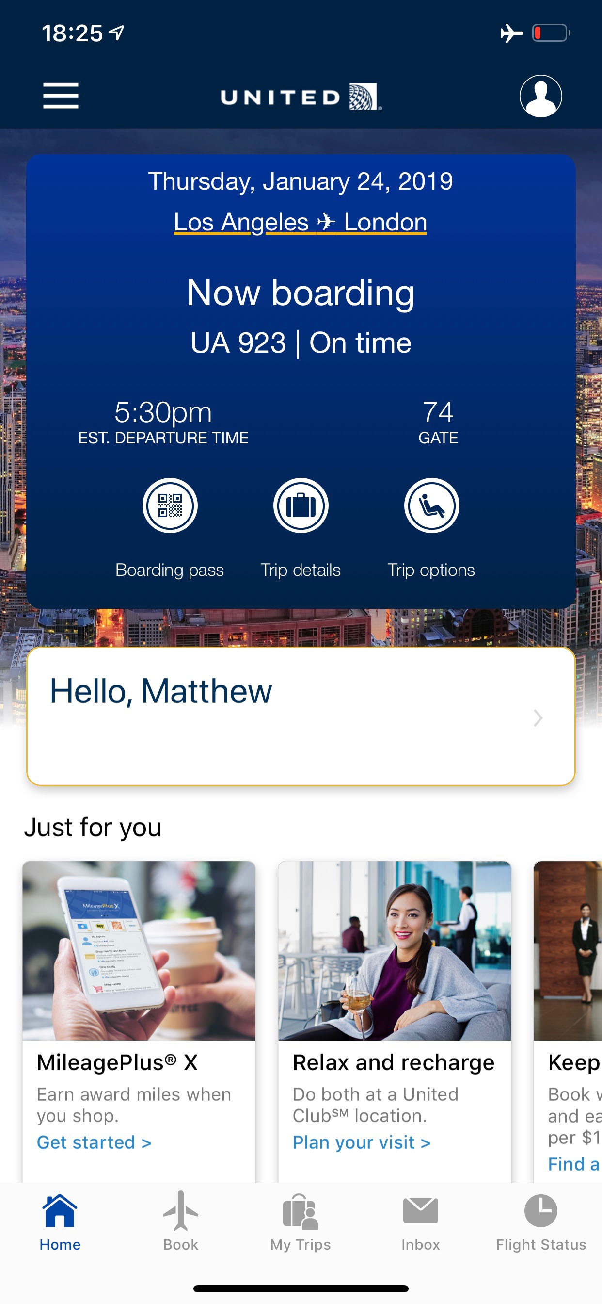
When it came time to board, the app prompted me that it was time to board.
Once in the air, the homepage displayed the updated arrival time as well as streaming in-flight entertainment options.

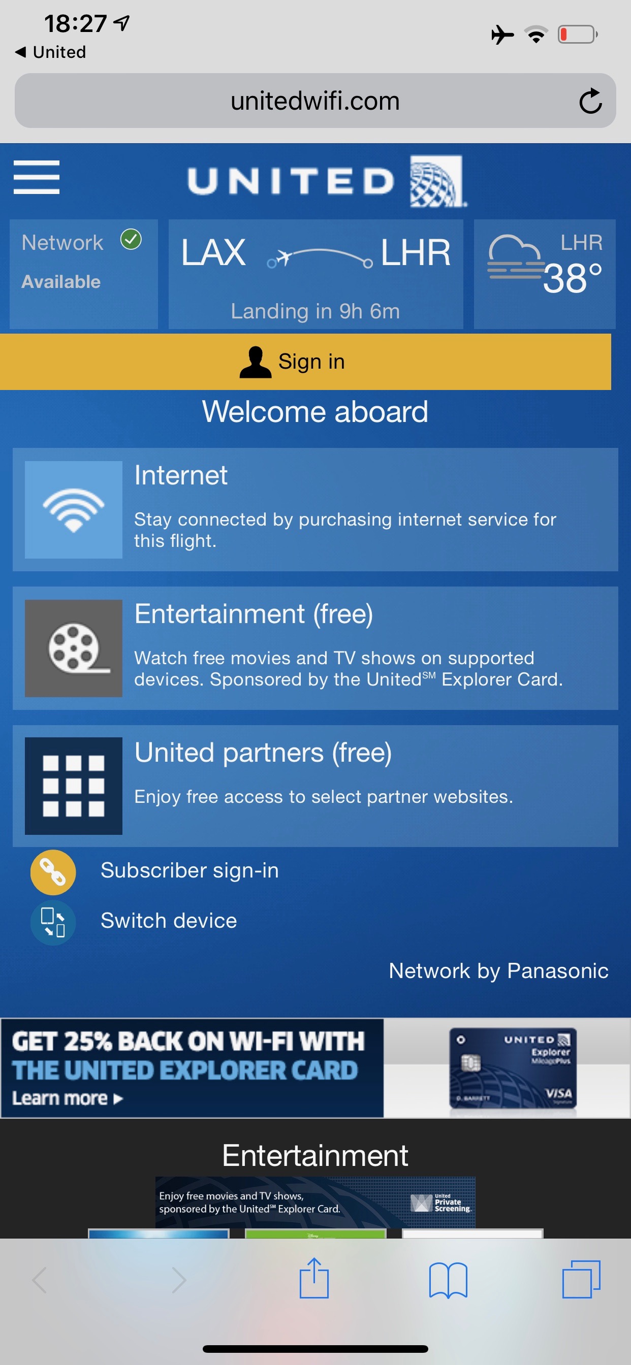
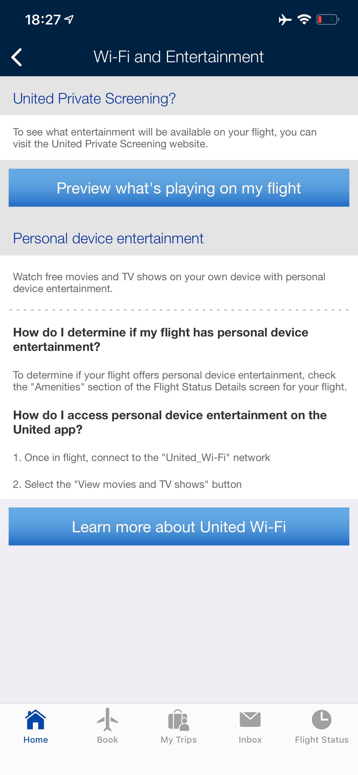

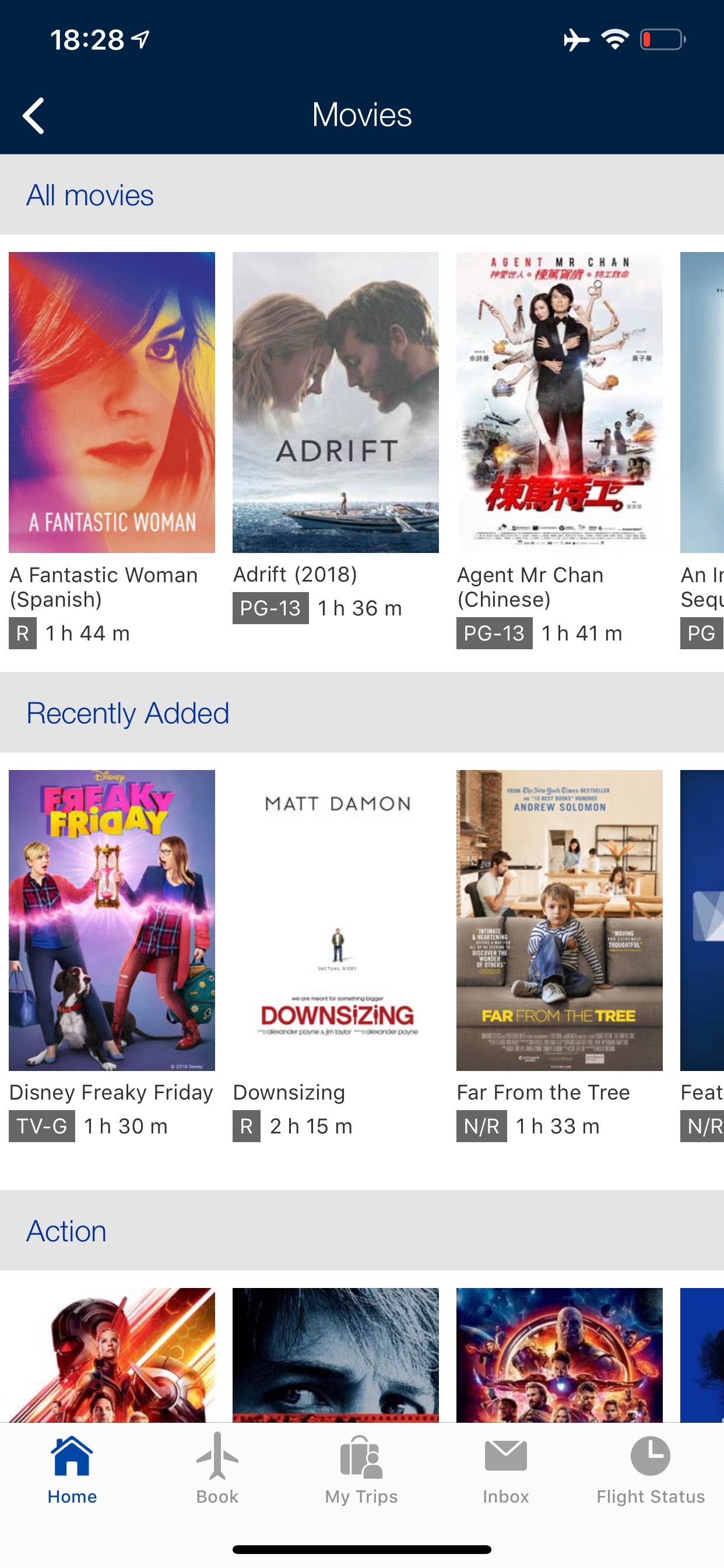
I did not have a connecting flight on the same itinerary, but the app is also supposed to guide you to your connecting gate, if needed. It did let me know when we landed.
You can check out a brief video touring the new app below.
Our improved app is landing soon. Take a sneak peek with United Chief Digital Officer, Linda Jojo, and @thepointsguy: https://t.co/RyYG4Okd3i pic.twitter.com/u4BwQsn7AK
— United Airlines (@united) January 8, 2019
Linda Jojo, Executive Vice President for Technology and Chief Digital Officer, said:
As we continue to improve the customer experience, we are looking at our digital channels to create better experiences for our customers. We are reimagining the United app and giving our customers a more dynamic experience to make managing their travel seamless. The improved app includes several new useful enhancements while keeping the same features our customers know and love from the previous version of the United app.
CONCLUSION
I am happy to report that United hasn’t ruined their app. That’s all I wanted, so I’m satisfied. If you’re a regular user of the United app, version 3.0 will take some getting used to. Let’s hope United continues to improve it.




The front screen picture changes everytime you go in the app. I just got one of (what I assume is) Tahiti
Mine always stays the same.
I like the fact it tells you when to board. Annoying to have to continually check the board.
Wish it sorted cheapest mileage redemptions for a destination (rather than having to scroll to the bottom).
One of the best features of United’s app has been the ability to see the seat map, which includes how many seats available, upgrade lists etc. Has that changed? I hate AA’s app which includes the upgrade list for maybe an hour or so on its app then disappears. I hope they haven’t ruined that experience.
I like the new app. I think they did a good job of predicting what parts of the app I would need to use a different times during travel. There are some functions I wish they would have added, like being able to do mileage and GPU/RPU upgrades through the app, but something tells me I would be complaining more about the unintended errors that would occur in trying to program too much into the app.
Why should we be happy about giant banner ads and marketing invading the home screen? Functionality improvement is minimal but marketing financial products or ways to spend miles has been greatly enhanced for the worse.
I feel the same as Alex. The home screen is full of marketing that I neither use nor want. The important parts of the app have been moved to the bottom and the swipe across feature has been removed. I use the app almost weekly for my flights. The “just for you” section needs to be able to be adjusted to be “just for me”. Let me pick what I want to see down there.
I used the new app yesterday. I give it D because the back tracking system totally failed. I was in first on the flight so I was at baggage before bags arrived at the carousel before bags arrived. After waiting 45 minutes, and the system saying my bag was at the carousel, the bags stopped coming without my priority bag being delivered. Big fail in the data to the app. As far as I can tell the new app does not do anything better so it is kind of a case of a dog chasing its tail.
Talk about heavy cognitive load on the home screen. I was hoping for a bit more of a forward thinking and radical change. Instead this feels like an app from 2013.
I don’t disagree. I was just afraid United was going to ruin it like they have ruined the website. The award search (especially change) function is totally broken. The new desktop site is a piece of crap. I don’t like the ads, but at least the app is also not a piece of crap.
Every review in Play Store says the new United App is a disaster. Just like the old app.
One Star.
I downloaded it on Android. Complete piece of garbage. Would not even scan my machine readable UK passport. Waste of time. I won’t be downloading anything from them again.