United Airlines will reveal an “evolution” to its livery on Wednesday morning in Chicago. Leading up to that event, the carrier has offered us a couple more clues of what we may expect.
Take a look at the video below.
A new look is getting ready to take flight. pic.twitter.com/yHknAh0CPD
— United Airlines (@united) April 19, 2019
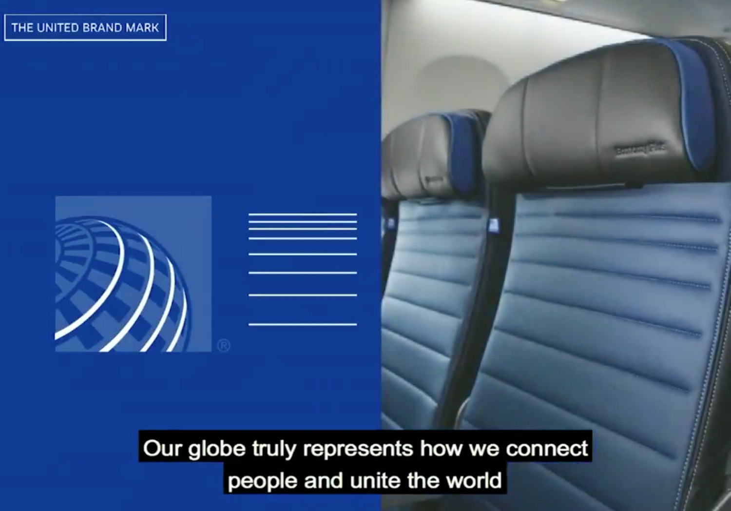
A few takeaways. First, there is no way the globe is going anwyhere. The video includes this line:
Our globe truly represents how we connect people and unite the world.
Notice that the gold has been removed, creating a simpler blue and white globe. This is the likely evolution.
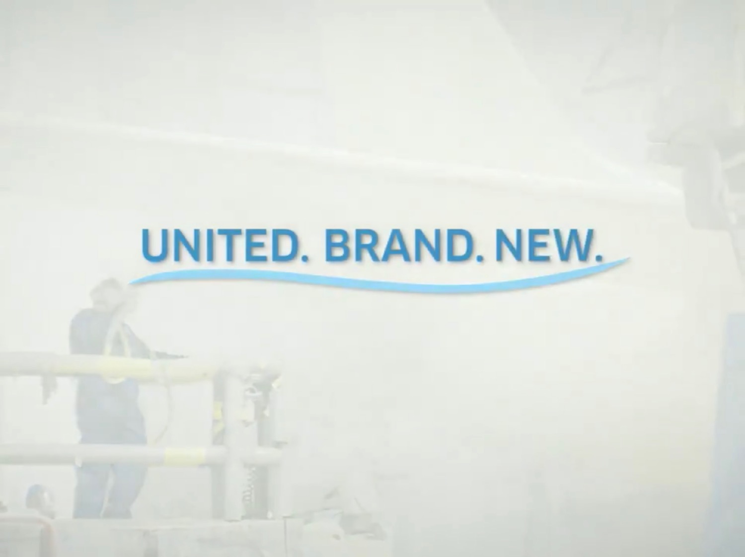
Second, the blue stripe that appears twice in the video is likely an indicator of what we can expect on the new livery. The 787 currently has a gold swoop…look for a blue swoop across the fleet.
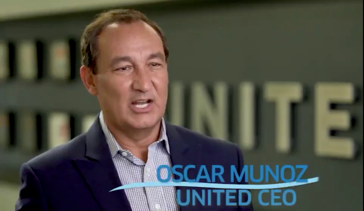

Finally, there is the mysterious purple. We see purple added as part of the flight attendant uniform and the Premium Plus (economy plus) seating. Will that play a role in the exterior livery? If so, how?


CONCLUSION
My prediction is simple. A new stylized globe in blue and white, larger UNITED print (perhpas a slightly different font), and a blue swoop. Perhpas some purple around the wings.
How do you picture the new United livery?
> Read More: Do New United Airlines Mobile Boarding Pass Colors Offer A Hint On New Livery?
> Read More: United Denies Link To Leaked Livery
Arriving 4.24.19 pic.twitter.com/yJro6yYoeQ
— United Airlines (@united) April 16, 2019


They should stop spending money on useless stuff like this and actually get the real Polaris product in all the planes and fix their service issues before throwing money out on a new logo! Like any consumer cares about the logo on a plane or seat…just give me the upgrades you’ve been promising for years already!
Planes need to be repainted every 10 odd years anyways. It’s almost standard airline SOP to take advantage of that event for PR purposes.
Sorry, Matthew, no offense, but I gotta agree with Christian… lipstick on a “Polaris” pig (given the continuous service/inflight amenities/food reductions since inception)..
The blue swoop reminds me of toothpaste…
Just bring back the tulip. Any color. 1970’s. 1990’s. 2000’s blue.
agreed. ditch the clipart globe. just signals a regional IAH/CLE airline.
.. maybe it is just me, but the Star Wars special paint job (12-Apr) felt like an announcement that was supposed to be just AFTER the big-reveal and just a special “version.”
If the new livery does not involve the tulip, it’s not United, and they should just call the airline “Continental.”
United posted another video about repainting their aircraft on their twitter. In that video, if you look close enough, you can see a diagram of a United aircraft in the new livery, but only the tail section. The tail seems to be the same as the tail now, except that the gold got replaced with white.
Here’s the link:
https://twitter.com/united/status/1120343847215693824
looks like cheap marine industry products