It probably was not as planned, but United Airlines has officially revealed the next phase of its livery.
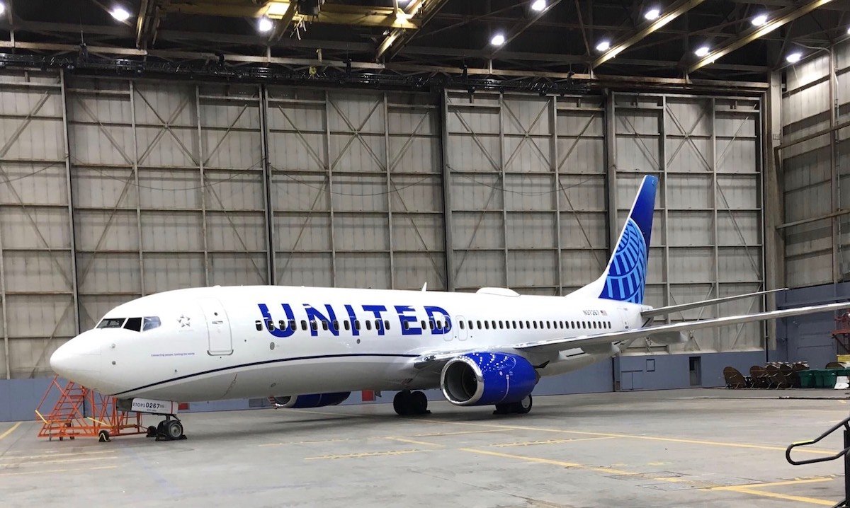
The photo above leaked yesterday evening, a half-day ahead of the planned reveal ceremony today in Chicago. After the leak, United released the following video on Twitter, thereby confirming the new livery:
Our next livery has been cleared for takeoff. Stay tuned right here for more from our celebration in Chicago tomorrow! pic.twitter.com/n4CJrAJERG
— United Airlines (@united) April 24, 2019
“United” is larger, the underbelly is gray, a new slogan and blue “swoop” or “swish” has been added, gold has been replaced by blue in the tail globe logo, and the winglets are blue.
Notice that the photo above does not depict the winglets/scimitars, but the video shows they will be a mix of purple and blue. United will hold a special ceremony to formally reveal the new livery at noon CT today in Chicago.
“Worldwide Service” may be gone, but in a nod to that pre-merger slogan, a new slogan appears on the new livery:
Connecting People. Uniting The World.
My Thoughts On New Livery
With all the clues that have come forward in the preceding weeks, the new livery was not exactly climatic. Still, I love the slogan on the side of the aircraft. I also appreciate that the all-blue tail at least feels a bit more like the legacy United logo (not the tulip, just the color). The return of the gray color to the underbelly of the plane is an interesting choice. I’d argue that gray looked more dated than gold, but what do I know?
While I am no fan of the globe, I do not believe that it is so wedded to Continental and Jeff Smisek so as to render it toxic. I do still believe that it looks dated and like a bingo cage or golf ball (though less so now that the gold is gone).
All in all, the “evolution” of the livery was as expected. I expect to quickly get used to it.
CONCLUSION
As I said when United first revealed it will introduce a new livery, its focus should be on what happens inside the plane, not the exterior paint job. But since much of the fleet was due for a new paint job anyway, the new livery made sense.
Let us hope that United uses this new exterior livery and new uniforms as a chance to put on display better service onboard for all passengers.


so they functionally copy Delta, and visually copy JetBlue? lmao, talk about an airline with an identity crisis
Long live the Death Star!
Can someone post a photo of the old next to the new? I am seriously not seeing much of a difference. Or maybe the old one was so unmemorable?
From exteriors to interiors: ANA reveals the A380 cabins:
https://www.flightglobal.com/news/articles/pictures-ana-reveals-new-a380-interior-457650/
To any company Logo is everything. So on that note, Continental lives on.
…Ugh, still that Continental globe. United truly looks like their post-merger (Continental) mindset – Cheap and ugly, from uniforms to their computer systems to their whole way of doing business with the passengers (we can’t/ we don’t, etc). Once the window shades are pulled down, the (unnecessary) oversized font will look like a jumbled mess. Thanks United, how about thinking out of the box for a change instead of warmed-up leftovers.