I have been writing about United Airlines for over 16 years on Live And Let’s Fly. Over that time, I have seen the airline at its best, at its worst, and in long stretches where complexity seemed to overwhelm common sense. One thing United has drastically improved on in the last several years is its technology. Empowering passengers with more real-time data and information is inherently helpful in building trust and United deserve great credit for what it has become, especially for those who remember what it was. But a new fan-built United Airlines operations dashboard called The Blue Board takes this to the next level…a true work of devotion.
So Cool: A Fan-Built United Airlines Operations Dashboard
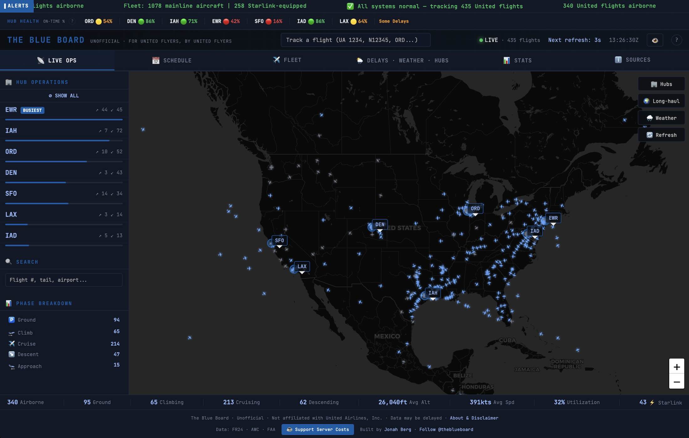
The dashboard, built by a dedicated United Airlines enthusiast named Jonah Berg, pulls together publicly available United flight and operations data into a single, easy-to-read interface. Anyone can use it. There is no login, no insider access, and no need to stitch together multiple flight tracking tools to understand what United is actually doing at any given moment.
Berg calls it a “real-time command center for United flights” and includes;
- Live Map
See where every United flight is right now — updated every 30 seconds - Delays & Disruptions
Know before the app does — hub delays, cancellations, and ground stops at a glance - Schedules
Departures & arrivals at all 7 hubs with on-time stats and equipment swap alerts - Weather & Hub Status
Conditions at every hub airport — radar, visibility, wind, and how it’s affecting flights - Fleet & WiFi
Check if your plane has Starlink WiFi, seat config, and aircraft details - Stats
Fleet utilization, route patterns, and network health — the truly nerdy stuff
United has many cool tools, but nothing this cool…and all consolidated into one place.
Of course, this dashboard does not solve operational problems. It does not prevent delays, cancellations, or crew shortages. But if it works as promised, it will reduce uncertainty. It gives travelers and observers a clearer picture of what is happening in real time without having to guess which data source is correct.
For an airline that prides itself on technology leadership, it is notable that a private individual was able to build something this useful using only publicly accessible data.
What I love about this tool is that everything is in one place and it is easy to use:
- Flight activity is easy to scan without clicking through multiple menus
- Delays and disruptions are visible across the system, not just flight by flight
- The interface avoids clutter and focuses on operational reality
- It works equally well for casual users and aviation obsessives
It looks old school and for those of us who remember tools like United Connection, the old ITA Matrix, KVS Tool, or other defunct “nerdy” airline tools, this looks to be in the same tradition.
Hopefully United Will Embrace This, Not Fight It!
United can react in many ways. It can try to shut it down like Air Canada tried to shut down Seats.Aero, or it can actually give Berg a call and hire him as an IT consultant…or perhaps just promote this tool and broadcast it to customers.
Airlines increasingly rely on technology to manage operations, sell products, and communicate with customers. Making operational data more accessible and understandable is not a threat. It is an opportunity to reduce confusion, lower support costs, and improve the customer experience during disruptions…Berg has done great work on behalf of United and it makes me smile to see such a cool tool like this.
You can check it out here.
Hat Tip: FlyerTalk


Hello,
I really like your work. Can you double check the link as it is not working.
Thanks
Click on the “live” tab.
https://theblueboard.co/#live
The work that Mr. Berg did is impressive. If it were offered only as a paywall type thing, I would pay!
All kudos goes to Jonah Berg!
If only every airline had a superfan as talented as Jonah Berg!
This is amazing. UA should consider the path of least resistance and just hire him with a buyout of what he did to integrate it into the United App.
Outstanding! This site is both entertaining and useful.
Tim, can you get us one for Delta, please?
This is cool. Yes, ideally it is embraced. Other airlines should follow. C’mon Tim!
Why would United embrace something like this or hire the developer? As a UAL retiree, I can tell you United already has something similar but already far more advanced.
Of course, in terms of its own system. I’ve seen it in control towers and ops center. But this is so cool as a customer-facing tool.
United tends to embrace technology like this that creates an enhanced customer experience so don’t be surprised as they no doubt reach out to the creator privately. They tend to be very forward thinking.