.bomb is an affectionate term for United Airlines’ website given by its frequent flyers. Why .bomb? Because for years–probably as far back as United has had a website, numerous technological issues have persited that cause the website to bomb out by giving lengthy error messages, randomly reverting to the home page, or simply freezing.
UA recently redesigned their Mileage Plus website and heralded it as vastly improved and much more user-friendly than the previous version. I actually prefer the old MP website better, but the enhanced  website includes a few appreciated new features, like the ability to search for award travel on US Airways and Continental as well as United.
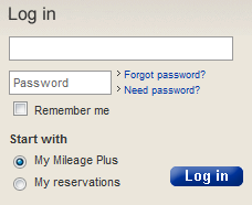
But problems persist. I can’t figure out why UA spent so much essentially giving the Mileage Plus website a cosmetic facelift, but failed to fix the little bugs that I have to deal with every day on United’s main website. In fact, there is a new bug now when I try to log on to my Mileage Plus account. On the united.com homepage, after inputting my login information and requsting to view “My Mileage Plus” I am taken to this page:

When I click on “My reservations” I get my reservation list…sometimes. Don’t bother storing your account information because if you navigate away from the page and want to return, you are greeted with this message, which requires you to log off and log back on:

The second problem has been around for at least a year. Why UA’s crack web support team cannot figure it out is beyond me. Or maybe not.
United.com is still functional, but it continues to be a pain in the rear to use. Is it too much to ask to fix the problems highlighted above?


It is not too much to ask from a company that tries to push everything they can to the website. However, I think they figure that people have learned how to deal with many of the existing “features” and are using their limited IT capacity to add new features rather than deal with the hassles of fixing their platform which people have used for years, since to do so would prevent anything new being added until well past the merger is completed.
Speaking as a computer programmer, non-techie people usually think that changing the look of the user interface is a huge deal, but the reality is that a seemingly simple back-end (behind the scenes) change is usually much more difficult and time consuming. I think UA just wanted a little wow factor with some new graphics and fonts that is fairly easy and cheap to do.
I think the award search thingy was an attempt to throw us a bone after ANA cut us off.
If UA/CO are smart, the CO IT infrastructure will survive the merger (probably with new enhancements which I bet are well in the works by now under the weak guise that they are an “upgrade” to the CO systems that will work whether there is a merger or not)
many of the new features bring the UA site things that the CO site already has. This is similar to UA serving our cookies on napkins now which CO has been doing for a long time. CO does fold them more elaborately though, and they seem to have 4 different kinds of cookies that “rotate” somehow. My point is that this is just more “aligning” so that we don’t get such a huge shock all at once after the merger is finalized. I would argue that mobile boarding pass is another example.
As far as further back-end development on UAs current website goes… I think all of that was over about the same time that UA suddenly stopped repainting aircraft that have the old grey livery.
LOL…you guys should try DER BOMB (unitedairlines.de) or LA BOMB (united.fr)…error messages in English 🙂
@mowogo: Good point. I doubt we’ll see any major changes till after the merger.
@HunterSFO: Good analysis. I hadn’t even thought about the cookies on napkins aligning with CO.
@sindjic: LOL.