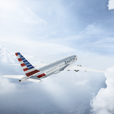
 American Airlines rolled out a new logo and aircraft livery today. No one asked me for my opinion, but I’ll weigh in just the same.
First, you know I prefer the status quo when it comes to many things, including airline logos. I voiced my dismay over United Airlines’ bingo-cage-1992-circa “Continental” logo after the merger was announced and although I have become accustomed to it, I still do not like it. It displays an utter lack of imagination to me, though it does fit the carrier’s hoary persona.
But I like the new American logo. I liked the old one just fine and would never have changed it, but the new logo is sleek and attractive.
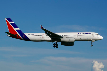
But the livery…come on American! Surely you could have done better than copy Cubana, the Cuban national carrier.


I loved the silver finish and simple American Airlines’ logo that had not changed in 30-years. Coming out of bankruptcy with brand new aircraft, I can understand that American might want to freshen up a bit, but the new paint job really is a let-down. Air France, Transaero , and the aforementioned Cubana already have very similar paint schemes. Why not something a little more unique and a little more classy?
Oh well, I’m sure I’ll get used to it. Maybe one day when the silly Cuban embargo has been lifted by the United States, AA will partner up with Cubana and the eerily similar liveries can be touted as having been foreordained.


I actually think they copied Colgan
http://www.flickr.com/photos/dcaspotter/5244821788/
What a mistake! Going from distinctive, traditional livery and logo to homogenized and anonymous in one step! They would have done better by going back to the original orange lightning bolt design, to convey a return to traditional values and level of service. (Oh, wait – that doesn’t exist anymore, does it?)