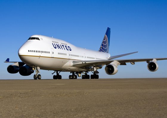
Fresh out of the paint shop, United’s first repainted 747-400, N127UA, is heading for San Francisco then on to Incheon tomorrow morning on Flight 893 at 11:05a.

Photo by: Jon Ostrower
The new livery is starting to grow on me, but I still miss the tulip. Very much.


IMHO, there is too much empty space on the fuselage. With the old livery, the blue stripes running down the side really let you tell the 744 from other airlines with boring liveries..
The tulip will always be missed, and this clip-art can not replace it.
It is boring, and yet in its simplicity it presents a little more upscale image. Now if only they could really make the interior product more upscale to go with the exterior 😉
Yawn
All the decades of hardwork for a worldwide brand recognition as strong as the pre-merger United was reduced to this… What a shame…
I very much like the incorporation of the CO logo on the tail – there should be a bit more on the main fuselage – but paint costs $ to apply and adds weight to the craft and that causes drag and extra fuel costs. Just hope the cabins are treated as well.
Unfortunately, the old United logo is affiliated with a recently bankrupt airline with very outdated cabin conditions and horrible customer service. The new logo reflects Continental’s take over of the operations of this crummy airline. . .if anything, I hope this merger doesn’t affect us who love flying Continental. . .it’s the Rolls-Royce of US airlines, without question.
Always avoid United Bad service and attitude. Continental always has well trained personnel.
Many trips to Hawaii. Continental was always the best. Pan Am was also on top of their game. Except purchasing National Airlines.