UPDATE: United Denies Link To Leaked Livery
Perhaps deliberately, perhaps accidentally, it does appear we now have a very good idea of the next-generation United livery will resemble.
Yesterday I wrote about a quartet of livery designs that suddenly appeared on the website of San Francisco design firm David Scott Design Office. While I found it curious that a United client would have the right to display such work before United made it public, it still leaves us guessing…to an extent.
I suppose we can approach this news in two ways. On the one hand, we can complain about how uninspired all four new logos are. We can mock the purple hue and scoff that the “globe” logo has gone from a bingo cage to a golf ball. But what good would that do?
We knew United was going to emphasize its new purple color. We also knew that United is moving away from gold. Finally, we knew that United wanted a simplified livery that represented evolution, not revolution.
So it is what it is. The tulip is not coming back, at least for now. We’re also not going to see a brand new design. Just in case the decision has not been made yet, let’s give United some constructive criticism on the new logo.
First, use the comment section below to vote on your preferred livery; A, B, C, or D.
Second, if you do have some areas you think can be improved, chime in under your vote.
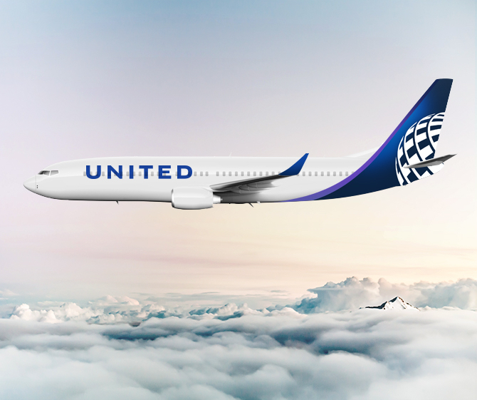
A.)

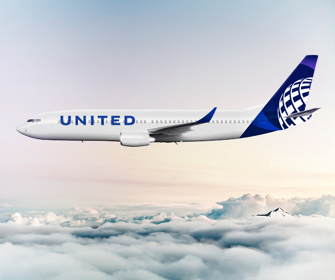
B.)
C.)
D.)
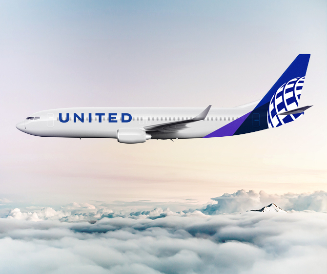
My vote is for B, though it was close between B and D. I think the curved lines look sleeker. While I think gold would look better than purple, the livery is not objectionable.
If I could change one thing, it would simply be a small statement under the flight deck window:
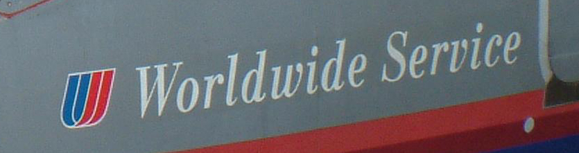
Again, I don’t mean the tulip. But returning “Worldwide Service” to the side of each plane would be a small nod to United’s past.
Which livery do you vote for? Please leave a comment below.


I vote for B
I would vote for B or C. A is by far my least favorite. It will be interesting to see what it looks like on an actual plane, but I think I so far prefer the old livery to all these designs
The purple trim is barely noticeable on these photos against the deep blue. I hope it shows up better on the actual livery. Provided it is, I vote B. Also, I personally like the stars they use in Polaris branding. It would be nice to see the globe icon switched out for those.
B then A. The different angles in D isn’t visually pleasing, it looks like a mistake.
I don’t know what the fuss over the globe is. It has to be a “legacy” thing (preference for United tulip) and not an actual design critique. It’s fine.
Is there a difference between a and b? Anywho, my vote goes to c.
I think livery A. should be picked, but I think they should make the globe a come closer to the front of the tail.
I would vote for B, however unfortunately all of these livery are basically what every other airline has recently announced, see LH, EI, QF, etc.
First vote for C, next is B. I agree with Nicholas that the globe needs to move forward on the tail. Matthew makes a great point of adding the Worldwide service to the design.
A.
Add: Worldwide Service under the flight deck windows, no Tulip.
looks almost the same as what they have already???
I guess B, but overall meh. How about a design that doesn’t ape every other airline, ie big color on tail, white everywhere else and big brand name?
The way the golf ball looks when its wrapped around the bottom of the tail, rather just on the main body of the tail, is horrible. The edgy effect isn’t aesthetic. My vote is for none of them..
Yeah, agree 100% – how about “none of the above”!
Seriously, there’s money to burn on those uninspiring, sleepy, snore-fests?!?!
If so, then maybe flyers would be better off flying planes with the current insipid look, and the money saved used for something that might make their flights a little better like a smidgen more row pitch or skipping next year’s hikes in ancillary fees & escalations planned for ever higher fare “fences”.
Better yet, how about being only as terrible as American, and at least allowing Basic Economy flyers to use the overhead bins for a carry on bag?!?!
Anything but these sad looking paint schemes that’s a ringer for Lufthansa’s not very inspiring “new look” or is nominally distinguished from Aer Lingus’ “new look” by the colors used!
Lastly, yes, inclusion of “Worldwide Service” or maybe just adding the decals for that while keeping the existing boring and banal look is the way to go.
But spending money for those four?
That’s just plane crazy!
If they simply must burn money painting planes with a different look, why not do heritage planes featuring the beloved classic liveries of yesteryear on a few of them – and leave the rest as they are until more dynamic and imaginative leaders replace the ones there now that seem to think one of these four “looks” are good?!?!
JMHO.
I would vote for C. I like the curve on “B”, but I like the swirls around the globe a bit better on C.
To clarify a bit further. My ranked choice would be C then B then D then A
I’ll pick B as m first, then C
None of them! You said it correctly, totally uninspired design. The globe has to go.
I do enjoy all the new livery ideas, but can’t help but wonder – they all look like a form of Alaska Airlines, Aer Lingus and Lufthansa …
D though I would make it more curved like B.
None of them are inspiring though. None of them really look beautiful or inspiring.
I don’t like any of them (hate Eurowhite liveries other than the original LH), but I find C least offensive.
How uninspiring to say the least.
A: Too Lufthansa
B: Too Amazon Prime Air meets Alaska
C: Meh
D: Too Atlas Air
So, the best of the uninspiring = C
B 1st choice
D 2nd choice
Without a doubt, “b”. However, replace the “globe” with the “tulip”. What great memories that would bring back.
I am with Rick Banzhoff. “B” with the Tulip . The globe needs to go.
B is best
B for sure! It blends better with the the colors as it merges with the plane.
Of these 4 options, I like B the best.
I wish UA would bring back the tulip. They could do something interesting with the new purple color in the tulip logo
B designs enhances the aerodynamic of the aircraft tail
C
I really miss Bass’ Tulip logo. If these are real designs, I vote for C, but hope they are not real ones.
i vote A but they all look good
Of all the choices, it definitely has to be “B”. The curve is somewhat elegant, but it really could be something a bit prettier and even more elegant. Much too stylized.