Airline liveries have changed over the years and I would argue not in a good way. Yes, there are beautiful liveries today, many in fact. But the move to bland, mostly-white liveries with dull “modern” logos is a sad development. The best historical airline liveries combine simplicity with color and uniqueness.
Today I’ll look back on my 10 favorite historical airline liveries. Next week, I’ll share my favorite current liveries.
#10: Royal Brunei
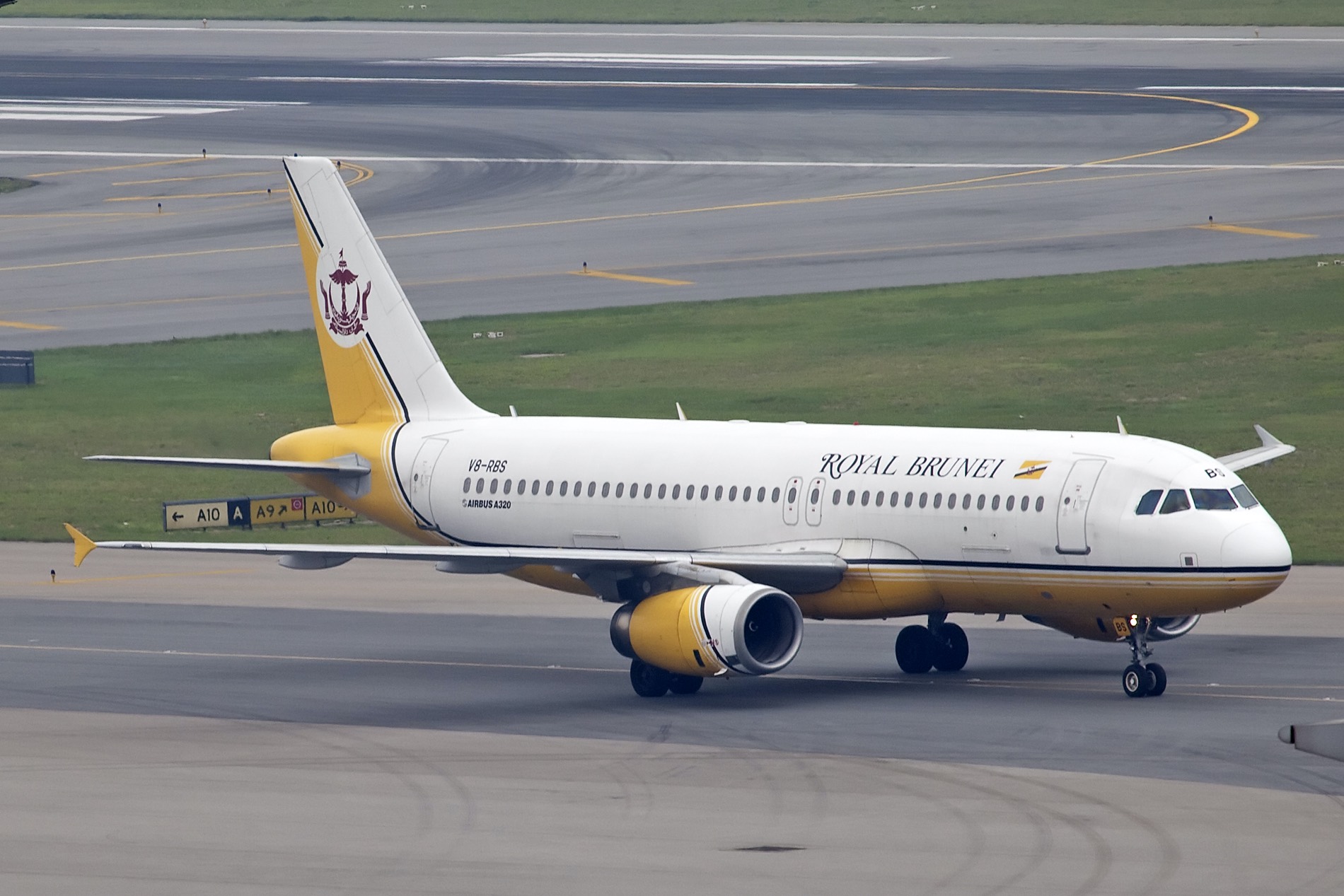
That font. It reminds me of the Charlie Brown specials growing up. I also love the unique yellow color and the distinct logo of Brunei on the tail.
#9 South African Airways
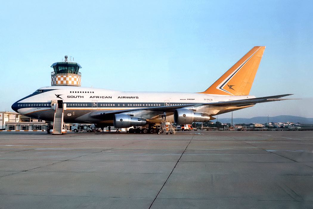
The apartheid-era logo is timeless and I love the orange tail and the cheat lines.
#8 Aer Lingus
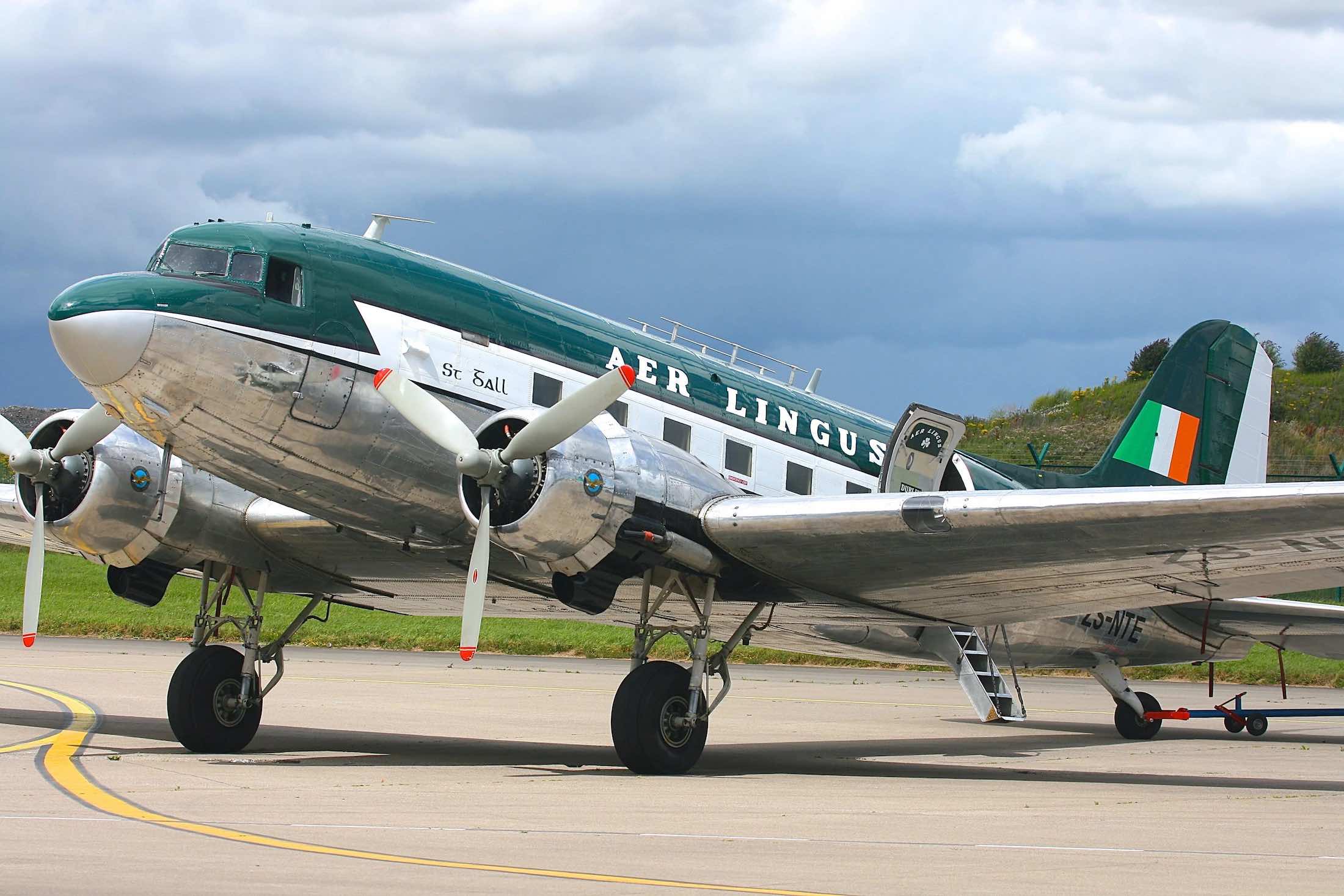
I think the current Aer Lingus logo is so dull and devoid of character compared to this classic livery.
#7: British Airways BOAC
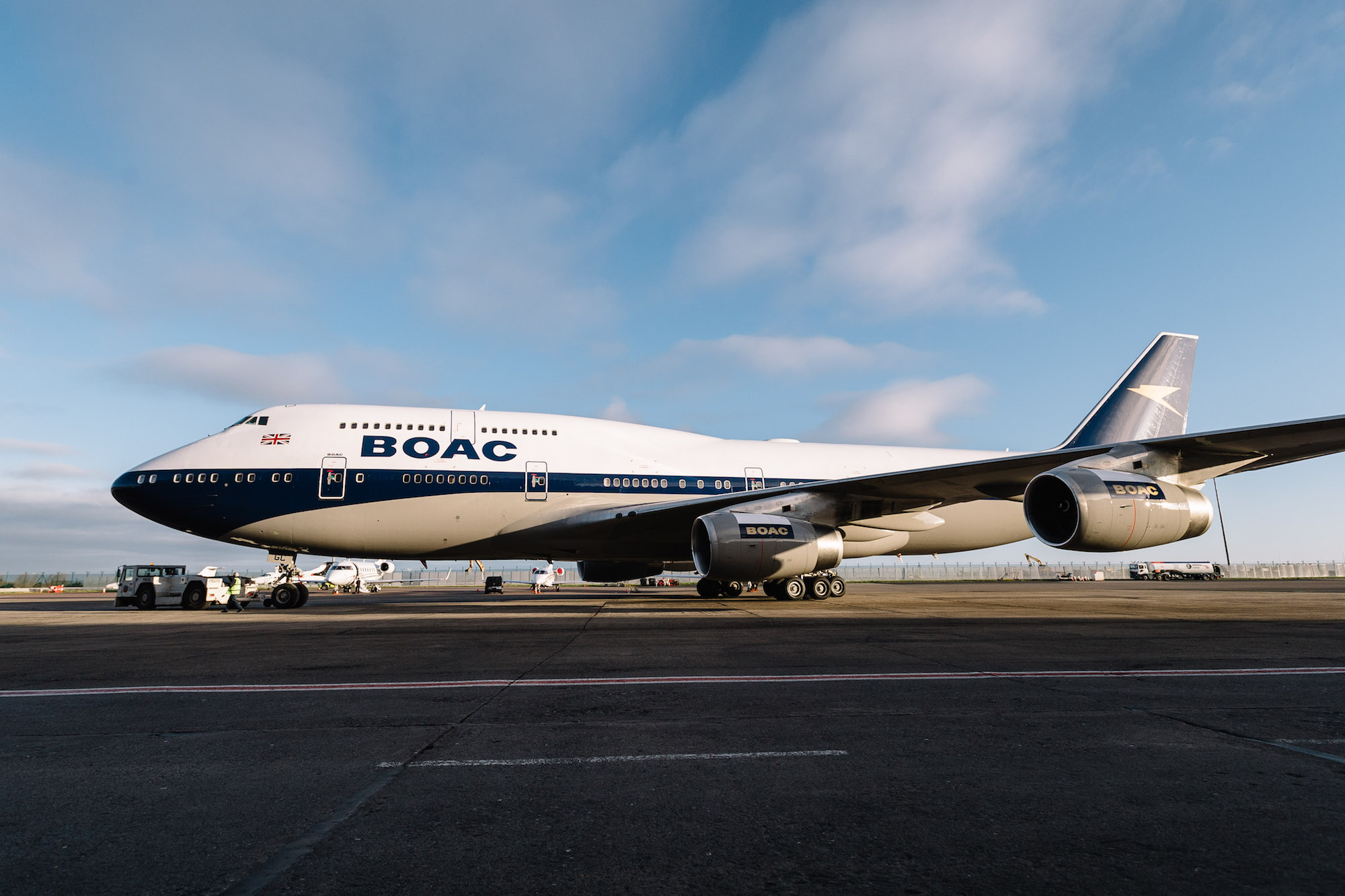
The shade of blue, the tail, the engines…so elegant. BA brought this livery back on one 747-400 for its centennial anniversary and I had the chance to fly it in premium economy class from London to Los Angeles.
#6: Lufthansa
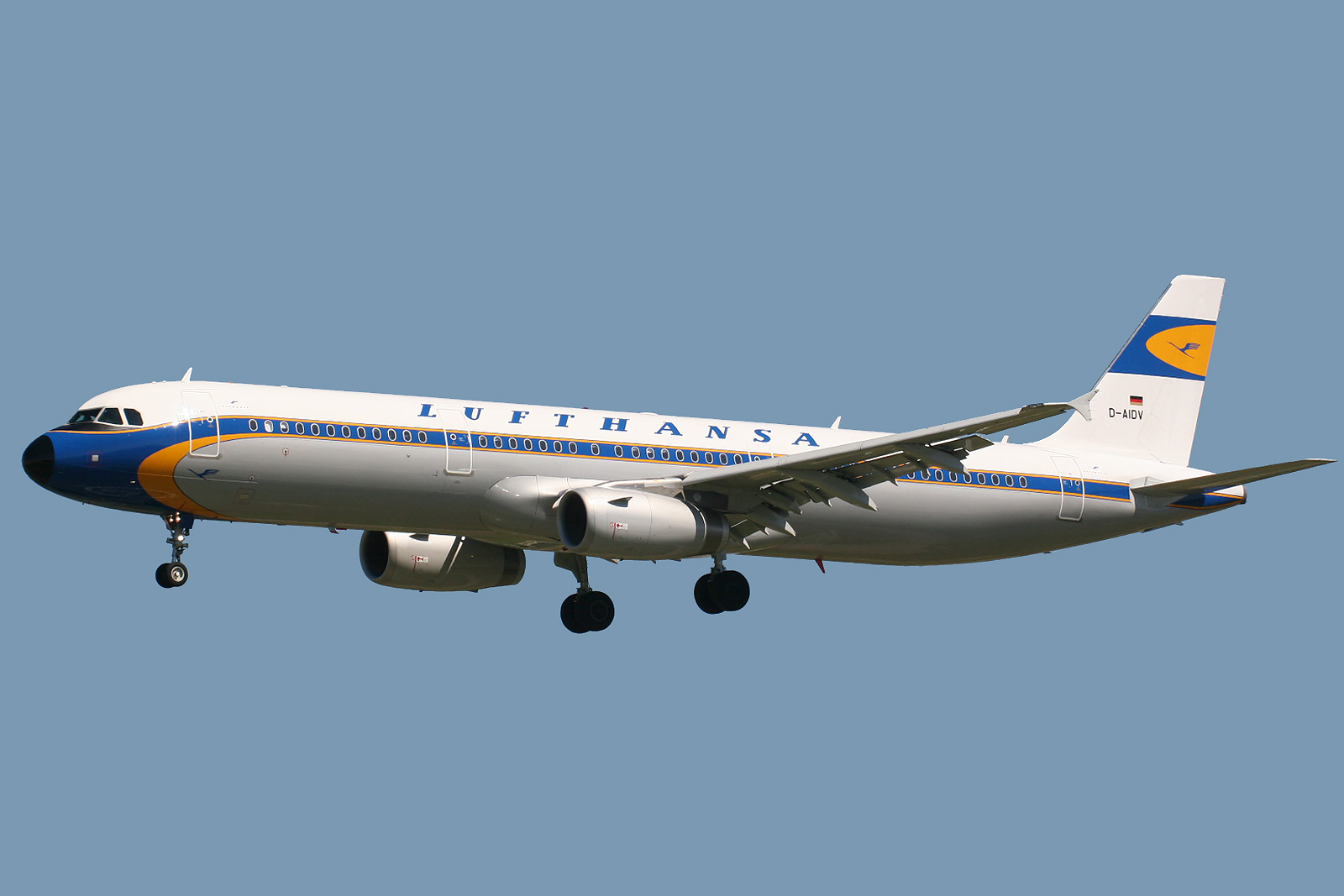
This 1950’s era livery features the classic Lufthansa crane, an attractive blue cheatline, and a great Lufthansa font. You can still catch this livery on a retro-themed A321.
#5: Northwest Airlines
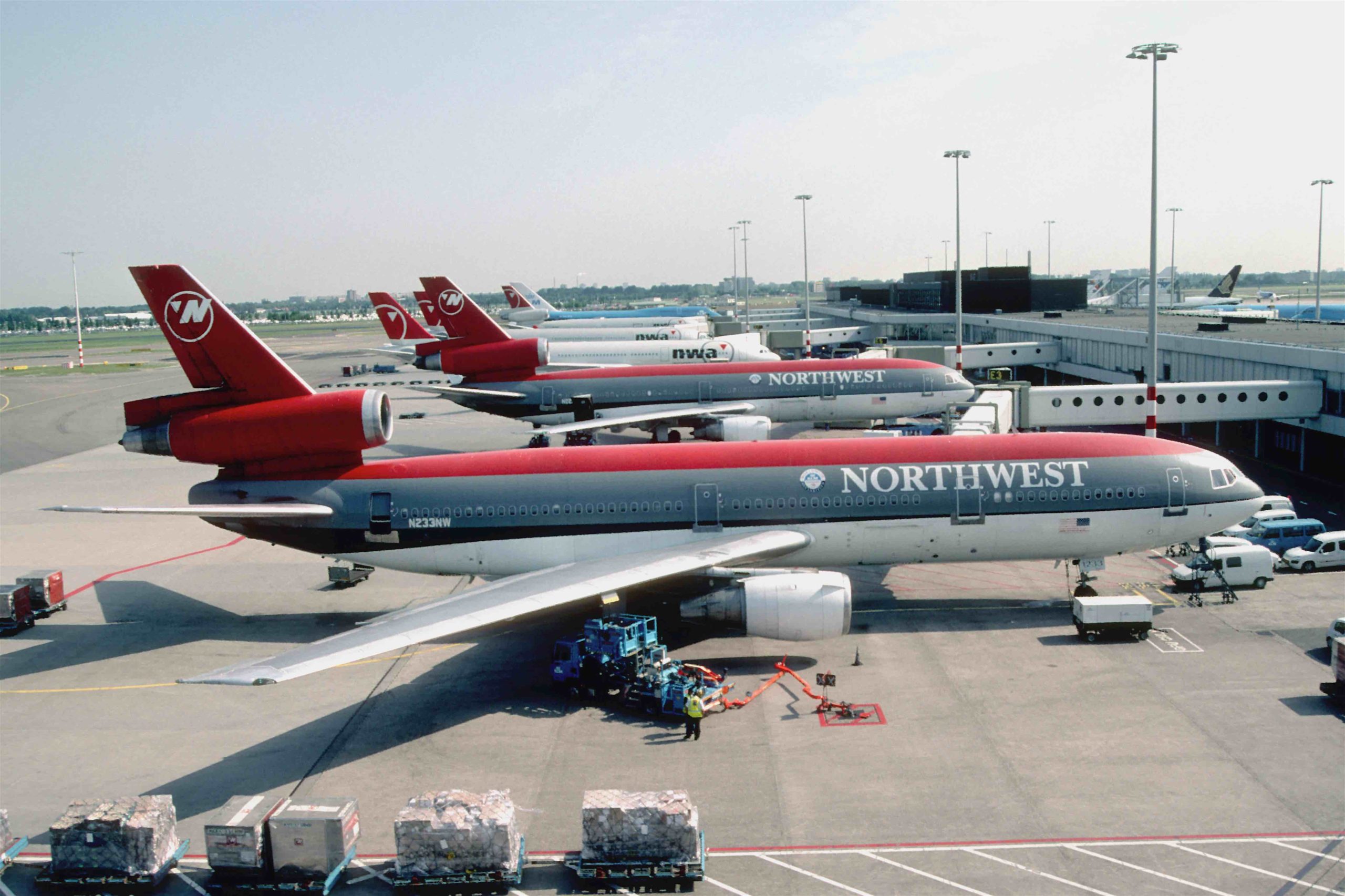
I always loved the second-to-last Northwest livery prior to the Delta merger. The red and gray were distinctive and that logo that formed an N and W through the clever use of a compass pointing northwest always impressed me.
#4: United Airlines
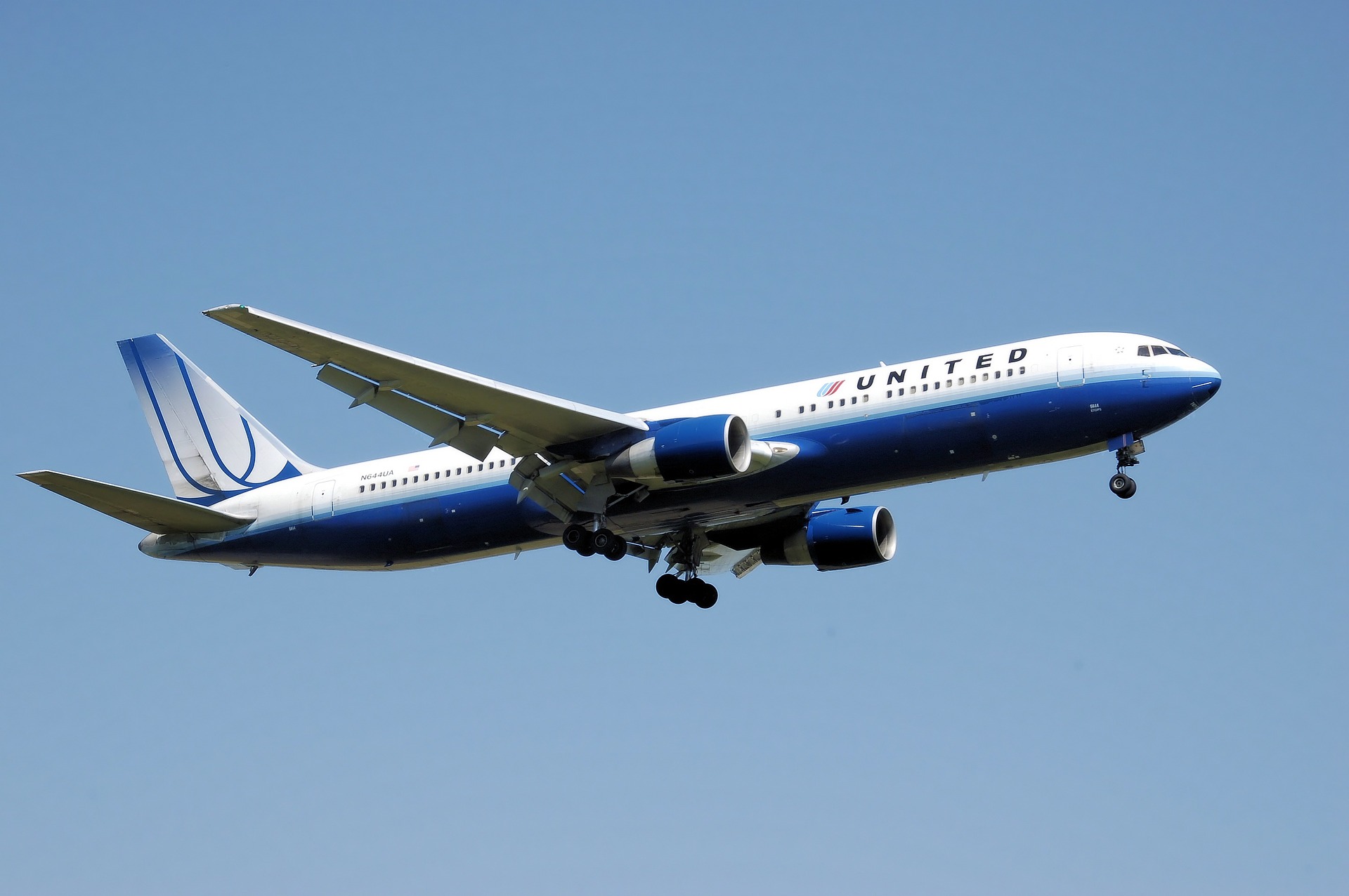
I greatly miss the pre-merger “rising blue” United livery and the tulip. I find it so much more beautiful than the present livery.
#3 Air France
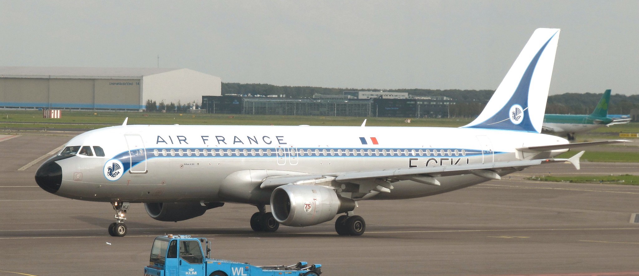
The classic Air France livery featuring the Winged Seahorse is timeless. You can still catch an A321 painted in this retro livery…I’d love to see the entire fleet look like this.
#2: Olympic Airways
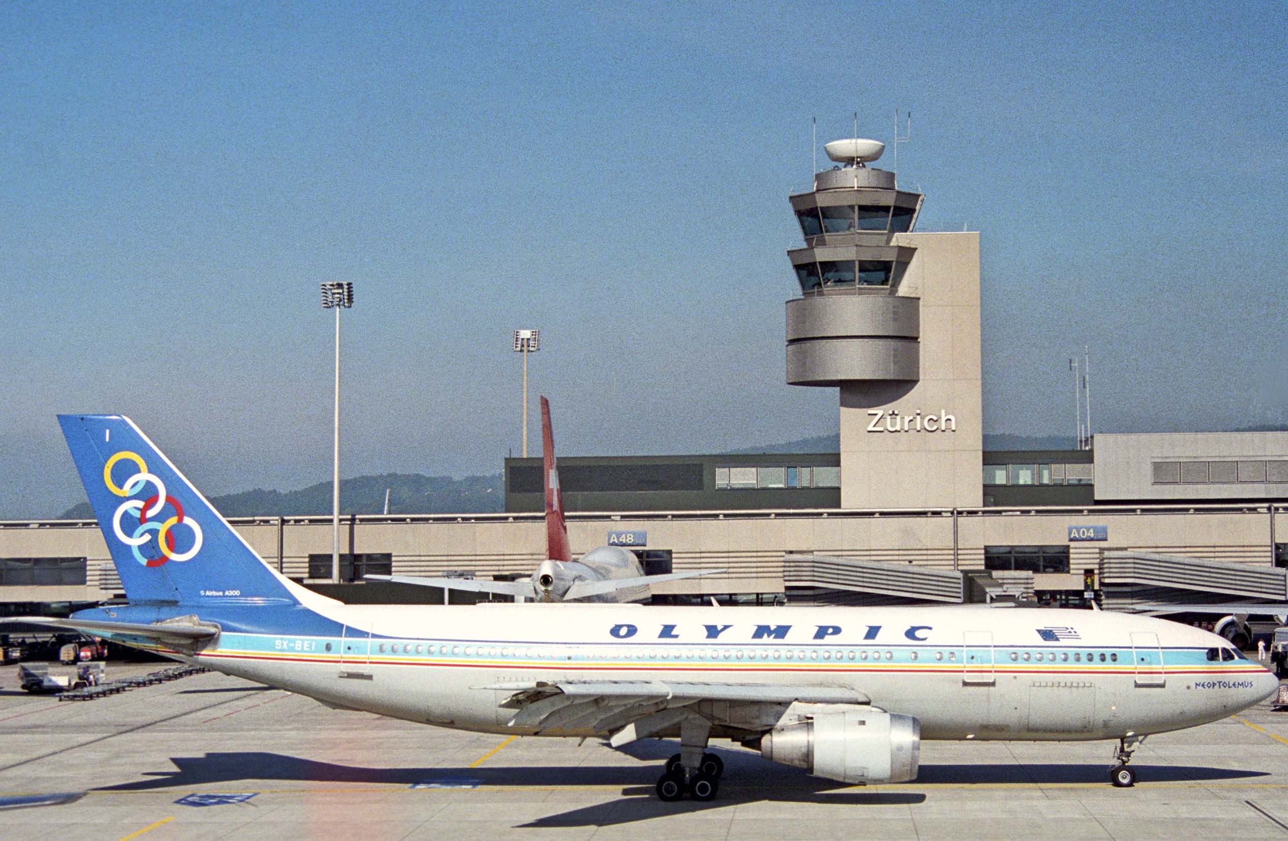
Olympic Airways, the defunct Greek flag carrier (now reborn as Olympic Airlines), maintained its historic livery up until the very end. I love the font, colors, and inverted logo of the Olympic Games, which originated in Olympia, Greece as far back as 776 BC.
#1 TWA
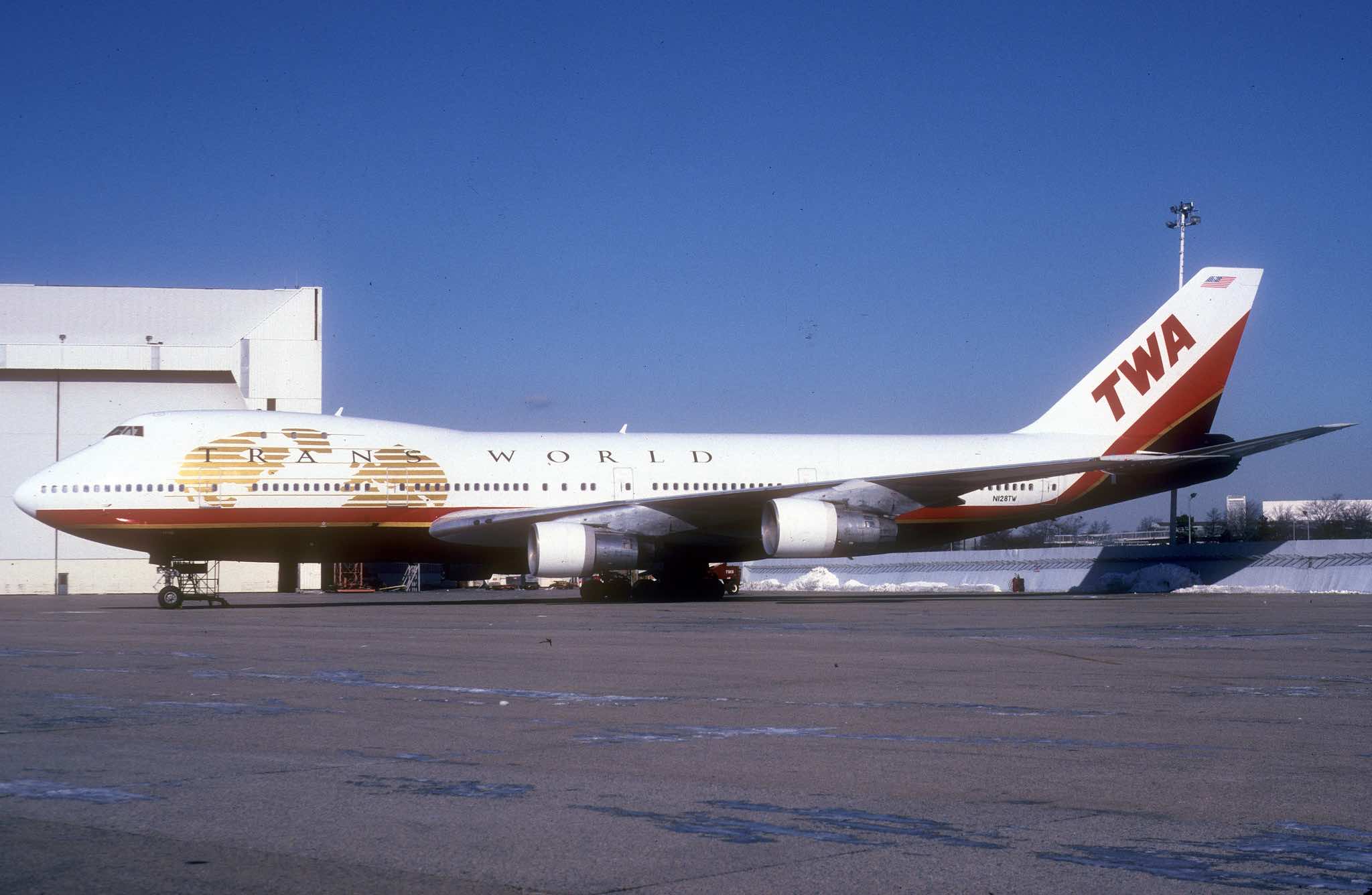
I know many loved the double globe livery (I did too…) but my favorite TWA logo was the final globe logo introduced in September 1995.
CONCLUSION
Compared to the rather dull and unimaginative airline liveries today, I quite miss the era of bold colors and cheat lines. These historical liveries are not just a window to the past, but a reminder of how much the industry has changed.
What is your favorite historic airline livery?


Air France retro livery and the winged seahorse will always be the most iconic to me. And it’s why I collect early original Air France travel posters from the 1930’3-1960’s that represent this. The most brilliant and beautiful designs ever from the romantic age of flying.
That almost made the cut. I too love the AF seahorse.
I agree with you, Stuart. I’m a huge fan of the Air France livery, which in the early 70’s began the whole Euro-white craze, yet manages to still look modern and fresh. The tri-colour stripes on the tail contain just enough white to balance-out the white fuselage. (I only wish marketing hadn’t convinced management to change AIR FRANCE to AIRFRANCE.)
Air France’s prior livery was also very handsome, and dated back to the Constellations! As the decades went by and new aircraft types were introduced, that virtually unchanged livery continued to look good, on the smart little Caravelle (my all-time favorite Air France plane), the 707, 727 and 747.
I respect Air France for honoring their iconic winged seahorse logo; ‘la crevette’ (the shrimp) as it is affectionately called by Air France employees. Last month I flew Paris-Toronto on the A350 and smiled seeing the seahorse emblazoned on the engines and wingtips. Vive l’Air France!
Right? How they emblazon it on the engines is something beautiful when looking outside at 35K feet. It feels like there is history and romance still left in the world.
As a collector, take the time to look at their travel posters from the 1930’s-1960’s. You can spend hours just staring at them. The history is so rich. Pinterest is a good place to see many.
If I could time travel it would be to 1960 and flying on an Air France Caravelle to Dakar. Of course I would have a suite booked at the modernist gem, The Terenga Hotel, upon my arrival.
I wish so much I could have experienced travel then. For now, at least, we have, “la crevette” to remind us to dream.
Happily, I flew many, many Air France Caravelles. Though I never managed to catch the one that spent all day flying from Miami to Martinique, with stops in San Juan, Port-au-Prince and Guadeloupe. When the little twin-jet was rapidly being retired from service in the early 80’s – making way for more 727’s – I delayed my departure from Nice by 24 hours so I could fly a Caravelle to Amsterdam rather than a new ‘3 holer’.
At that time the Caravelle interiors were a soft pink (!), which only Air France could have successfully pulled off. They matched the pink summer uniforms of the stewardesses…
In our house in France we have a framed Air France poster from the early 50’s displayed on a guestroom wall. (And a 1930’s poster of the French Line’s ILE-DE-FRANCE on another.)
Wow! This is the best comment I ever read. One day I hope to meet you and hear stories of the romantic age, Kenneth. Thanks for sharing those memories. What a change you saw from one time to another.
CP Air (“Orange is Beautiful”) and Braniff International are personal faves.
My favorites are: Brirish Airways landor scheme, United Airlines battleship grey, American Airlines polish bare metal, Swissair chocolate strip, Canadian Airlines > 80s livery white and blue. Lastly: LanChile with red, white and blue eighties lievery.
NWA had the best breakfast ever on their morning flights from DCA to MSP, made to order Eggs Benedict !! Now that was a treat little did we know then that it would disappear ! Yes I am going back a long ways folks.
Pentagram did great work for United. https://www.pentagram.com/work/united-airlines. I really miss the tulip. The tulip stood out – in a very good way. The current Continental globe does not exude any of the joy or happiness of flying.
It would be nice if Pentagram would return and completely revamp United’s branding – all aspects! But sadly I doubt that will ever happen. It would be very hard to backtrack on all of the bad and bland United branding over the past few years.
The UA bingo cage sucks, but at least with the new livery they are getting back a bit closer to the UA one you showed
@Bob – nailed it
As a kid I always like Mexicana Airlines, and would constantly point out that an “M” was incorporated into its logo. I did also like the AA polished aluminum look as a kid too.
Once I started getting out of North America I came to like JAL, Qatar Airways, China Airlines, EgyptAir — these liveries and logos of the late 90s and early 2000s. Maybe not retro for many other readers but those were my formative AvGeek years.
Color scheme of the UA aircraft reminds me of Eurowings strangely enough.
Not to be picky, but your headline should say historical, not historic. “Historic” means important to history, while historical describes something from the past.
Fair. I’ll make the adjustment.
The old Cathay Pacific livery was wonderful, the bright green and red were a pop of color in the otherwise blue, gray and white. And the old Lufthansa yellow circle was so much better than the completely hollow blue on blue – what a dud of a make-over. The yellow was cheery and elegant and said “Luthansa” anywhere in the world, the new livery is just so bland as is Iberia’s – granted Iberia needed a refresh, but what they have is so uninspired. Then we have American … the washed out gray “American” on the body just doesn’t say American, it looks like the plane is ashamed of being American… Bright blue or hot red, now that would pop and say “hello world, we’re American!”
I also loved the old Cathay Pacific livery! Agree that the new American and Iberia logos are particularly bad. Lufthansa too.
Love the old Delta one and tan/bronze Southwest one the most of any retro liveries.
America West had a great livery as well.
Delta – https://live.staticflickr.com/4054/5168557802_9b207c07e2_b.jpg
Southwest – https://www.nycaviation.com/newspage/wp-content/uploads/2014/09/swa1.jpg
America West – https://airlinegeeks.com/wp-content/uploads/2015/01/N834AW_Airbus_A.319_America_West_8401797394.jpg
That 90s America West livery looked like it was made by a student using Adobe illustrator for the first time with the grotesquely scrunched type face
The original southwest themed AW livery was elegant yet casual
How could you leave out the TWA livery they had at the end or Hughes Airwest?
Oh my. I forgot last TWA livery. I will need to update this post.
While the final TWA globe livery was awesome (especially on the 757) the classic 70’s double globe livery should rank among the best.
It’s simply criminal that the AA TWA retro jet uses the double red stripe livery that a.) no one loved and b.) represents the worst period in the airlines history.
UA original orange Saul Bass is an essential
PSA with the smile
Aer Lingus (still current until update recently announced)
BA Landor
Air Florida
Yes, I love the green Aer Lingus livery too!
UA’s “Stars & Stripes” which is currently being flown on an A320 retro jet.
For me, nothing will ever top the TWA StarStream double-globe livery, especially on a Convair 880 or Boeing 707. The livery was such a perfect fit for these jets, it’s as if the planes “flew” into them.
https://fineartamerica.com/featured/trans-world-airlines-convair-880-starstream-erik-simonsen.html
https://commons.wikimedia.org/wiki/File:Boeing_707-131B,_Trans_World_Airlines_(TWA)_JP5932479.jpg
1970/80s Delta, widget with the black nose (especially on the L1011) is my favorite livery. Also, while not an airline, Boeing’s current house livery is my favorite of today’s schemes. You should also do your favorite logos and font. My favorite logo is the Delta widget and my favorite font is Swissair and Cathay Pacific.
Agree on the BOAC speedbird logo. That shade of blue! Probably my favorite historical livery.
My other favorite livery is the JAL crane roundel, but they brought that back so it’s no longer really historical.
After Air France, my favorite liveries include:
BOAC’s gold and navy Speedbird livery on the VC10 and 707
Sabena’s initial 707 livery with the graceful, crown-topped ‘S’ on the tail
Cathay Pacific’s 707, L-1011 and 747 green livery, with the two white tail stripes
Piedmont Airlines’ 727 in the 1967 livery
TWA’s iconic twin-globe livery, introduced on the 707
Come on. Pan Am, anyone?
Amen. Pan Am by a mile. But British Caledonian was interesting.
National Airlines … the SunKing … is absolute number one in my list always … and the citrusy lemon yellow, orange and lime green uniforms put everyone in a good mood !!
https://upload.wikimedia.org/wikipedia/commons/6/69/National_Airlines_DC-10_%286074172759%29.jpg
As Matthew mentioned, the old United livery looked much better than the one after the merger. For me, I liked the old Air Canada livery with very light mint green color (?). Its new livery in black is not attractive.
In no particular order:
1. UTA with the green doors.
2. The final AirCal.
3. The final Ozark (original OZ)
4. The final Frontier (Ha, I mean the first Frontier, not Star Trek).
5. The white plane Western with the “Swizzle Stick”
6. First Braniff’s “Ultra Scheme”.
7. Super Orange AeroMexico.
8. The final Canadian Airlines.
9. The Hawaiian “swoop” scheme from the 70’s/80’s.
10. BCal.
Just personal preferences,
Glad to see the last Ozark paint job get a mention! The original was a good one too.
Yes of course Pan Am, TWA and BOAC. UTA with the green doors! Then there’s a whole bunch of airlines outside North America and Europe – and great liveries too: PIA (original livery, currently on a 777); Qantas; Turkish Airlines; Royal Jordanian… and back to the US – the beautiful Western DC-10 which remember seeing at LAX in 1981 taxiing at sunset. Never forgot that.
It doesn’t really count as it’s a one off but I do also love the JetBlue retro livery they put on one airplane.
VARIG
CRUZEIRO
UNITED BATTLESHIP
AA (old Livery)
NORTHWEST (old Livery)
Thai Airways, KLM, the new Philippine Airlines, South African Airways, Korean Airlines, Air France.
KLM’s current livery will always be my favorite. There’s just something about that bright blue that my eyes are drawn too, I think it has to do with much less white than most other airlines. Making the dark blue strip smaller was an improvement. The special Orange Pride livery on one of their 777’s is also fun to look for whenever at Schiphol. Blending the beautiful blue with the typical Dutch orange – nothing better! Ukraine International Airlines is honorable mention for similar blue on tail and yellow markings with it, resembling their flag. Delta’s livery is the best out of US airlines, but it is quite boring and just feels like it is missing something.
My favorite liveries are: Delta Airlines: 2000 – 2004, 2004 – 2007, and 2007 – present, Northwest Airlines: 1989 – 2003 and 2003 – 2009, Continental Airlines: 1991 – 2012, American Airlines: 1967 – 2013, and United Airlines: 1993 – 2004 and 2004 – 2011 as my all time favorites, and 2011 – 2019 as a little mention.
KLM has and had the MOST beautiful commercial planes in the sky especially their 747! Always admired that. JPH (Ret. Delta Air Lines, Inc. 32 years)
Logo of Brunei?
Umm … I believe that’s the crown of the ruler / royal family (the Sultan)
National Airlines (N7, the Vegas based one) will always be my favorite!
I too miss the United Airlines branding before the merger. So much cleaner and friendlier. Really fit with the brand and “flying the friendly skies.”
They’ve got a decent ad agency nowadays, 72andSunny, and I wish they would convince them to do a big rebrand. There’s no way they like the bingo cage.
Off the topic a wee bit – my favorite all-time livery is a current one – Nok Air. I love the beak on the nose.
TWA twin red stripes but after the globe
PanAm before the big letters
United tulip with the orange, red, blue stripes
Northwest 2nd to last with the red tail and red on top
UTA French Airlines with the purple doors
Lufthansa recent past with the yellow bird
Transbrasil
old South African Airways
Ansett (Australia)
Continental Airlines ball, not globe
I always admired the charter airline ‘court line’ liveries…so similar to Braniff. Very evocative of that era
TWA in general and Braniff in the ending credits of South Park.
I liked Braniff’s Flying Colors and also mgm GRAND AIR. Lucky to have flown mgm two times to JFK and back. LA is home
The best TWA livery, at least on a 747, L1011, and 767, was the double red striped one, introduced in the late 1970s. The giant red TRANS WORLD name across the fuselage was something to behold.
In no particular order:
BOAC speedbird
BA Landor
70’s Pan Am
Twin globe TWA
Swissair 70’s
Air France w/ blue cheatline
Alitalia 70’s
Eastern
Delta 70’s
Tie: United Saul Bass and United Stars/Bars
The BOAC one is definitely number 1 for me!
Big fan of the Pan Am globe with the small font “Pan American” of the 60’s just above the blue cheat line. Classic!!
My first flight was on Pan Am with Delta supplying the crew between MSY and JFK with a stop in ATL (called an interchange flight at the time).
The Eastern Airlines hockey stick logo was also very classic, especially on the B727 & DC9 whisperjets.
Absolutely! The PAN AMERICAN of the early jet era was just classy. They probably would have survived if they hadn’t devalued the brand by splashing the oversized PAN AM on their fuselages.
1. CP orange
2. Delta widget
3. Sabena ’80s
4. Braniff Flying colors
5. Air Cal final livery
6. Continental red meatball
7. Varig ’80s
8. Frontier 80’s
9. Alitalia 80’s
10. Royal Jordanian
Hughes Airwest
Southern
Final Republic in the Mary Tyler Moore font
Saudia…both 70s/80s and today
LACSA
Silver fuselage Eastern
Silver AA
CP Air and Canadian
National…both the old Sunkimg and current cargo/AMCI carriers
National Airline’s Sun Livery – as noted above
Partial to the Eastern hockey stick (blue and blue)