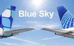
With a Continental merger drawing near, the LA Times featured a great article yesterday on the struggle over the re-branding of United.
I won’t quote from it, but it discusses the ongoing debate over the livery of the merged carrier, tulip v. globe logos, fonts, Economy Plus, DirecTV, and Rhaposdy in Blue.
Interestingly, the only new piece of info that I learned was that uniforms are being designed for the combined carrier that will give FA’s a "new look." For the sake of UA’s dear SEA-based FAs, I trust that tight blue dresses aren’t in the fray…
All this talk of superfluities is all fine and dandy, but the final paragraph of the article nicely sums up the bottom line:
In the long run, the debates over fonts and logos will be meaningless if Smisek successfully builds a global carrier with first-rate service, branding expert Masi said. "If they play that well, deliver on the service well, deliver on the integration from the customer experience, they’ll be fine. That’s really the test."
Indeed, that will be the real test and I’m happy to have Smisek at the helms.


Leave a Reply