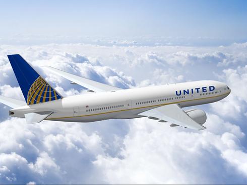
I still am rooting for this design, but at least the merger team at Continental/United is making some progress on the livery of the combined carrier.
When UA and CO announced they were getting hitched in May, they revealed this livery for the post-merger airline. I was horrified by it because it completely eliminated the UA-brand identity and the proposed “United Airlines” font appeared woefully outdated and unbecoming.
Yesterday, a new livery was released that still features the CO colors and leaves the tail unmodified, but introduces a new font. The good news is the custom-made sans-serif font looks much better than the old font. United looks better as UNITED and I commend the merger team for realizing that restoring all caps was appropriate.
But why design a brand new custom font when the current United font is perfectly adequate? And how about incorporating the tulip, or at least the old UA shield, into the design as my archetype above has done?
Progress is slow, but UA/CO has taken a step in the right direction. I trust this will not be the last revision.

image courtesy of Continental Airlines


Haha, except it is. And oddly enough, that picture doesn’t look the least bit out of date today, eh?
TBH, we all miss the tulip.